
World Map Art Room Color Coordination: A Practical Guide
World map art coordinates best when you match its dominant tones—blues, earth neutrals, or muted greens—to your wall colour, furniture, and accent textiles. In Hanoi and Ho Chi Minh City apartments, choose between canvas prints (warm, natural feel, needs occasional dusting in humid air) or glass-coated prints (glossy, moisture-resistant, easier to clean). Start by identifying your room's colour "anchor"—sofa, headboard, or accent wall—then select a map style that echoes 1–2 of those colours without competing for attention. Place it at eye level (145–160 cm from floor) covering about 60–70% of the wall width above that anchor furniture. Décor Vie offers single maps and 3/4/5-piece sets; contact us on +84 775 017 977 for a quote by size and finish.
What colour tones work best with world map art?
World map designs naturally fall into three colour families: cool-toned (navy, slate blue, grey with blue accents), warm earth (terracotta, ochre, rust, cream), and contemporary minimalist (black, white, soft grey). Your room's existing palette should guide which you choose. If your sofa is navy or charcoal, cool-toned maps amplify cohesion without visual strain. Warm-toned maps pair naturally with beige sofas, wooden furniture, and cream walls—common in many Hanoi rental apartments. Minimalist maps work in spaces with strong black-and-white contrast or scandinavian-influenced interiors. Never select a map tone that conflicts with your largest, most permanent item (sofa, headboard, or flooring). The map should anchor the room's colour story, not interrupt it.
💬 WhatsApp/Zalo +84 775 017 977 for size and design advice
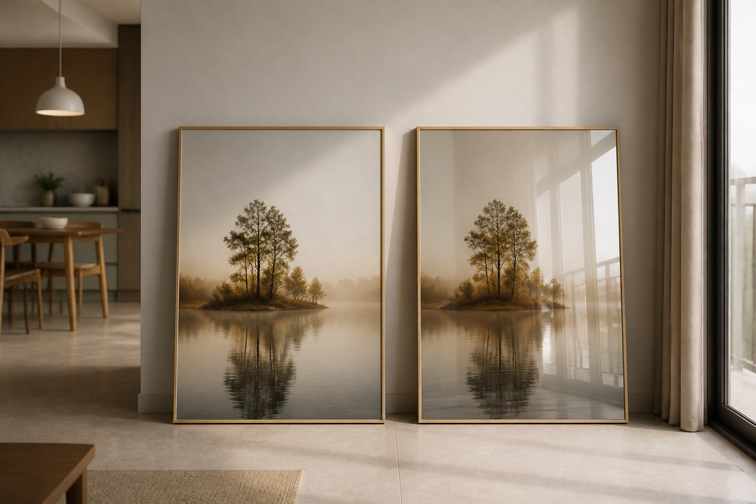
Canvas or glass-coated: which finish suits colour coordination better?
Canvas prints have a matte surface that absorbs light, making colours appear warmer and softer—ideal if you want the map to blend seamlessly. Glass-coated (crystal) prints have a glossy, reflective finish that makes colours pop and appear more saturated; reds become richer, blues deeper. In humid Hanoi apartments, glass-coated resists moisture buildup better and wipes clean without risk of water marks. Canvas can collect dust in the air-con cycles typical here, dulling colour vibrancy over time. If your room has strong natural light from large windows, glass-coated may create glare; test a small mock-up first. For colour-critical rooms (home offices, galleries), glass-coated is more stable. For bedrooms or relaxation spaces, canvas feels warmer. Neither is "better"—it depends on your lighting and maintenance comfort.
How large should the map be relative to wall and furniture?
A common mistake is hanging art too small or too high. World map art should cover approximately 60–75% of the width of the furniture beneath it (sofa, bed, console table). If your sofa is 1.8 m wide, aim for a map or set totalling 1.1–1.35 m. The vertical centre should sit at 145–160 cm from the floor—roughly eye level when standing or the sightline when seated. For bedroom wall art, measure from your pillow's top; the map should sit 20–30 cm above the headboard, never touching it. In living room layouts, leave 15–20 cm between the top of the sofa back and the map's lower edge. Use Décor Vie's 2-piece, 3-piece, 4-piece, or 5-piece sets to fill larger walls without overwhelming them; a 3-piece set often suits a 2.5–3 m wall better than a single oversized print.
Can I hang world map art in a rented apartment without damage?
Yes, using damage-free hanging methods. Command adhesive strips (rated for 1–2 kg) work reliably on smooth walls; most Hanoi apartments have paintable surfaces that accept them well. Avoid nails or drilling—it voids the security deposit. Test the adhesive on a hidden spot first (behind furniture). For heavier glass-coated prints (4–5 kg, depending on size), use two pairs of strips rated 2 kg each, spaced horizontally. Never hang directly above a bed or seating area where failure could cause injury. Document your installation with photos before moving in; keep the adhesive packaging. When you leave, remove strips slowly at a 45° angle; they come off cleanly if applied correctly. Landlords typically accept perfectly clean walls. For a 3-piece or 4-piece set, hang each piece individually with its own adhesive anchor.
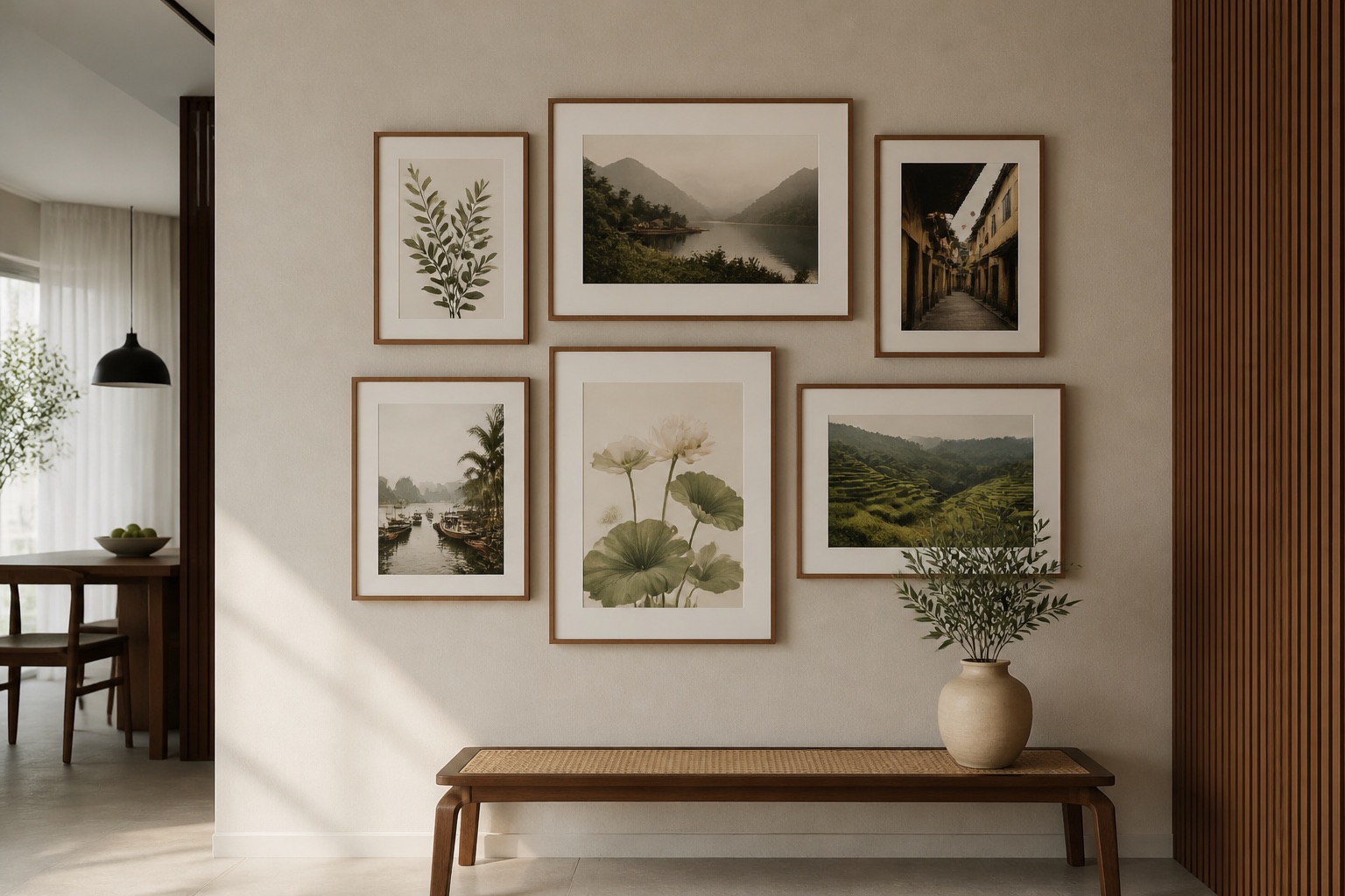
Which world map designs coordinate with specific room styles?
Minimalist monochrome maps (black on white, grey on cream) suit modern, industrial, or Scandinavian interiors; they don't compete with bold furniture. Vintage or antique-style maps with serif fonts and sepia tones pair with mid-century, bohemian, or eclectic rooms. Contemporary flat-design maps in saturated single colours (navy, emerald, terracotta) work in maximalist spaces or rooms with patterned textiles. Travel-themed maps with hand-drawn details suit art for galleries and hotel projects; they photograph well and spark conversation. Political-boundary maps feel corporate or educational; they suit offices and studios. For colour coordination, match the map's style language to your furniture era: if your sofa is modern, choose a clean, contemporary map; if it's vintage, a retro map looks intentional, not random. Décor Vie offers abstract and contemporary designs alongside classic world maps.
| Map Style | Room Type | Colour Strength | Why It Works |
|---|---|---|---|
| Monochrome minimal | Modern, studio | Low (blends) | Doesn't overwhelm small rooms |
| Vintage sepia | Bohemian, eclectic | Medium (warm) | Pairs naturally with earth tones |
| Saturated single-colour | Maximalist, bold | High (pops) | Holds its own against patterned walls |
| Antique with script | Traditional, mid-century | Medium (muted) | Matches period furniture tones |
| Flat contemporary | Scandinavian, minimalist | Medium (balanced) | Clean lines echo furniture shape |
🖼️ Browse world map collections
How do I avoid common colour-matching mistakes?
Don't use the map as your room's only colour source. It should echo or complement existing tones, not introduce them alone—you'll feel unbalanced. Don't hang a cool-blue map above a warm-toned sofa unless you're after deliberate contrast (which works only in design-forward spaces). Never choose based on the online preview alone; order a small swatch or test print first if available—screen colour differs from wall colour under real light. Don't forget room lighting. North-facing rooms with cool daylight favour cool-toned maps; south-facing rooms with warm afternoon sun suit warm maps. Don't hang too high or too far left/right—centre it, and keep it at eye level. Avoid matching the map's colour exactly to your wall. A map the same shade as the wall disappears; choose one that sits 1–2 tones lighter or darker for definition. Don't overcrowd: if you already have patterned cushions, art books, or textiles, choose a simple map; if walls are plain, a detailed design shines.
What to check before you buy
- Room lighting: North-facing (cool), south-facing (warm), or mixed? This determines which map tone will look natural.
- Furniture anchor colour: Identify your sofa, bed, or console tone. The map should harmonize, not clash.
- Wall dimensions: Measure furniture width and ceiling height. Use these to calculate map size (60–75% of furniture width).
- Existing décor saturation: Busy patterned walls suit simple maps; plain walls can handle detailed designs.
- Humidity tolerance: In older apartments or north-facing rooms with less air circulation, glass-coated resists moisture better than canvas.
- Renter status: Confirm your lease allows adhesive hanging. Use Command strips only.
- Installation space: Ensure no pipes, outlets, or light switches behind the hanging zone.
💬 WhatsApp/Zalo +84 775 017 977 for size and design advice
We're here to help you choose the right size, finish, and colour. Contact us with your room's dominant colour, furniture dimensions, and wall layout—we'll recommend a map that ties your space together.
FAQ
Can I coordinate a world map with feng shui colour principles?
Yes. Feng shui wall art uses earth tones and blues to balance energy in living spaces. Warm maps support social areas; cool maps suit rest zones. It's a cultural framework, not a guarantee of outcomes, but it guides thoughtful colour choices in Vietnamese homes.
What's the humidity risk for canvas maps in Hanoi?
Canvas absorbs moisture in high-humidity months (May–September). Dust accumulates faster and colours may appear dulled over time. Glass-coated prints resist moisture and wipe clean. Neither fails catastrophically indoors, but glass-coated is more practical in tropical climates.
Should I hang a world map above a colourful sofa or accent wall?
Keep it simple. A plain wall behind a patterned sofa lets the map stand out. A plain sofa with a patterned accent wall works too. Avoid both bold patterns competing—choose one anchor, let the map complement it subtly.
How do I know if my map colour will look right under my room's lighting?
Request a sample or test a small print in your space for 2–3 days under natural and artificial light. Colours shift dramatically between screens and walls, and between north and south light.
Can I use a world map in a bedroom without it feeling too busy?
Yes. Choose a monochrome or muted-tone map, hang it at eye level above the headboard, and keep other wall décor minimal. Bedrooms benefit from calm, simple designs; save detailed maps for living areas.
Is a 3-piece or 4-piece set better for colour coordination than a single large map?
Sets work if your wall is wide (2.5+ m) and furniture is proportional. They break up colour visually and suit modern, asymmetrical layouts. Single prints are easier to coordinate in smaller rooms. Measure first; we'll advise.