
Wood Element Picture for Living Room: Feng Shui & Style Guide
A wood-element picture for your living room is wall art featuring warm wood tones, natural wood textures, wooden furniture subjects, or earth-coloured designs that evoke trees, forests, or timber—used in feng shui to represent stability and growth, and in interior design to warm modern or minimalist spaces. For Hanoi apartments, we recommend canvas prints or glass-coated prints in sizes 80×60 cm or 100×100 cm placed 20–30 cm above a sofa at eye level (145–160 cm from floor). Wood tones pair well with concrete, white, or grey walls. Avoid dark browns on north-facing walls (they deepen shadows); choose lighter oak or pine tones instead. Décor Vie offers canvas, glass-coated, and fabric prints in single or multi-piece sets; contact us for sizing and colour samples matched to your wall and furniture. --- 💬 WhatsApp/Zalo +84 775 017 977 for size and design advice
Why Does Wood-Tone Wall Art Work in a Living Room?
Wood tones create psychological comfort and anchor a room visually. Warm browns and golds slow the eye, making busy living spaces feel intentional and cohesive. In feng shui tradition, wood represents growth and renewal—a cultural reference many Vietnamese and international residents in Hanoi appreciate as a styling principle rather than a superstition. Practically, wood-coloured art bridges modern furniture (glass, steel) and natural elements (plants, textiles), preventing a space from feeling cold. A single well-chosen wood-element print above a sofa or console table becomes the room's focal point without overwhelming smaller apartments common in District 1 or Hoan Kiem.
What Size Wood Picture Fits Above Your Sofa?
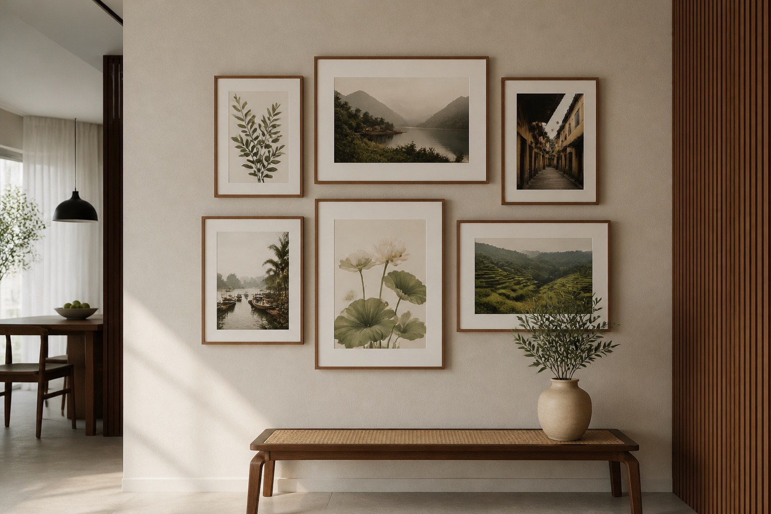
The rule is simple: art width should be 60–70% of the furniture width below it, centred 20–30 cm above. For a standard 2-seater sofa (160 cm wide), choose 80×60 cm or 100×75 cm. For a larger 3-seater (200+ cm), go 120×90 cm or even a 2-piece set totalling 160 cm width. If your wall is narrow or your sofa sits in a corner (common in Hanoi studios), a 1:1 square (60×60, 80×80, 100×100 cm) off-centre still balances well. The vertical centre of the print should sit 145–160 cm from the floor—roughly eye level when seated. Too low looks cramped; too high appears to float. We recommend 3-piece wall art sets for larger walls or open-plan spaces, as they distribute visual weight naturally and create rhythm without dominance.
Canvas vs. Glass-Coated: Which Handles Hanoi Humidity Better?
| Aspect | Canvas Print | Glass-Coated Print |
|---|---|---|
| Humidity Resistance | Moderate; absorbs moisture; risk of warping if >70% RH prolonged | High; sealed tempered glass repels moisture and mildew |
| Cleaning | Dust with soft brush; water marks leave permanent stains | Wipe with microfiber cloth; tolerates damp cleaning without damage |
| Reflections | Matte finish; no glare; warm, intimate look | Slight gloss; glare if positioned opposite windows; premium, gallery feel |
| Wood-Tone Appearance | Warmer, deeper tones; grain detail visible | Sharper, more vibrant; wood texture appears lifted and dimensional |
| Lifespan (Hanoi) | 5–10 years; monitor for edges lifting in monsoon months | 10+ years; zero degradation from humidity cycles |
| Cost Basis | Base format for Décor Vie pricing | Premium finish; +20–30% over canvas (contact us for exact quote) |
| Renter-Friendly Hanging | Light (0.5–1 kg); easy command-strip adhesion | Heavier (2–4 kg); requires secure wall anchors; check lease first |
Hanoi's annual humidity reaches 70–85% May–September; air-conditioned apartments stay 50–65% but see condensation spikes in monsoons. For high-humidity living rooms (ground floor, interior without AC), glass-coated (crystal) prints preserve wood-tone depth and prevent canvas edges from curling. Canvas works fine in well-ventilated, climate-controlled spaces. Décor Vie uses tempered glass and fade-resistant inks; both formats resist yellowing, but glass outlasts canvas in moisture-prone locations.
How to Match Wood-Tone Art to Your Wall Colour
Wood-element prints shine on neutral walls: white, soft grey, beige, concrete-grey, or warm cream. The print becomes the room's warmth anchor rather than competing with wall colour. Avoid pairing rich dark-wood tones (charcoal, mahogany browns) with grey-green or dusty blue walls—the combination feels heavy and dated. Instead:
- White or light grey walls: Choose warm oak, honey, or medium-brown wood tones; the contrast reads modern and clean.
- Warm beige or cream walls: Opt for darker or deeper wood; the tones merge subtly, creating cohesion.
- Concrete or industrial walls: Bright, light wood tones (pale oak, whitewashed wood) lift the space; dark wood deepens moodiness.
- Accent walls (jewel tones, navy, terracotta): Use wood art only if the wall is behind the sofa, not opposite; never flank an accent wall with competing art.
Take a phone photo of your wall in daylight and bright evening light (Hanoi's light shifts dramatically); send it to us for colour-matching advice. Wood tones appear warmer under warm bulbs (2700K) and cooler under daylight (5000K+)—a critical detail for apartment dwellers who can't control building lighting.
💬 WhatsApp/Zalo +84 775 017 977 for size and design advice
Which Wood-Inspired Designs Work Best?
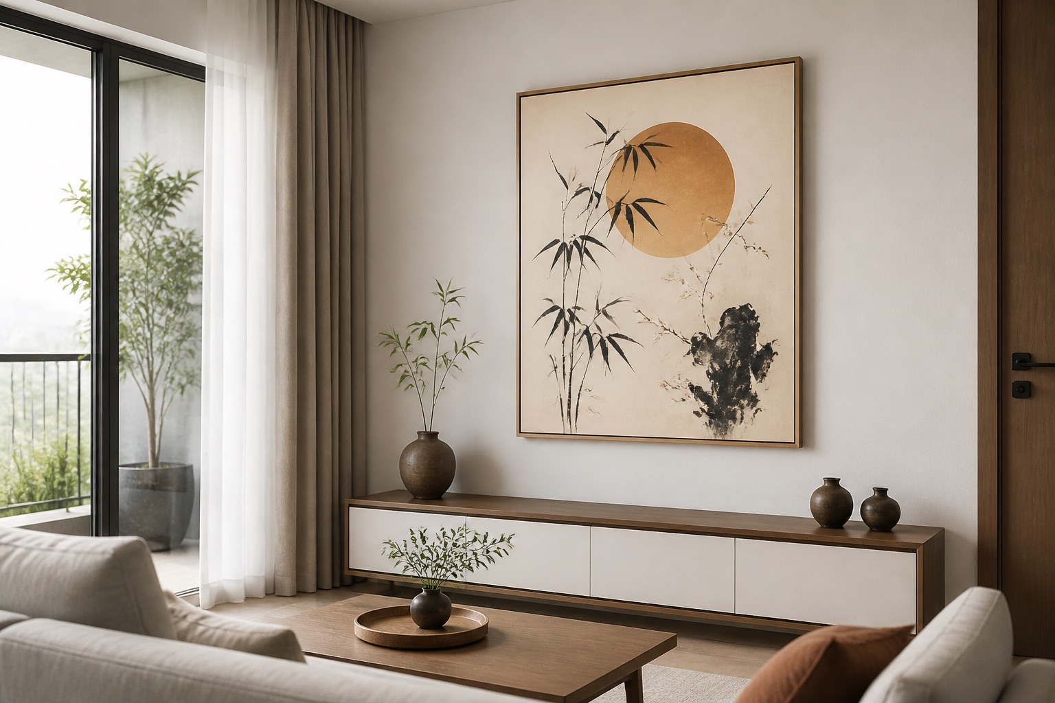
Canvas prints featuring forests, wooden architecture, botanical studies, or abstract warm-toned work best for living rooms. Vietnamese motifs—Hoi An's wooden ancient town, wooden boats on Ha Long Bay, or rice-field landscapes at golden hour—anchor cultural identity while adding warmth. Modern geometric or abstract designs with wood textures suit minimalist or industrial living rooms. Avoid photorealistic wood grain or ultra-literal timber close-ups; they read as wallpaper and date quickly. Single large-format prints (100×75 cm) command attention; multi-piece sets of 3–5 pieces in coordinating wood tones work for open-plan spaces where one print might feel incomplete.
For contemporary interiors, abstract wall art in warm ochre, rust, and bronze tones delivers wood-element energy without literal imagery. Feng shui enthusiasts appreciate feng shui wall art featuring wood symbols (bamboo, cedar branches, or mountain scenes); we frame these as design choices, not luck guarantees. Hotels and commercial projects often request custom art for hotels and projects in wood tones to create welcoming, cohesive lobbies and common areas—the same principle scales to home living rooms.
Common Mistakes to Avoid When Hanging Wood-Tone Art
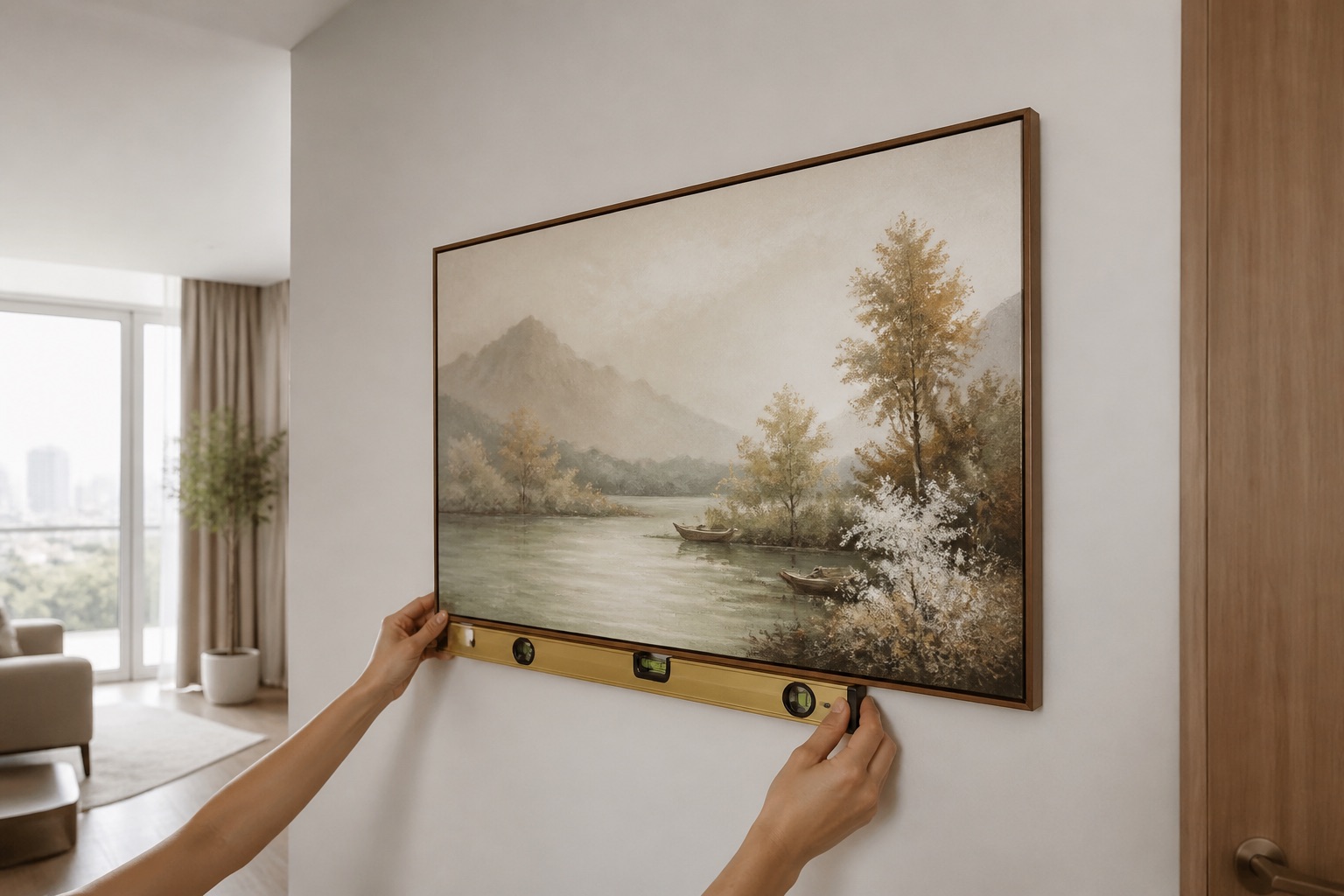
Mistake: Hanging art too high. At 170+ cm from the floor, the print floats above furniture and breaks visual connection. Measure twice; the top edge of the frame should sit no higher than 15–20 cm above the sofa back.
Mistake: Choosing art darker than your sofa. If your sofa is charcoal or dark grey, a very dark wood-tone print can make the room feel shadowed. Balance with a lighter wood tone or pair the dark print with a light wall colour.
Mistake: Over-decorating around the print. One wood-tone picture + a console table below + plants on either side is enough. Adding mirrors, shelves, or secondary art nearby creates visual clutter and dilutes the focal point.
Mistake: Ignoring wall anchors for canvas. Canvas is light but can sag unevenly if hung on cheap picture hooks in Hanoi's older apartment walls (often soft concrete). Use quality wall anchors rated for 3+ kg, or command strips (removable, renter-safe, up to 2 kg per strip).
Mistake: Glass-coated prints on walls near AC vents. Temperature swings cause the tempered glass to expand and contract; over years, tiny stress fractures can appear. Keep glass-coated wall art at least 1 metre from AC units or heaters.
Wood-Element Art for Living Room Wall Art
Living rooms are where wood-element décor shines because they're high-traffic, multi-use zones where warmth and calm matter most. A wood-toned print above the sofa invites people to sit; above a console or media unit, it softens the technology aesthetic. For Hanoi's tropical climate and compact apartments, we favour canvas or glass-coated prints in ratios 1:1 (square) or 2:3 (portrait), which fit standard wall spacing without looking stretched. If your living room is part of an open-plan kitchen-dining area, living room wall art should bridge the zones—warm wood tones here connect visually to any bedroom wall art in adjacent spaces, creating flow.
🖼️ Browse Décor Vie wall art
What to Check Before You Buy
- Measure your wall and furniture first—don't guess. Tape a cardboard frame to the wall at intended height; stand back and sit down to test sightlines.
- Check your wall surface—new plaster, old paint, or painted brick require different anchors. Cheap walls may require professional installation.
- Confirm room lighting—photograph the wall in morning, afternoon, and evening light. Wood tones shift dramatically; order a sample or consult us before committing.
- Verify humidity level—if your living room is ground floor, interior-facing, or near a bathroom, glass-coated is safer long-term despite higher initial cost.
- Decide on frame colour—natural wood, black, or no frame (canvas stretched edge) affects the final look. Consult us on frame options matched to your sofa and walls.
- Ask about delivery and hanging service—Décor Vie delivers across Vietnam; contact us to confirm timelines and whether installation is available in your district.
💬 WhatsApp/Zalo +84 775 017 977 for size and design advice
FAQ
Does wood-element wall art actually bring good feng shui to a living room?
Wood represents growth and stability in feng shui tradition; many residents appreciate it as a design principle. We recommend it for warmth and visual balance, not as a luck promise. Proper placement (above furniture, balanced with wall colour) matters more than the subject's symbolic meaning.
Can I hang a wood-tone canvas print in a humid Hanoi ground-floor apartment?
Canvas works if the room has AC or good air circulation; humidity under 65% is safe. Ground floor or high-humidity spaces (monsoon exposure) risk canvas edges curling. Glass-coated prints are more durable in these conditions and require less maintenance.
What's the ideal size if my living room wall is only 2 metres wide?
Choose a single 60×60 cm or 80×60 cm canvas or glass-coated print, positioned 20–30 cm above furniture. If you want two pieces, a 2-piece set totalling 120 cm width (e.g., 60×90 cm each) fits and creates rhythm without overwhelming the space.
Should I match my wood-tone picture to my wooden furniture?
Not exactly—match in tone family (warm, medium, light) rather than identical shade. If your wooden table is light oak, choose a print with honey or pale-wood tones, not dark mahogany. This creates intentionality, not accidental repetition.
Can I hang wood-tone art in a rented apartment without damaging the walls?
Yes, using quality command strips (up to 2 kg per canvas print) or removable wall adhesive. For heavier glass-coated prints (2–4 kg), use temporary wall anchors or consult your landlord. Avoid nail holes if your lease forbids them; we can advise on renter-safe mounting via WhatsApp.
What's the difference between canvas and glass-coated for wood-tone pictures?
Canvas is warmer and matte; best for well-ventilated spaces. Glass-coated (tempered glass) has slight gloss, resists humidity and mildew, and makes wood textures appear more vivid and dimensional. Glass costs more but lasts longer in Hanoi's climate. See the comparison table above for details.