
Wood Element Kitchen Art: Which Colors to Avoid
Avoid dark muddy browns, cool grays, overly saturated reds, and weak yellows in kitchens with wood cabinets—they compete or recede. Instead, choose warm neutrals (cream, soft taupe), jewel tones (deep emerald, navy), earthy oranges, warm whites, or accent colors that sit opposite your wood's undertone on the color wheel. Décor Vie's canvas and glass-coated prints let you test designs before committing, since kitchens face steam and temperature swings; glass-coated finishes resist humidity better in Hanoi and Saigon apartments. Match the saturation of your cabinetry, not its exact tone—a print should complement, not duplicate. Light matters: north-facing kitchens need warmer art; south-facing kitchens handle cooler hues well.
Why do wood cabinets reject so many art colors?
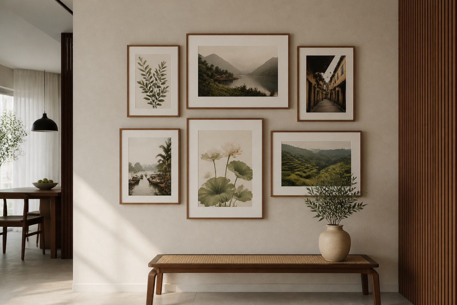
Wood naturally carries warm or cool undertones. Warm woods (honey, golden oak) have yellow, orange, or red bases; cool woods (gray-toned, whitewashed) lean toward blue or violet. When art repeats or fights those undertones, the kitchen feels chaotic or dingy. A muddy brown print on golden cabinets flattens both. Your eye needs contrast without collision. The wood becomes the anchor; art should float alongside it, not anchor-fight.
What specific colors should I skip in my wood kitchen?
Colors to avoid:
- Muddy, desaturated browns: Too close to cabinetry; they disappear or look like dust.
- Cool grays and cool greiges: Clash with warm wood; create a "clinical" vibe inappropriate for a kitchen gathering space.
- Overly bright reds and magentas: Dominate the space and exhaust the eye in a room where you spend daily time.
- Weak, pale yellows: Look sickly next to warm wood; lose vibrancy under kitchen lights.
- Dull olive or sludge greens: Muddier cousins of muddy brown; they age badly in kitchens.
- Dead blacks and near-blacks: Absorb light; make kitchens feel smaller and colder (unless you're doing a dramatic modern statement on white cabinetry).
Which colors work best with wood cabinets?
| Color Family | Why It Works | Best Wood Match | Example Mood |
|---|---|---|---|
| Warm neutrals (cream, soft taupe, warm white) | Extends light; complements without competing. | Honey, golden oak, medium cherry. | Calm, timeless. |
| Jewel tones (emerald, sapphire, deep teal) | High saturation cuts through; adds sophistication. | Most woods, especially medium-dark. | Luxe, grounded. |
| Earthy oranges and warm corals | Echo warm cabinet undertones without duplication. | Golden oak, honey, natural teak. | Warm, approachable. |
| Warm whites and soft ivories | Maximum lightness; allows wood to shine. | All cabinet tones. | Bright, clean. |
| Deep plums and mauves | Unexpected, rich; modern yet warm-toned. | Cherry, walnut, medium-dark woods. | Contemporary, artistic. |
| Warm grays (greige, taupe-gray) | Bridges cool and warm; adds depth. | Medium to light woods. | Balanced, modern. |
The key: saturation must match your cabinetry's intensity. Glossy, vivid cabinets need equally bold art; soft, matte woods work better with muted or jewel-toned prints.
How do light direction and kitchen layout change my color choice?
North-facing kitchens receive soft, cool daylight. Warm art (peach, warm white, cream) lifts the space and prevents it from feeling gray. South-facing kitchens get intense, warm afternoon sun. Jewel tones or cool-leaning warm neutrals prevent overheating visually.
Wall placement also matters. Art directly above a breakfast counter or dining table becomes a focal point—bold color works here. Art on a side wall above a narrow counter should be quieter, more harmonious. Kitchen size influences choice too: small kitchens need breathing room, so avoid maximum saturation; large, open kitchens can handle dramatic colors.
Canvas vs. glass-coated prints: which resists kitchen humidity?
Kitchens produce steam, grease particles, and temperature fluctuations. Standard canvas can absorb moisture over time, especially in Hanoi and Saigon apartments where humidity averages 70–85% year-round. Glass-coated (crystal) prints sit behind tempered glass or have a glass-like finish, creating a moisture barrier. They're easier to clean, resist yellowing, and don't warp.
For wood kitchens, glass-coated wall art makes practical sense: the finish protects color vibrancy and won't expand or contract with seasonal shifts. Canvas works if you use a dehumidifier or the kitchen is well-ventilated; it also offers a warmer, less reflective aesthetic. Test your choice—contact us on +84 775 017 977 for a quote by size to compare finishes side-by-side before hanging.
💬 WhatsApp/Zalo +84 775 017 977 for size and design advice
How do I size and place art above my wood kitchen cabinetry or counter?
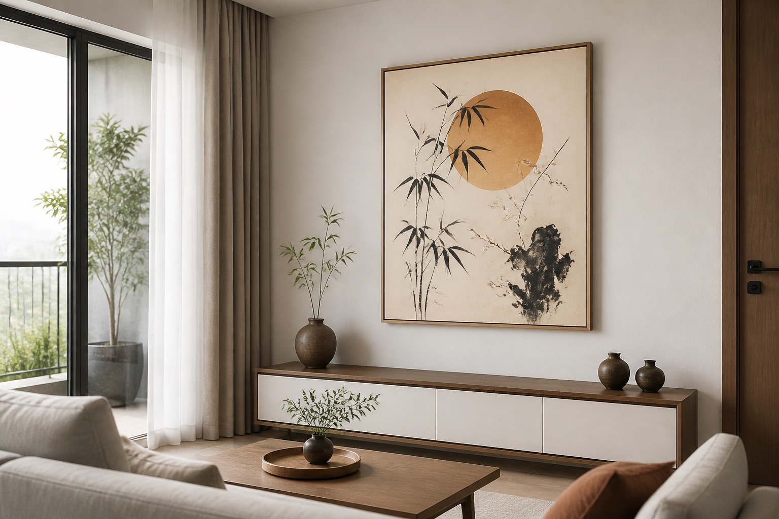
Art should sit about 20–30 cm above a breakfast counter or cabinetry edge. If hanging above a dining table, center it at eye level (145–160 cm from the floor). Width should be roughly two-thirds the width of the furniture below—a counter 150 cm wide works with art about 100 cm across. This prevents the print from looking lost or cramped.
For narrow galley kitchens, a 3-piece wall art set (vertical orientation) makes efficient use of vertical space. For open-plan kitchens, a larger single canvas or a 4-piece horizontal set ties the wood cabinetry to adjacent living zones without visual chaos. Measure twice; we offer stretched and rolled canvas prints in custom sizes, so contact us for exact dimensions and to confirm sizing before you order.
Real example: color decision framework
Step 1: Identify your cabinet undertone. Hold a warm light (phone flashlight) next to the wood. Does it lean warm (golden, orange, red) or cool (gray, blue, whitewashed)?
Step 2: Note the saturation (matte, satin, glossy, natural). Glossy cabinets accept bold, saturated art. Matte cabinets pair better with softer, more subdued tones.
Step 3: Check kitchen light direction. North = warm art. South = jewel tones or cool neutrals. East/West = flexible; lean toward the room's other dominant color.
Step 4: Choose a color at least two steps away on a color wheel from the cabinet tone. Example: golden oak (warm, yellow-based) pairs with emerald (cool, blue-green) or coral (warm, but orange-shifted), not burnt sienna (muddy, too close).
Step 5: Test contrast. Hold a sample or photo against cabinetry in natural daylight and under kitchen lights. Muddy or washed-out = wrong choice. Vibrant and complementary = proceed.
What to check before you buy
- Cabinet undertone: Warm or cool? Confirm before narrowing color.
- Kitchen humidity: Does your exhaust fan run regularly? Moist kitchens need glass-coated; dry kitchens can use canvas.
- Wall space & furniture dimensions: Measure counter/table width and wall height. Art should sit two-thirds the width of what's below.
- Existing décor: Are countertops, backsplash, or appliances warm or cool-toned? Art should harmonize with the overall palette, not compete.
- Renter status: If renting, confirm your landlord allows drilling or adhesive hanging. We offer renter-friendly options—contact us to discuss.
- Sample in situ: Ask to see a small print or photo in your kitchen under actual lighting before committing to a larger piece.
Final thought
A wood kitchen is warm, inviting, and durable—your art should honor that. Avoid muddy, weak, or visually combative colors. Instead, lean into jewel tones, warm neutrals, or saturation levels that complement your cabinetry. Décor Vie's custom sizing and finish options (canvas or glass-coated) let you test your vision without guesswork. Light, humidity, and placement all matter; we're here to guide each one. Reach out by WhatsApp or Zalo.
💬 WhatsApp/Zalo +84 775 017 977 for size and design advice
FAQ
Can I use black art in a wood kitchen?
Yes, if the kitchen is large, modern, and has good lighting. Black works as a graphic accent on white or very light cabinetry, but risks closing in smaller or traditionally styled wood kitchens. Test first.
Does art fade in a bright, south-facing kitchen?
Canvas can fade over years; glass-coated prints resist fading much better. For south-facing kitchens, choose glass-coated if the space receives direct afternoon sun.
What if my cabinet color is "medium cherry" (warm but slightly red)?
Avoid oranges and reds that echo the cabinet tone. Instead, choose jewel tones (sapphire, deep teal), warm creams, or soft mauves that contrast without clashing.
Can I hang art directly on painted kitchen walls, or only above furniture?
Both work. Art above a counter or dining table anchors the zone. Art on a side wall or above a slim counter works if it doesn't compete with busy cabinetry. Avoid crowding; allow at least 30 cm clear space.
How often should I clean a glass-coated print in a kitchen?
Wipe gently with a soft, dry cloth monthly to remove dust or grease. Avoid harsh chemicals. Glass-coated prints resist damage better than canvas in kitchens, making cleanup simple.
What size should a 3-piece set be above a 200 cm kitchen counter?
The combined width should be roughly 120–140 cm (two-thirds of 200 cm). Hang them 20–30 cm above the counter, spaced evenly. Contact us for custom dimensions and pricing.