
Wood Element Feng Shui: Why Red & Black Art Clashes, What Works Instead
In feng shui, the wood element associates with growth, vitality and the colours green and brown. Red (fire) and black (water) create tension: red exhausts wood through excessive fire energy, while black dampens it. Rather than avoiding all warm or dark art, choose pieces in greens, earth tones, natural wood frames, or balanced neutrals (cream, soft grey). If you love red accents, pair them with grounding greens or use them sparingly in one wall zone. Décor Vie's custom canvas and glass-coated prints let you match any palette to your room's existing wood furniture and light—explore our feng shui collection to see designs that honour traditional principles without restriction. 💬 WhatsApp/Zalo +84 775 017 977 for size and design advice
Why Does Red Clash with Wood Element Spaces?
In feng shui tradition, red represents fire energy—vibrant, expansive, and consuming. Wood feeds fire, so excessive red exhausts the wood element's growth potential, leaving a room feeling depleted rather than nourished. A large red focal-wall canvas or bold crimson abstract can amplify this drain, especially in bedrooms or home offices where you want calm focus. Test this: hang a red piece in your space for a week and notice whether the room feels energised or restless. The issue isn't red itself—it's proportion and context. A small red accent (10–15 cm tall) blended with greens and neutrals rarely destabilises balance.
What About Black Art in Wood-Element Rooms?
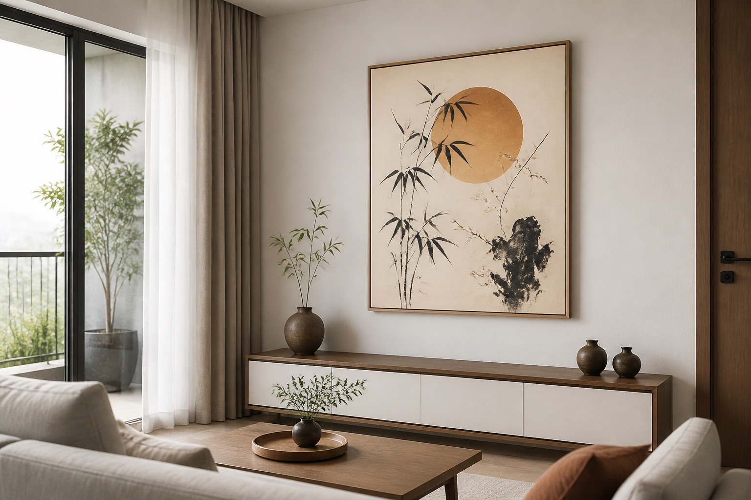
Black symbolises water in feng shui. Water extinguishes wood's fire element in the cycle, so excess black dampens motivation and creative flow. This matters most in living room wall art where you gather and decide, or home studios where you need clarity. A predominantly black abstract or dark geometric canvas can feel oppressive if it's the only focal point. Instead, frame black accents within a larger design that includes warm earth tones, greens, or cream—this anchors the water energy without suppressing it. Glass-coated prints (crystal finish) help here: their reflective gloss lifts dark colours and prevents black from appearing cave-like.
Which Colours Truly Complement Wood Element?
| Colour | Feng Shui Association | Room Type | Why It Works |
|---|---|---|---|
| Soft green | Wood growth | Any room | Echoes the element directly; calming |
| Brown, tan | Wood/earth grounding | Bedroom, study | Stability without excess fire |
| Cream, off-white | Metal clarity | Hallway, office | Reflects light; adds spaciousness |
| Sage, olive | Muted wood energy | Living room | Sophisticated, non-overwhelming |
| Terracotta (small accent) | Balanced fire | Dining room | Warm without exhaustion |
| Deep charcoal (framed by light) | Controlled water | Feature wall | Calms only if balanced |
Choose at least 60 % of your focal art in greens, earth tones, or neutrals. Reserve red and black for accent zones (corners, side walls, or small 2-piece sets rather than full 5-piece spreads).
How Do I Match Wood-Element Colours to My Room?
Start with existing wood furniture: its undertone (warm honey, cool grey-brown, golden oak) guides your palette. If your desk or bed frame is warm-toned, greens with yellow undertones (chartreuse, olive) harmonise better than cool teals. Next, check your wall colour—cream walls pair with any green, while grey walls suit sage or muted olive. Take a phone photo of your furniture in daylight and compare it against our canvas collection or glass-coated designs using the same light. Hang a test print (even a small 20×20 cm canvas) in your space for three days before committing to a larger piece. This costs less than a costly colour mistake. Contact us on +84 775 017 977 for a free colour consultation by photo.
What About Mixed-Colour Sets in One Room?
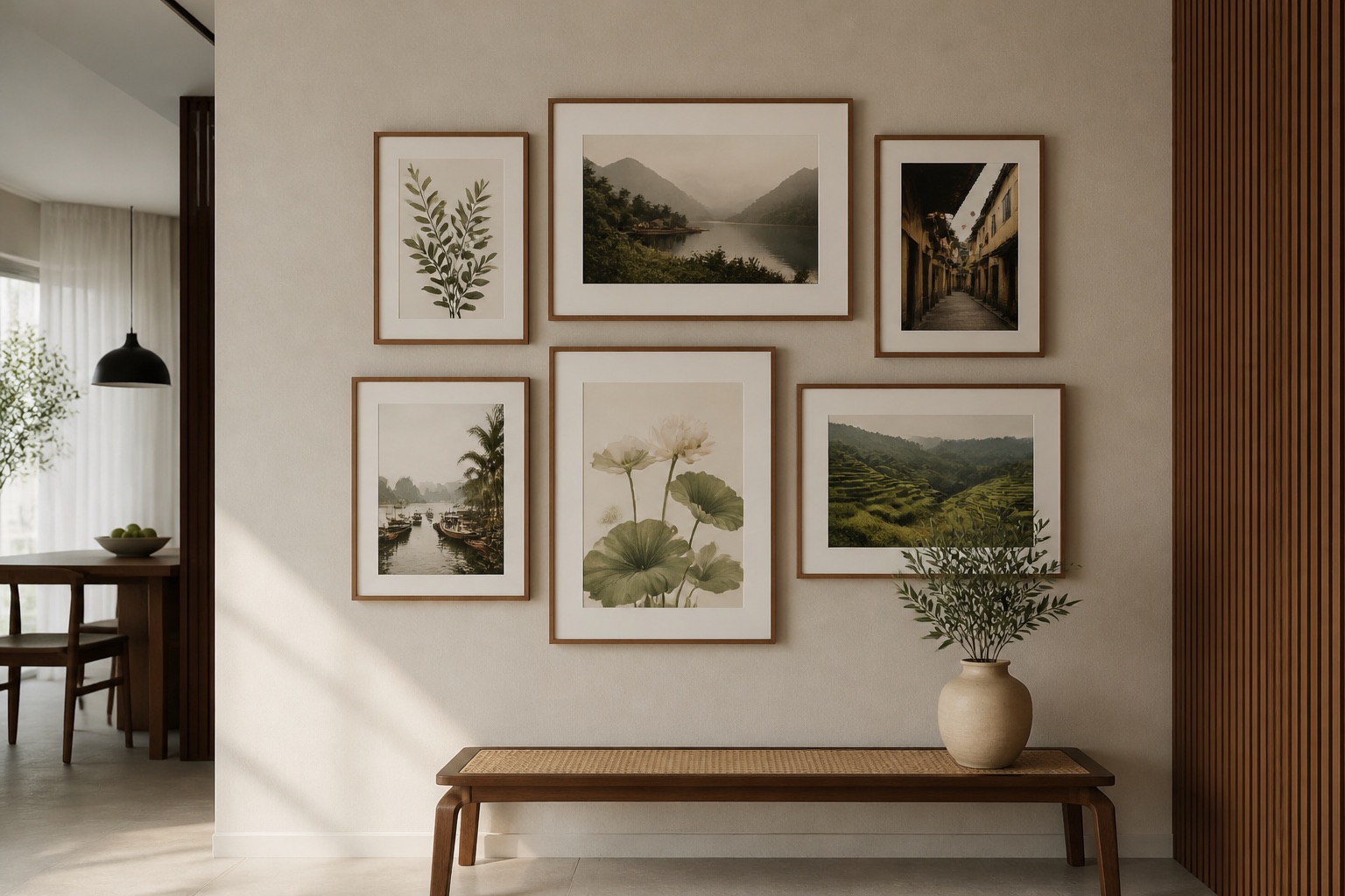
A 3-piece wall art set in complementary greens, creams and soft browns works beautifully above sofas or headboards—it creates visual rhythm without the flatness of a single colour. Stagger the heights slightly (centre piece highest, flanking pieces lower) and space them 15 cm apart. This breaks up monochrome energy and lets each colour "breathe." If one piece is darker (soft charcoal) and flanked by lighter greens, the contrast draws the eye without creating conflict. For bedroom wall art, layered greens with cream are ideal: they're restful but alive. Avoid mixing more than two accent colours (e.g. green + terracotta) unless you're designing a dining room, where warmth aids conversation.
Does Glass-Coated vs. Canvas Matter for Feng Shui Spaces?
Yes—gloss affects energy perception. Glass-coated prints have a crystal finish that reflects light and lifts colours, making darker tones less absorbing. This is useful if your palette includes black or deep charcoal: the reflective surface prevents those colours from feeling heavy or dampening. Canvas absorbs light, deepening colours and creating cosiness—ideal for greens and earth tones, less ideal for a room where you want brightness. In Hanoi and Saigon, humidity matters too: glass-coated prints resist moisture better, so if your wood furniture is already prone to warping in monsoon season, a glass-coated green or cream piece stabilises the micro-environment. Canvas works well in drier rooms or when paired with a sturdy frame. Neither type contains any hand-painted or oil elements—both are precision-printed and sealed for durability.
💬 WhatsApp/Zalo +84 775 017 977 for size and design advice
What to Check Before You Buy
- Wall size vs. art size: Art should cover roughly 60–70 % of the wall width above furniture. For a 1.5 m sofa, a canvas 90–100 cm wide is proportional.
- Existing wood tone: Match warm greens to warm wood, cool greens to grey-toned wood.
- Room light direction: North-facing rooms benefit from warmer earth tones; south-facing rooms suit cool greens and creams.
- Humidity level: If your apartment shows condensation or mould risk, glass-coated outperforms standard canvas.
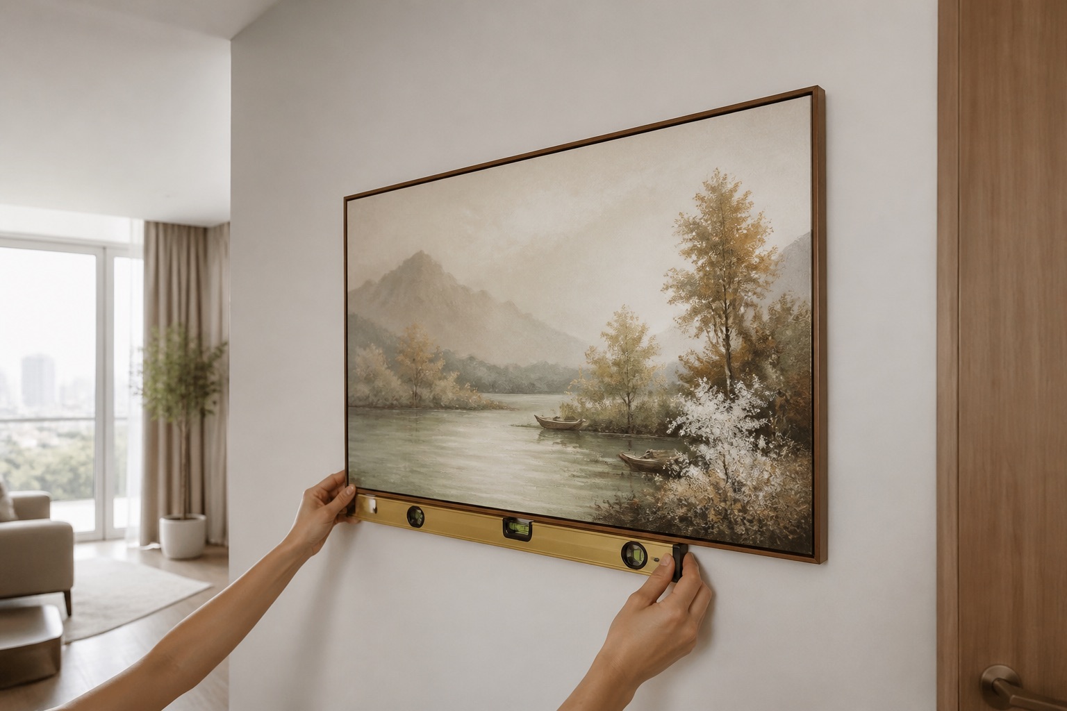
- Rented space: Both canvas and glass-coated use damage-free hanging (non-penetrating brackets). Confirm before ordering.
- Colour scheme already in place: Take a close-up photo of your sofa, curtains and rug in daylight; compare against our online galleries.
FAQ
Can I use red art if I add green accents to balance it?
Yes, but keep red to no more than 30 % of the total focal area. A red and green 3-piece set, with red as one piece and green as two, works. Avoid a solid red canvas paired with one small green frame—the balance tips too far toward fire.
Does black art harm wood element feng shui?
Not if it's framed by lighter, warmer tones. A small black geometric piece (under 50 cm) surrounded by cream or green design doesn't destabilise. Contact us for custom framing advice.
What size canvas works for a wood-element bedroom?
Measure your bed width and choose art 60–75 % of that width, hung 20–30 cm above the headboard. For a 1.6 m bed, a 100–120 cm canvas or 3-piece set is ideal. We'll confirm dimensions by photo.
How do I know if my room's wood furniture is warm or cool-toned?
Take a daylight photo next to a pure white card. Warm wood looks golden or honey-coloured; cool wood appears grey-brown or silvery. Send the photo to +84 775 017 977 and we'll match a palette.
Can I hang art in a rented apartment without damaging walls?
Yes—both our canvas and glass-coated prints use non-penetrating brackets (adhesive strips or hooks that leave no marks). Confirm your wall type (plaster, concrete, tile) when you contact us.
Does abstract wall art work for feng shui, or should I choose landscapes?
Both work if colours align with your element. Abstract in greens and earth tones honours wood; landscapes (fields, forests) naturally reinforce it. Choose whichever suits your room's existing décor style.