
Wood Element Feng Shui: Which Colors to Avoid
In wood element feng shui, avoid metal colours (white, silver, grey) and excessive earth tones (brown, ochre, muddy yellow) as they suppress wood's upward, expansive nature. Instead, choose water colours (black, deep blue, navy) and complementary wood tones (light green, fresh jade). Wall art plays a key role: at Décor Vie, we work with Hanoi homeowners to select canvas or glass-coated prints featuring water elements, nature scenes, or flowing abstracts in blues and greens that reinforce wood energy without static or metallic overtones. The principle is balance—not superstition, but spatial harmony through colour and form.
Wood element feng shui traditionally avoids metal colours (white, silver, grey) and excessive earth tones (brown, ochre, muddy yellow) as they suppress wood's upward, expansive nature. Instead, choose water colours (black, deep blue, navy) and complementary wood tones (light green, fresh jade). Wall art plays a key role: at Décor Vie, we work with Hanoi homeowners to select canvas or glass-coated prints featuring water elements, nature scenes, or flowing abstracts in blues and greens that reinforce wood energy without static or metallic overtones. The principle is balance—not superstition, but spatial harmony through colour and form.
Why Does Wood Element Fear Metal and Stagnant Earth?
In feng shui philosophy, wood naturally opposes metal (metal cuts wood) and struggles under heavy, stagnant earth (which blocks upward growth). Wood represents vitality, renewal, and expansion—qualities that metals' sharpness and hard symmetry contradict. Stagnant earth (muddy browns, ochres) anchors energy downward, draining momentum. This isn't mysticism; it's about visual and psychological balance. A north-facing Hanoi apartment flooded with cold whites or grey concrete tones creates heaviness; add a blue-and-green canvas or water-inspired glass-coated print, and the space breathes again. The rule: if a colour feels static or cold, it likely weakens wood. Test by standing in your room at different times—where does light land, and what emotion surfaces?
What Colours Actually Support Wood Energy?
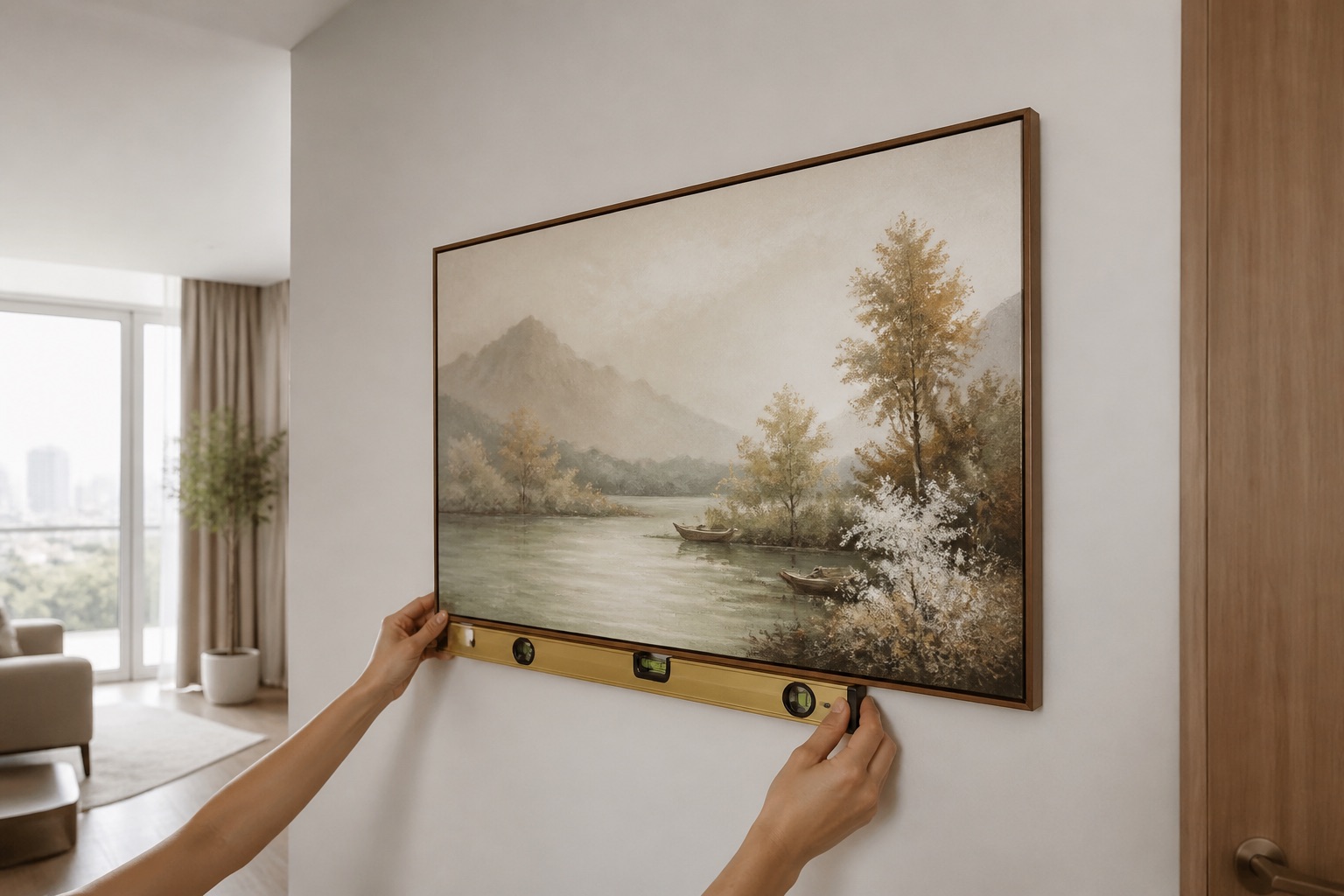
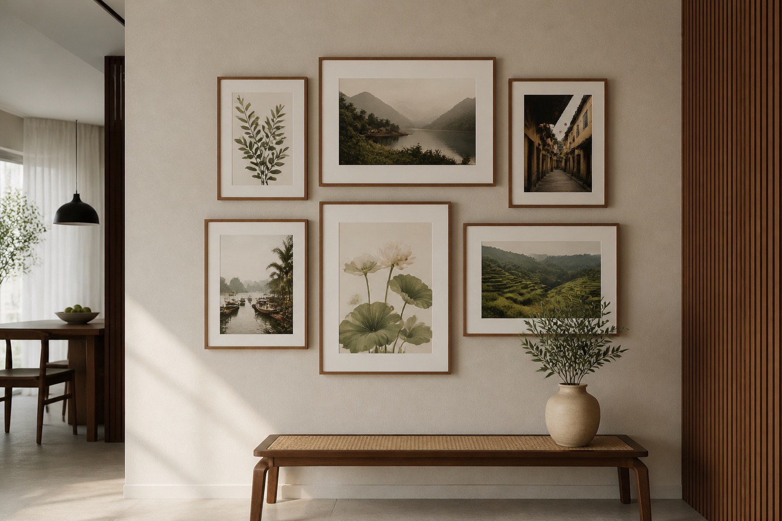
Water colours (black, navy, deep teal, indigo) feed wood—just as rain nourishes trees. Complementary wood tones (jade, sage, apple green, fresh celadon) reinforce the element without competing. These aren't bright, aggressive greens; they're muted, grounded, natural. Warm neutrals (soft beige, cream, pale grey) can work if paired with water or wood accents; pure white or metallic silver should be minimal. At Décor Vie, our feng shui wall art collection emphasises blues, greens, and water scenes—lotus blossoms in soft blues, Ha Long Bay landscapes in jade and navy, rice fields in layered greens. When you hang a 2-piece or 3-piece set in these tones, the colour dialogue feels continuous, not jarring. Avoid art with heavy metallic frames or predominantly silver/white designs; instead, opt for canvas (which absorbs light warmly) or glass-coated prints with matte finishes that reduce harsh reflections. The key: colour should feel alive and flowing, not trapped or cold.
💬 WhatsApp/Zalo +84 775 017 977 for size and design advice
Which Colours Should Never Dominate Wood Spaces?
| Colour | Why to Avoid | Where It Fails | Better Alternative |
|---|---|---|---|
| White (pure, stark) | Metal element; cuts wood visually | Bedroom, office—creates cold, hard energy | Cream, off-white, or white accents only |
| Silver, Chrome | Metal dominates; reflects harshly | Reflects light intensely; modern but drains calm | Matte glass-coated or canvas with soft finish |
| Grey (cool, dense) | Stagnant earth; heavy, inert | Dull, draining—common in Hanoi's urban apartments | Warm grey with blue-green art overlay |
| Brown (muddy, ochre) | Static earth; blocks upward energy | Closes a room down; feels stuck | Warm taupe with navy or green wall art |
| Black (if overdone) | Water's shadow; too yin alone | Oppressive if >40% of wall | Black paired with blues, jade, light wood frames |
Based on our experience advising Hanoi residents, mixing muddy browns with cold whites is the most common mistake—it creates neither grounding nor flow. Solution: anchor the room with one water-colour print (deep blue, indigo) and balance with warm natural frames or soft furnishings.
How Do You Apply This to Your Living Room or Bedroom?
Start by assessing your room's current palette and light. North-facing rooms in Hanoi often feel cool and damp; add a navy or jade canvas print to reinforce calm without coldness. South-facing rooms are already warm; a soft blue glass-coated print prevents overheating and balances excess yang. Bedrooms need gentler energy—choose 2-piece or 3-piece sets in pale jade and soft navy over the headboard or opposite wall. Living room wall art can be bolder: a 3-piece set with water and nature themes (blues, greens, flowing abstracts) draws the eye and frames seating well. Measure your wall width and position art 2/3 of the furniture width below; centre at 145–160 cm from floor. If your wall is narrow or cluttered, choose a single canvas or glass-coated print rather than multiple pieces—one strong blue-green image is more powerful than three competing colours. For bedroom walls, avoid art with sharp lines, metallic accents, or heavy browns; opt for soft landscapes, lotus motifs, or abstract flows in water tones.
Metal and Earth Colours: When Can You Use Them?
You don't ban them entirely—you balance them. A small white accent (cushion, frame trim, 10–15% of wall) is fine; pure white dominating 50% is not. Soft earth tones (warm taupe, pale sand) work well in accent walls if paired with wood-supporting blues or greens nearby. The rule is proportion and intention. If you have existing grey furnishings (common in Hanoi's modern apartments), offset them with a blue-green glass-coated print that visually "softens" the grey. At Décor Vie, we advise clients: measure your wall's dominant colour, then choose art that occupies at least 20–30% of that space and pulls the palette toward blue, green, or soft wood tones. A rented apartment with white walls? Hang a 2-piece set in jade and navy canvas above the sofa—no nails needed if you use renter-safe adhesive strips. Metal picture frames? Switch to natural wood or matte black frames to avoid the "cuts wood" effect.
What to Check Before You Buy
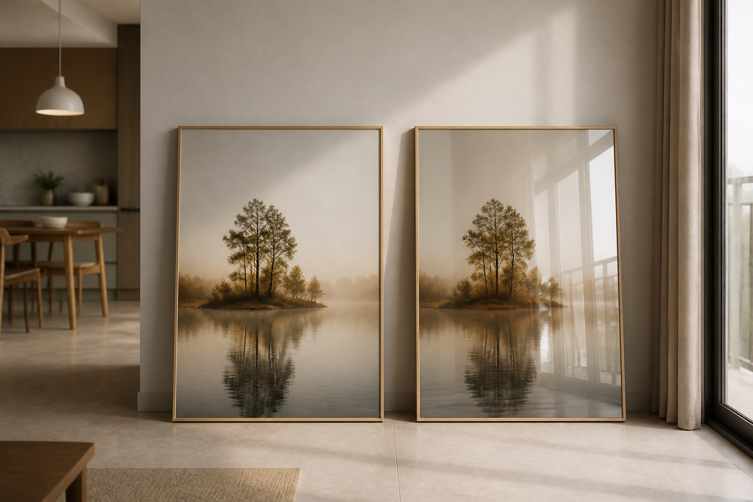
- Colour accuracy: Ask for detailed photos in natural daylight (Hanoi's light changes hourly). Glass-coated prints render colours more saturated; canvas is warmer and more forgiving.
- Room light and time of day: View samples at the time you'll see them most (morning in bedrooms, evening in living rooms).
- Wall colour: Have your wall colour code or a paint chip; email it with your room photo to ensure the art complements, not clashes.
- Size and proportion: Art should be 50–75% of your furniture width; we provide sizing guides with each quote.
- Frame and mount: Canvas arrives stretched on frames (wood bars inside, no visible metal); glass-coated prints come tempered and ready to hang. Confirm mounting hardware is included; contact us to confirm.
- Humidity resilience: Hanoi summers are humid. Canvas in stretched form resists moisture well; glass-coated (also called crystal prints) are most durable for bathrooms or high-humidity rooms.
💬 WhatsApp/Zalo +84 775 017 977 for size and design advice
Explore abstract wall art in blues and greens, or browse our 3-piece sets designed for wood element balance. For offices, studios, or investment properties, our art for hotels and projects team custom-designs installations by colour and feng shui principles. Whether you're in a rented Hanoi apartment or a permanent home, we'll help you choose art that feels alive.
Pages from our team you may need
FAQ
Can I use white art in a wood element room?
Yes, if white is not the dominant colour. A 2-piece set with 20% white and 80% blue-green is fine; pure white canvases are not. Balance is key.
Does glass-coated or canvas work better for feng shui colour?
Both work. Canvas absorbs light warmly and suits muted tones; glass-coated (tempered glass finish) renders saturated blues and greens more vividly. Choose based on your room's light and mood.
What if my apartment walls are already grey?
Pair grey walls with blue-green wall art in a 2- or 3-piece set. The art's colour will visually "lift" the grey and harmonise the room's energy without repainting.
Are metallic frames forbidden?
Pure silver or chrome frames can feel jarring in wood spaces. Use natural wood, matte black, or no frame (canvas stretched on internal bars). Glass-coated prints in matte finishes avoid reflective harshness.
How do I know if a colour is "stagnant earth"?
Stagnant earth is muddy, opaque brown or ochre that feels heavy and closed. Fresh earth is warm taupe or pale sand with clarity. If a colour makes the room feel smaller or duller, it's likely stagnant—offset it with water-coloured art.