
What Color Abstract Art for Small Bedroom: Expert Guide
For small bedrooms, cool tones (soft blues, greens, greys) and high-contrast neutrals (black + white, cream + charcoal) expand the room visually and reduce visual clutter. Warm, saturated oranges and deep reds can feel enclosed—use these as accent tones only. Décor Vie prints in abstract wall art across canvas, glass-coated, and fabric formats let you preview colour combinations before ordering. Light sources matter: north-facing rooms suit warm-toned abstracts; south-facing benefit from cool palettes. A single-piece 60×80 cm canvas or a 2-piece set above the bed (50 cm total height) works best for tight spaces—contact us on +84 775 017 977 for a quote by size and confirm how the colour will interact with your existing light and furnishings.
Does light colour in a small bedroom make it feel bigger?
Yes. Soft, desaturated abstract colours (pale blues, warm greys, muted sage) reflect more light and don't anchor the eye to one visual mass. In bedrooms with limited natural light—common in Hanoi and Ho Chi Minh City apartments—these palettes keep walls from feeling heavy. Glass-coated prints amplify this effect; their reflective surface bounces ambient light, making the entire wall feel deeper. If your bedroom faces north or is on a lower floor, avoid dark charcoal or deep navy abstracts; they'll make the space feel cave-like even with good artificial lighting.
💬 WhatsApp/Zalo +84 775 017 977 for size and design advice
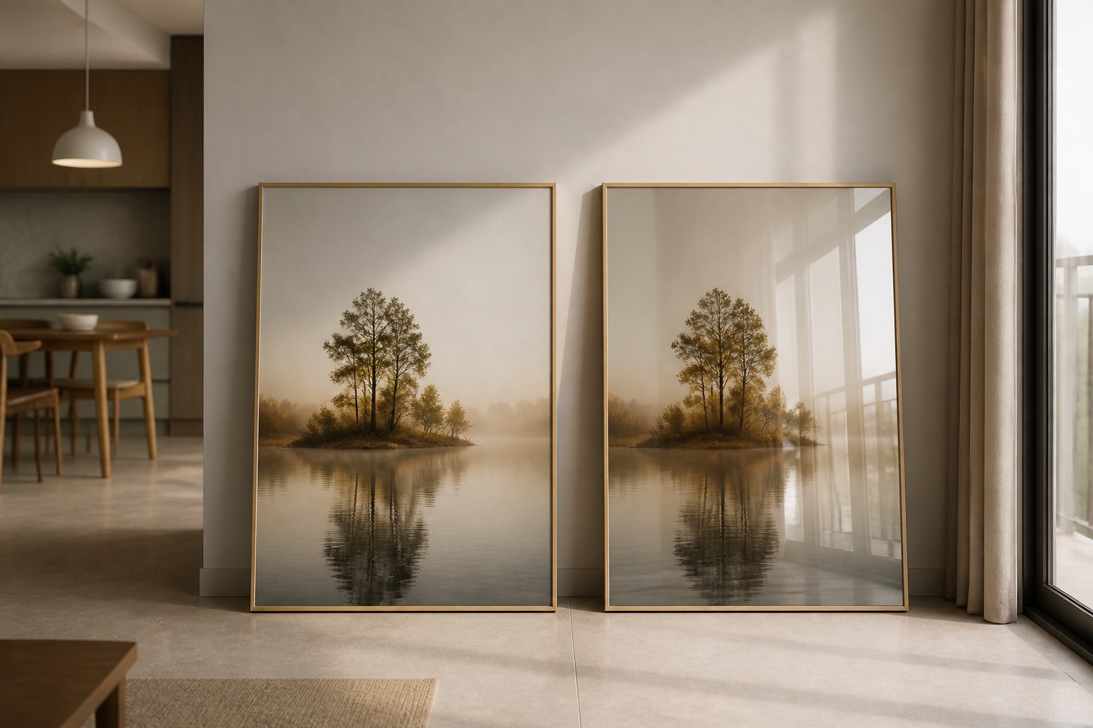
Which abstract colours work with small bedroom furniture?
Measure your existing furniture first. If your bed is light wood or white, cool-toned abstracts (dusty blue, pale green, soft grey) create visual harmony without competing. Dark wood or rattan beds pair better with warm neutrals or high-contrast black-and-white geometrics. For wardrobes or shelving in the same room, choose abstracts that sit between your furniture tone and wall colour—this bridges the visual gap and prevents the room from feeling segmented.
A simple decision framework:
- Light furniture + light walls → abstract with one pop colour (teal, burnt orange accent)
- Dark furniture + light walls → monochromatic or greyscale abstract
- Mixed wood tones → neutral beige, grey, or soft white abstract with minimal contrast
| Furniture Style | Recommended Abstract Colour | Why It Works |
|---|---|---|
| Scandinavian (light wood) | Soft blue, pale grey, cream | Echoes minimalist warmth |
| Industrial (metal/dark) | Black-white geometric, charcoal | Reinforces clean lines |
| Bohemian (mixed textures) | Warm taupe, terracotta accent | Softens eclectic energy |
| Contemporary (white/glass) | High-contrast or monochrome | Strengthens modern clarity |
What about humidity and colour fading in Vietnamese apartments?
Hanoi and Ho Chi Minh City humidity (60–85% year-round) affects how printed colours appear over time. Canvas absorbs moisture, which can dull pigments and cause mildew in poorly ventilated rooms. Glass-coated wall art resists humidity better—the tempered-glass finish seals the print, keeping colours stable and preventing colour shift. If your small bedroom has a window or sits near a bathroom, glass-coated abstracts in lighter colours will hold their tone longer than canvas. For canvas, we recommend placing pieces 15 cm from walls to allow air circulation. Fabric prints offer a middle ground—durable and breathable, though they need occasional dusting in humid climates.
Should I use a single large print or a 2-piece set in a small bedroom?
One large abstract print (80×100 cm or 100×120 cm) can dominate a small room—use it only if your wall is uncluttered and furniture is minimal. Most small bedrooms work better with 3-piece wall art sets or 2-piece sets (total height 60–80 cm, stacked vertically or arranged as a grid). Two smaller abstracts create visual rhythm without overwhelming the space; they also give you colour flexibility—pair a cool-toned piece with a warm accent, for balance.
For beds in alcoves or corner placements, centre your art 20–30 cm above the headboard at eye level (145–160 cm from the floor). A rolled canvas (shipped flat, unframed) fits through narrow doorways in older Hanoi apartments; stretched canvas requires more space during delivery.
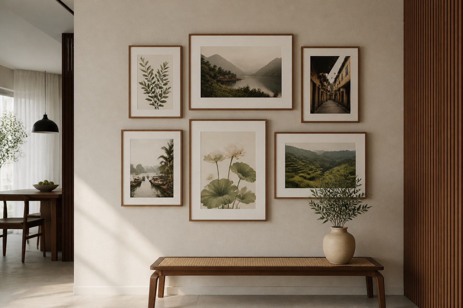
How do I choose between warm and cool abstract colours for mood?
Cool abstracts (blues, greens, purples, cool greys) promote calm and sleep—ideal for bedrooms. They feel spacious and reduce mental clutter, especially helpful in noisy urban settings. Warm abstracts (ochres, terracottas, warm creams) create intimacy and comfort but can feel confining in tight rooms. If you want warmth, use it as a secondary colour—pair a soft blue base with a rust or gold accent line. Many people also choose greyscale or monochrome abstracts to avoid colour-mood confusion; these work in any lighting and suit rooms with rotating seasonal decor.
What printing method holds colour best in humid conditions?
We use two main formats: canvas (cotton/polyester blend, ink-sealed with UV-protective varnish) and glass-coated prints (archival inks under tempered glass). Glass-coated wins for humid climates—the glass barrier prevents moisture penetration. Canvas is excellent for traditional aesthetic and cost-efficiency but needs 3–5 cm airflow behind it. Fabric prints (linen blend) fall between; they breathe well but are more susceptible to dust settling into texture. All use the same archival pigment inks, so colour vibrancy depends on format durability, not ink quality.
💬 WhatsApp/Zalo +84 775 017 977 for size and design advice
Sizing table for small bedrooms (height × width in cm, recommended placement)
| Room Wall Size | Recommended Print Size | Quantity | Notes |
|---|---|---|---|
| 2.5 m wide, 2.4 m tall | 80×100 or 60×80 | 1 | Centre above bed, 145 cm from floor |
| 2.5 m wide, 2.4 m tall | 50×50 (2-piece) | 2 | Stack or side-by-side grid, 160 cm centre |
| 2 m wide, 2.3 m tall | 40×60 or 50×70 | 1 | Fits above smaller furniture; 140 cm from floor |
| 1.8 m wide, 2.4 m tall | 50×50 or 60×60 | 2 | 2-piece set, vertical orientation |
What to check before you order abstract art for a small bedroom
- Wall orientation (north, south, east, west): determines whether cool or warm tones photograph well in your actual light.
- Existing colour scheme (walls, furniture, bedding): screenshot 2–3 reference photos and send them to us; we'll suggest matching abstracts.
- Humidity level: if your room has condensation on windows or a musty smell, choose glass-coated over canvas.
- Renting vs. owning: renters should ask about renter-friendly hanging (damage-free adhesive strips, no wall anchors) before ordering.
- Distance from bed: place art 20–30 cm above headboard; lying down, it should sit at a comfortable eye line, not feel like it's floating or pressing down.
- Delivery access: check doorway widths; rolled canvas fits tight spaces better than stretched.
Browse our bedroom collection for curated abstract designs sized for compact spaces, or contact us on +84 775 017 977 for a quote by size.
FAQ
What's the best abstract colour to make a small dark bedroom feel lighter?
Soft blues, pale greys, and warm creams reflect light and open the space visually. Avoid dark charcoals or deep purples—they'll increase the cave-like feeling. Glass-coated prints amplify reflection, so the colour impact is even stronger in low-light rooms.
Can I use a warm-toned abstract in a cool-toned small bedroom?
Yes, as an accent. Use it as a secondary colour in a multi-piece set (pair one warm with one cool) or as a 20–30% colour element in a predominantly cool abstract. This adds warmth without feeling cramped.
Will abstract art fade faster in humid Vietnamese apartments?
Canvas is prone to colour shift and mildew in humidity above 70%; glass-coated resists fading and mould because the glass seals the print. If humidity is a concern, choose glass-coated or ensure canvas has 5 cm airflow behind it. All our inks are archival-grade, so format matters more than pigment quality.
How large can I go with abstract art in a 2×2.4 m bedroom?
Maximum 80×100 cm single piece (or two 60×60 cm pieces in a grid). Anything larger will dominate and make the room feel smaller. Centre your piece 20–30 cm above furniture and check that you can step back 1.5 m to view it comfortably.
Should I choose monochrome or multi-colour abstract for a small bedroom?
Monochrome (greyscale, single-colour-on-white) feels calm and spacious; multi-colour abstracts add personality but can feel busier in tight rooms. If you choose multi-colour, limit it to 2–3 hues and ensure they tie back to your existing decor. Contact us to preview options by colour and room light.
Can I hang abstract art in a rented small bedroom without damaging walls?
Yes, using adhesive strips or damage-free picture hangers rated for your print weight. Confirm your print format (canvas = lighter; glass-coated = heavier) and room wall type (plasterboard vs. brick) before ordering. Contact us for hanging advice by material.
What's the difference between a 1:1 and 2:3 aspect ratio abstract for small bedrooms?
1:1 (square) is compact and modern; 2:3 (portrait) draws the eye upward in low-ceilinged rooms. For small bedrooms under 2.5 m wide, 2:3 or 1:3 (tall, narrow) works best—it doesn't eat horizontal space and feels elegant above beds or shelving.