
Warm Earth Tone Wall Abstract Art: Canvas vs Glass for Hanoi Homes
Warm earth tone wall abstract art combines ochre, terracotta, burnt sienna, and warm greys in non-representational designs—think organic shapes, layered textures, and colour gradients rather than recognizable subjects. Décor Vie delivers these as canvas prints (stretched or rolled), glass-coated prints (a gloss tempered-glass finish that resists Hanoi's humidity better), or glass-coated canvas hybrid pieces. Single prints range from small accent sizes (30×30 cm) to large statements (120×80 cm); 2–5-piece sets let you fill walls proportionally. Canvas suits rented apartments (removable adhesive mounting); glass-coated prints are easiest to clean in humid climates. Both ship within Vietnam; contact us on +84 775 017 977 for a quote by size. The key mistake: choosing art by colour alone without considering wall light, furniture scale, and room function—warm earth tones shift dramatically in yellow vs. north-facing light.
Why warm earth tones work in modern Hanoi apartments
Warm earths—ochre, burnt sienna, terracotta, warm taupe—don't compete with tropical light or city noise the way cool or primary colours do. They evoke natural materials (clay, wood, stone) and calm the nervous system, which matters in compact urban spaces. Abstract versions (no literal landscapes or objects) feel contemporary, not rustic, and pair easily with both minimalist and eclectic décor. In Hanoi's humid climate, earths also hide dust and water marks better than pastels or whites, keeping your wall looking fresh longer without constant cleaning.
💬 WhatsApp/Zalo +84 775 017 977 for size and design advice
Canvas print or glass-coated: which handles Hanoi humidity better?
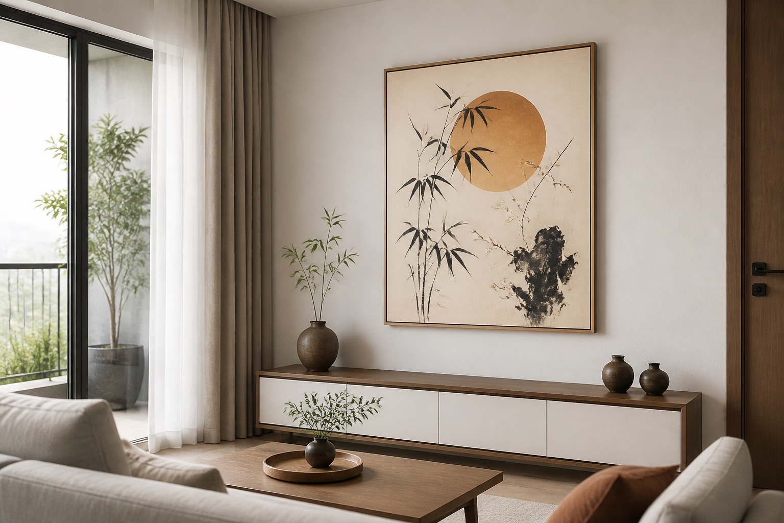
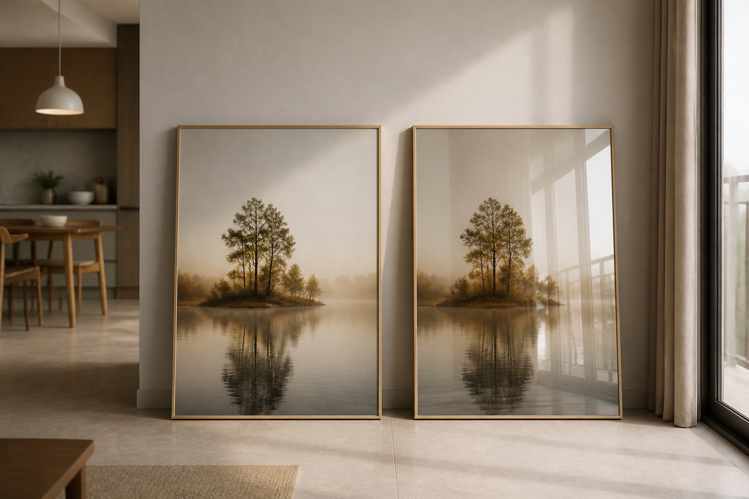
Canvas breathes and forgives moisture fluctuations; Hanoi apartments (especially older ones or during monsoon) often hit 70–85% relative humidity, and canvas won't warp or bubble. It has a tactile, matte finish that feels warm and approachable. Glass-coated prints (tempered glass bonded to the front of the artwork) are non-porous: moisture cannot penetrate, and the glossy finish is wipeable with a soft cloth—essential if you live near cooking areas, windows prone to condensation, or busy streets sending dust indoors. Glass-coated works best if you value durability and low maintenance; canvas if you rent and want flexibility. For glass-coated wall art in earth tones, the gloss also deepens colour saturation, making warm tones feel richer. Neither yellows or fades faster than the other if kept out of direct sunlight (which you should do anyway in Hanoi's heat).
What size abstract art should hang above your sofa or bed?
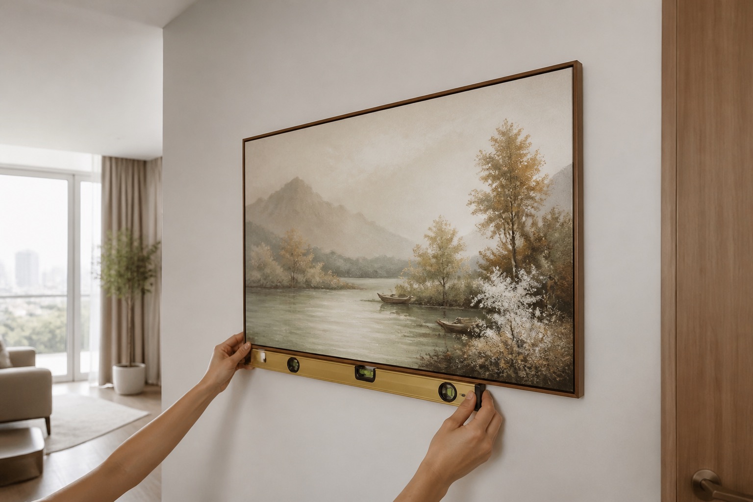
Measure the width of your sofa or headboard. Your art should be roughly two-thirds that width, centred horizontally. Mount the centre of the art 145–160 cm from the floor—this aligns with average eye level when standing or seated. Leave 20–30 cm between the top of your furniture and the bottom of the frame. For a standard 1.6 m sofa, a single 90–100 cm wide print works; for 1.2 m, go 70–80 cm. If your wall feels bare, consider a 3-piece wall art set in complementary earth tones—each piece smaller but visually linked by colour harmony. Measure twice before ordering; we can help you choose ratios (1:1 square, 1:2 horizontal, 1:3 panoramic, 2:3 portrait) to fit your space. Rented apartments? Use removable mounting; we include hanging hardware, and canvas or rolled prints are easier to pack when you move.
Choosing abstract designs that match your room's light and mood
North-facing rooms stay cool and need warmer earths to feel inviting; south-facing rooms stay warm and can handle cooler terracottas or dusty ochres without feeling heavy. Test your colour choice by holding a swatch against your wall at different times of day. Abstract art with gestural brushstrokes (swirls, drips, overlaps) feels dynamic and energetic; geometric shapes or minimalist washes feel calm and meditative. Warm earths pair best with natural or warm-white lighting (2700–3000 K bulbs); harsh cool LED can flatten the richness. If your living room wall art will hang in a bright entertainment zone, choose a design with tonal variation (light and dark ochres, not flat monochromes) so it holds visual weight. For bedroom wall art where you want relaxation, pick organic, flowing abstracts in soft terracotta and cream—avoid high-contrast designs that feel too stimulating before sleep.
| Setting | Best earth tones | Design style | Material |
|---|---|---|---|
| Living room, bright south wall | Dusty terracotta, warm brown | Gestural, layered | Glass-coated (easy clean, gloss adds depth) |
| Bedroom, north wall | Warm ochre, cream | Flowing, organic | Canvas (soft, matte, calm) |
| Small rented space | Burnt sienna, warm grey | Minimalist, geometric | Canvas (removable, portable) |
| Kitchen/dining, humid area | Warm taupe, rust | Textured abstract | Glass-coated (wipe-clean, durable) |
💬 WhatsApp/Zalo +84 775 017 977 for size and design advice
Common mistakes to avoid when buying warm earth tone abstract art
Mistake 1: Choosing colour online without seeing it in your room. Screens show colours differently than prints on your wall. Warm earths especially shift: ochre can look golden on one monitor, muddy on another. Ask for samples or close-up photos before ordering a large piece. Mistake 2: Hanging too high or too small. Art at ceiling height looks disconnected; art half the width of your sofa reads as an afterthought. Use the sizing framework above. Mistake 3: Ignoring humidity. Canvas in a kitchen above a stove or near a bathroom exhaust fan risks mould; glass-coated is safer there. Mistake 4: Matching art to accessories that fade. Cushions and throws fade with washing; buy art that works with your wall colour and furniture, not just this season's throw pillows. Mistake 5: Buying sets that don't suit your wall layout. A 5-piece set spread thin across a small wall looks chaotic; a single large print or 2-piece set often reads better. Sketch your wall with measurements before you order.
For abstract wall art across multiple rooms or a studio, we can coordinate colours and layouts to feel intentional, not random. Contact us to discuss your specific wall and light conditions.
What to check before you order
- Room light direction (north, south, east, west) and bulb colour temperature (colour code printed on bulb).
- Furniture width below the hanging point; measure in centimetres.
- Wall material (plaster, brick veneer, tile, wallpaper) and any moisture issues (cracks, water marks, peeling).
- Humidity level: is this room prone to steam (kitchen, bathroom) or outdoor dampness?
- Rented or owned: if rented, choose removable mounting and canvas or rolled format.
- Other art or décor on that wall already; ensure new piece doesn't clash or crowd.
Take a photo of your wall in daylight and share with us at +84 775 017 977; we'll suggest sizing and material in context.
🖼️ Browse Décor Vie wall art
Warm earth abstract art for hotels and projects
If you're designing a hotel, office, or Airbnb space with multiple rooms, warm earth tones create visual continuity without feeling corporate. Guest rooms, lobbies, and common areas all benefit from cohesive abstract art that calms without distraction. We work with commercial clients to coordinate sets across rooms and ensure durability (glass-coated is preferred for high-traffic areas). Email or WhatsApp your project brief and wall dimensions for a bespoke quote.
For more on colour harmony and room-by-room strategy, read our wall art journal articles on abstract art and earth tones.
FAQ
Can I hang warm earth tone abstract art in a rented apartment without damaging walls?
Yes. Use removable adhesive strips rated for your wall type (plaster, painted brick, tile), or ask-and-tell your landlord about renter-friendly adhesive. Canvas and rolled prints are lighter and more forgiving than heavy glass-coated pieces. We include clear hanging guidance with every order.
Will warm earth tones look dated or trendy?
Earth tones are historically grounded (clay, ochre pigments have been used for millennia) and cyclically fashionable, but as pure colours—not styles—they last. Avoid designs tied to specific trends (e.g., farmhouse maximalism) if longevity matters; choose timeless abstraction instead.
How do I clean warm earth tone canvas or glass-coated prints in Hanoi's dust and humidity?
Canvas: gently vacuum or wipe with a dry microfibre cloth every 2–3 weeks; never use water or solvent. Glass-coated: wipe with a soft, slightly damp microfibre cloth and dry immediately; the glass is non-porous, so moisture won't damage it. Both resist dust better if kept out of direct sunlight and high-humidity zones (kitchens, bathrooms).
What's the difference between warm earth tones and warm neutrals like beige or cream?
Warm neutrals (beige, cream, soft white) are lighter and less saturated; warm earth tones (ochre, terracotta, burnt sienna) carry pigment and history. Earth tones feel more grounded and sophisticated in abstract art; neutrals feel airy and minimal. For small or northern-lit rooms, start with earth tones; they add warmth without overwhelming.
Can warm earth abstract art work in a modern minimalist apartment?
Absolutely. Choose a single large canvas or a minimal 2-piece set in simple geometric or washed abstract designs. Earth tones are naturally understated; pair them with clean lines, negative space, and sparse furniture, and they strengthen the minimalist mood.