
Wall Art Theme Colors & Psychological Effect: How to Choose
Colour psychology in wall art works through direct neural response: warm tones (reds, oranges, yellows) stimulate energy and appetite; cool tones (blues, greens, purples) promote calm and focus. The effect depends on saturation, context (bedroom vs. living room), and your personal history. Décor Vie custom-printed canvas and glass-coated prints lock in colour fidelity through our production process—crucial in Hanoi's humidity, where fading or shifting happens fast on cheaper substrates. The key is matching the dominant wall colour and room function first, then choosing your art's palette to either harmonise (cohesion) or contrast (impact). Most renters and owners miss this step and end up with beautiful work that feels "off" in the space. We guide you through size, ratio, and colour coordination during consultation.
💬 WhatsApp/Zalo +84 775 017 977 for size and design advice
Why Does Wall Art Colour Matter More Than the Image Itself?
Your brain processes colour before subject. A blue landscape calms you; the same scene in red-orange energises you—the objects are identical, the mood completely different. Colour triggers memory, emotion, and physical response within milliseconds. In apartments across Hanoi and Ho Chi Minh City, we've observed that expats and families often choose art they love at first glance, then feel subtle resistance when living with it daily—usually because the colour palette conflicts with their room's light, wall tone, or how they use that space. The image quality matters; colour psychology matters more. This is why we always ask about your wall colour and room purpose before recommending a design.
Which Colours Suit Living Rooms, Bedrooms, and Work Spaces?
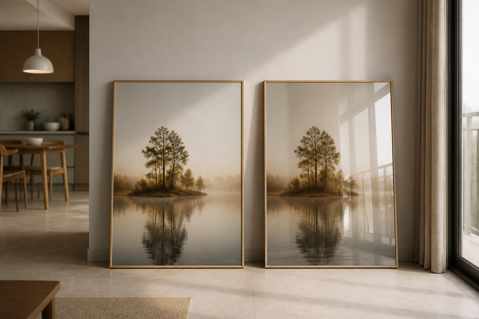
Living rooms benefit from warm-to-neutral palettes (burnt orange, terracotta, sage, warm grey) that encourage conversation and gathering. Bedrooms respond best to cool or muted tones (dusty blue, soft grey-green, lavender, cream) that lower heart rate and cortisol. Home offices work with blue-green or pale yellow—focus without fatigue. The science: warm colours raise energy and blood pressure slightly; cool colours lower them. Vietnamese design often draws on natural landscapes—lotus greens, rice-field golds, Ha Long limestone greys—which naturally align with these principles. When you're choosing wall art for your living room or bedroom, start by naming the room's purpose (relax, work, entertain) and your wall's current tone, then ask whether you want your art to reinforce that mood or gently shift it.
How Do Saturation and Intensity Change the Psychological Effect?
A muted blue-grey calms; a vibrant cobalt energises even in a bedroom. Saturation—how much pigment colour has—controls intensity. Highly saturated colours demand attention and provoke stronger emotion (excitement, passion, urgency); desaturated colours recede and soothe. This matters acutely in small spaces: a fully saturated 4-piece abstract set in primary colours can overwhelm a 15 m² bedroom; the same design desaturated feels spacious and restful. Our glass-coated prints and canvas formats both hold colour saturation consistently in tropical humidity—a critical difference from paper or fabric that fade or yellow. When humidity spikes (June–September in Hanoi), cheaper printing inks shift; ours stay true because we use colour-locked substrates. If you like bold colour, choose glass-coated; if you prefer understated tone, stretched canvas accepts subtle hues without reflective washout.
What's the Difference Between Colour Harmony and Colour Contrast in Art?
| Approach | Effect | Best For | Challenge |
|---|---|---|---|
| Monochromatic (one hue, varied tones) | Restful, unified, minimalist | Bedrooms; small spaces | Can feel monotonous if palette too narrow |
| Analogous (adjacent hues on colour wheel) | Harmonious, cohesive | Living rooms; offices | Requires precise saturation match to wall |
| Complementary (opposite hues) | Bold, high-impact, energetic | Feature walls; galleries | Easy to overwhelm; needs neutral wall to anchor |
| Triadic (three evenly spaced hues) | Vibrant, balanced, playful | Kids' spaces; creative studios | Demands confident colour sense; risky in rentals |
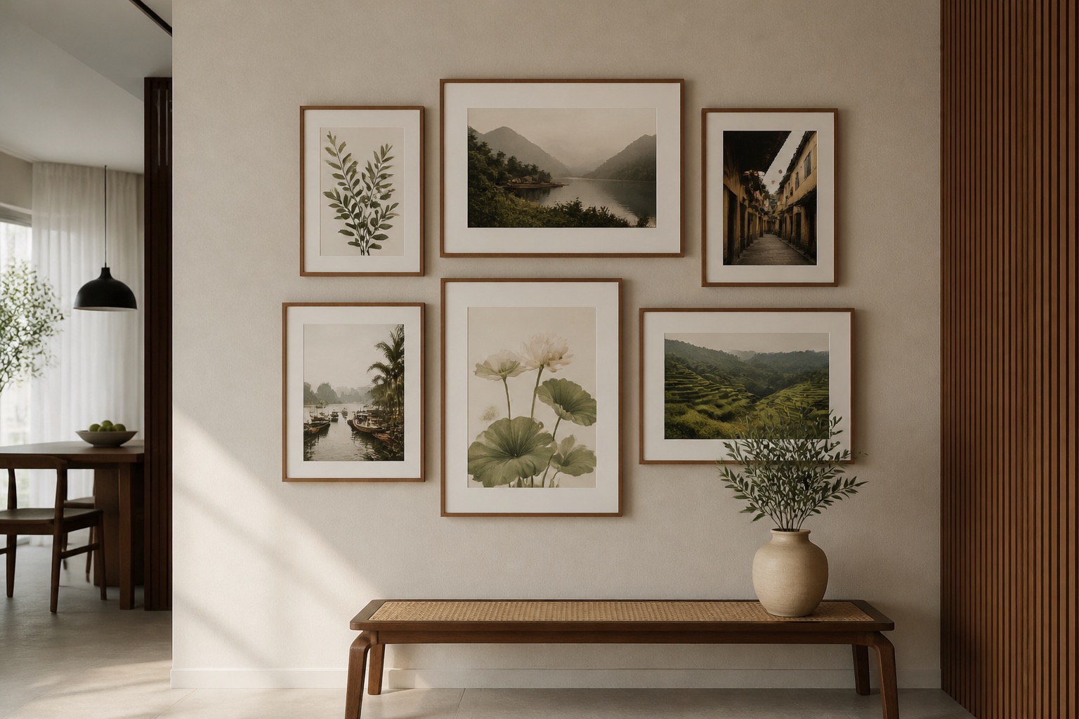
Harmony invites the eye to rest; contrast makes it work and play. Neither is "better"—it's about intention. A serene bedroom needs harmony (soft greens, creams, dusty blues together). An art-collector's living room might demand a bold complementary set—deep teal art on a warm sand wall. Vietnamese cultural designs (Hoi An lantern prints, rice-terrace scenes) often use analogous palettes naturally, which is why they settle so well into Hanoi homes. Test your choice by photographing the wall and art together in phone light and daylight—colours shift wildly under artificial bulbs, and this free test prevents buyer regret.
How Does Lighting Change Colour Psychology in Your Room?
The same art looks completely different at 8 a.m. north-facing light versus 6 p.m. warm tungsten. Blue appears colder and cleaner in daylight; under warm bulbs it can flatten or shift purple. Reds glow under warm light but can feel dull in cool daylight. This is why we always ask about your room's window orientation and bulb type before finalising a design. Northern and eastern light (cool, steady) suits cool-palette art; western and southern light (warm, strong) works with either palette but can saturate warm colours intensely. If your space has mixed lighting (daylight + evening lamps), choose a canvas or glass-coated print in mid-saturation colours that hold neutrality across both. Glass-coated prints have a slight reflective quality, which can either amplify colour vibrancy (advantage in dim rooms) or create glare (risk in bright, east-facing spaces). Canvas absorbs light softly, making colours feel more intimate—useful in living rooms where you want warmth without intensity.
What to Check Before You Buy Wall Art by Colour
- Photograph your wall in daylight and at the time of day you use the room most. Send this to us; we'll show you how the design will read.
- Name your room's dominant colour(s). (Wall paint, floor, main furniture.) This becomes your "anchor"; your art should harmonise or deliberately contrast, not accidentally clash.
- State the room's primary mood goal. (Calm, energetic, focus, creativity.) This narrows your palette to 2–3 safe choices.
- Check humidity in your space. Hanoi and Saigon both hit 85%+ June–September. Standard canvas can yellowing or ink shift; our glass-coated prints resist this. If you're in a rented apartment with no climate control, glass-coated is worth the choice.
- Ask yourself: do I want this colour in five years? Trendy colours (millennial pink, sage green explosions) age fast. Timeless palettes—soft blues, warm neutrals, natural greens—hold. Vietnamese classics (lotus cream, lantern gold, terracotta) are almost always safe.
💬 WhatsApp/Zalo +84 775 017 977 for size and design advice
How Vietnamese Design Palettes Use Colour Psychology Naturally
Vietnamese art draws from landscape and culture: rice-field golds and greens calm through natural association; Ha Long stone-greys and water-blues ground urban apartments; Hoi An lantern warm golds and reds invite gathering and joy. These aren't accidental—they're centuries of colour psychology baked into cultural practice. When you choose art inspired by Vietnamese themes, you're often choosing colours already optimised for human wellbeing. Expats who've lived in Vietnam 2+ years often report that returning to Western art palettes feels jarring; local palettes feel "right." This is partly nostalgia, partly genuine psychological fit—tropical light and humidity suit warm-to-neutral and cool-green tones more than the high-saturation primaries common in northern European art. If you're new to Hanoi or Ho Chi Minh City and searching for a cohesive home identity, exploring Vietnamese-inspired designs is both aesthetically sound and grounded in cultural psychology.
Practical Framework: Choosing Colour Step by Step
Step 1: Identify your room's function and current dominant colour. Example: "Master bedroom, pale grey walls, receive morning east light."
Step 2: Choose your mood goal from this list.
- Calm + retreat → cool or muted palette (blues, greens, soft purples)
- Energy + focus → warm or bright palette (yellows, oranges, corals)
- Balance + harmony → analogous palette (adjacent wheel hues)
- Impact + boldness → complementary palette (opposite wheel hues)
Step 3: Search Décor Vie collections by colour descriptor, not just subject. Our 3-piece sets, abstract art, and room-specific galleries let you filter by mood and palette.
Step 4: Request a mockup or photo consultation. Text or message our team a photo of your wall and bulb type; we'll show you the colour preview under your specific light.
Step 5: Choose substrate: canvas or glass-coated? Canvas for soft, intimate colour; glass-coated for crisp, vivid, humidity-resistant colour. Both lock in fidelity far better than paper or unframed prints in tropical climates.
Step 6: Order, hang, live for 30 days, adjust if needed. We offer a 30-day smile guarantee—if the colour doesn't settle, contact us to discuss options.
🖼️ Browse Décor Vie wall art
FAQ
Does colour psychology work the same for everyone?
No. Personal and cultural history shape response—a colour that calms one person may trigger another. Blue calms most Western audiences; it can feel cold to others. We always ask about your personal colour preferences and associations, not just theory.
Can I use a highly saturated colour in a small bedroom without it feeling chaotic?
Yes, if you use a single saturated accent colour and keep the rest of the palette neutral. A vivid teal 1:1 print on soft grey walls works; a 4-piece set with four different bright hues often overwhelms. Test in low saturation first.
What colour should I choose if my wall is already a strong colour?
Either harmonise (choose analogous art tones) or go neutral/muted (let the wall be the colour statement). Avoid a second competing strong colour unless you're confident in complementary contrast design.
How does humidity affect colour fidelity more than other factors?
In tropical climates, standard inks oxidise and yellowing occurs within 18–24 months on unprotected paper or low-quality canvas. Our inks and substrates are rated for 85% humidity without colour shift. Glass-coated adds another layer of protection through the tempered finish.
Can I use the same colour palette in multiple rooms?
Yes—it creates flow and cohesion. But vary the saturation and intensity between high-energy and low-energy spaces so each room keeps its psychological function. For example, soft sage in the bedroom, richer sage in the living room.
What if I live in a rented apartment and can't paint the walls?
Choose art in colours that complement the wall without matching it exactly. Neutrals (grey, cream, soft white) and cool tones work over most rented beige and white. We can advise on colours that feel intentional in rental spaces.
Does the size of the art change the colour's psychological impact?
Significantly. A small, vibrant red print feels playful; a large red feature wall feels intense or aggressive. Larger art intensifies colour psychology; smaller art softens it. This is why we ask about your wall space and mood when recommending dimensions.