
Japanese Kitchen Art: Auspicious Designs for Hanoi Homes
Japanese auspicious kitchen art works in two ways: it adds focused visual calm to a functional space, and it reflects intention (cranes for longevity, koi for resilience, Mount Fuji for stability). At Décor Vie, we offer canvas prints and glass-coated prints in sizes scaled to typical Vietnamese apartment kitchens (walls 2–4 m wide); you pick single pieces, 2–5-piece sets, and aspect ratios (1:1 square, 1:2 horizontal, 2:3). Japanese art thrives in kitchens because it's minimalist—it doesn't compete with appliances or clutter. Glass-coated prints resist humidity and grease splatter better than canvas; canvas feels warmer and costs less per piece. Choose based on your wall finish (matte or tile), humidity exposure, and whether you want reflections. Contact us on +84 775 017 977 for a quote by size and style. 💬 WhatsApp/Zalo +84 775 017 977 for size and design advice
Why Japanese Motifs Belong in Kitchens
Japanese design is built on restraint—negative space, single-line brushwork, symbolic animals. A kitchen is where restraint matters: too much visual noise stresses you while cooking. Auspicious motifs (cranes for peaceful aging, koi for determination, bamboo for flexibility) add meaning without clutter. The philosophy translates directly to practical living. Studies on workspace colour psychology suggest calm, nature-based imagery reduces cortisol; Japanese art achieves this through simplicity, not saturation. For expats or property owners in Vietnam, these prints also bridge cultural respect and personal style—a conversation piece that shows you've integrated, not imposed.
Canvas vs. Glass-Coated: Which Handles Hanoi's Kitchen Climate?
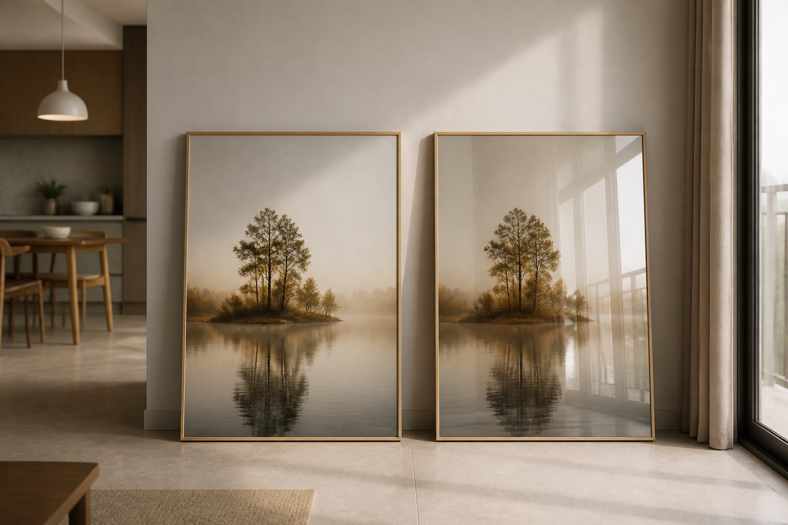
Hanoi kitchens face heat from cooking, steam, and humidity that peaks in summer. Here's the practical difference:
| Feature | Canvas Print | Glass-Coated Print |
|---|---|---|
| Humidity resistance | Moderate (sealed edge, backing board) | Excellent (tempered glass, sealed) |
| Grease splatter cleanup | Brush gently with dry cloth | Wipe with damp cloth, no damage |
| Reflections / gloss | Matte finish, no glare | Gloss or satin, may reflect overhead lights |
| Warmth / feel | Cloth texture, traditional | Smooth, modern, gallery-like |
| Lifespan in humid kitchens | 5–10 years with care | 10+ years, minimal fading |
| Cost (per square meter) | Lower | Higher |
What to choose: If your kitchen has an island or open layout where you face the wall while cooking, canvas creates intimate calm. If your wall gets direct afternoon sun or steam from a stove nearby, glass-coated is safer. Many households order both: a 1–2 piece canvas set for the dining side, a glass-coated print above the counter where splashing happens.
Best Sizes and Placement for Kitchen Walls
Kitchen walls look right when art covers about two-thirds the width of the furniture beneath it—typically a counter, stove, or dining table. Measure first:
- Kitchen counter width 1.5 m: 1-piece horizontal canvas or glass-coated, ratio 1:2 (90 cm × 45 cm). Centre it 20 cm above the backsplash or 30 cm above the counter edge.
- Dining table width 1.2 m: 2–3-piece set, each piece ~40 cm wide. Hang as a horizontal line 145–160 cm from the floor (eye level while seated).
- Accent wall 2–3 m: Single large-format print (120 cm × 80 cm, ratio 2:3) or a 4–5-piece grid. Mount the grid's centre at 155 cm from the floor.
Common mistake: Hanging too high (above 170 cm) makes the art feel distant and unsettles the room's proportions. Too low (below 140 cm) crowds the counter or creates a collision hazard. Measure your furniture, then place art so it anchors that zone—not floating between zones.
Auspicious Designs That Work in Small Spaces
Japanese auspicious imagery scales beautifully because the symbols are graphic, not photographic. Consider these themes:
- Single-crane linework: Minimalist, works in 1:1 square (40 × 40 cm) or as a vertical 2–3 piece set. Cranes symbolize longevity and are ideal above a tea corner.
- Koi field (blue-water series): Horizontal ratio 1:2 or 1:3, sits well above a full counter. Koi moving forward suggests progress; perfect if your kitchen faces the main entrance.
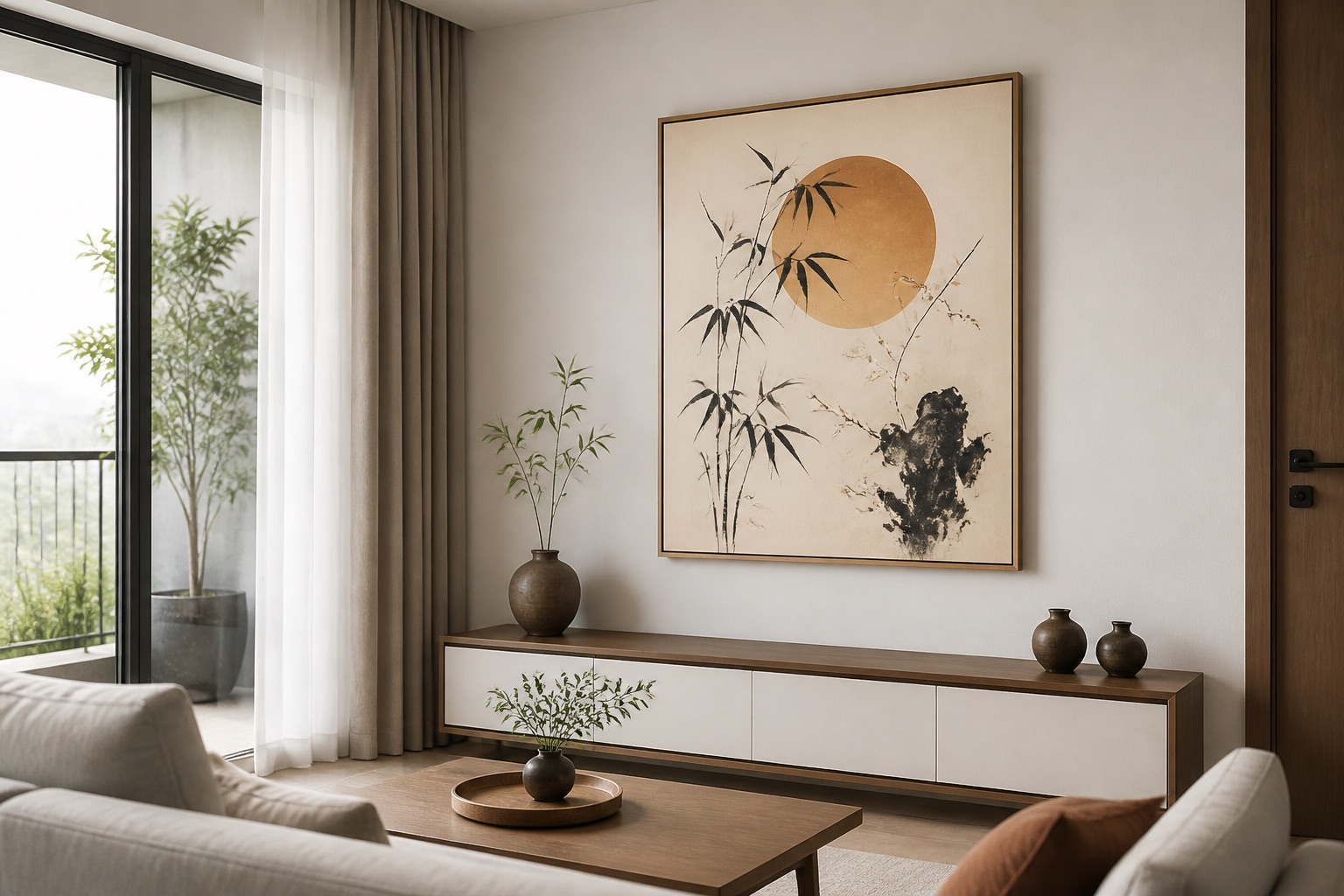
- Bamboo grove or Mount Fuji: Calm, grounding. Works as a 2-piece horizontal set (90 × 45 cm total). Bamboo invokes flexibility; Fuji invokes stability.
- Cherry blossom branches: 1:3 horizontal or 2–3-piece triptych. Soft, ephemeral—a good choice if your kitchen feels too hard-edged.
Explore abstract and minimalist collections for designs that strip Japanese symbols to their essence. These suit modern kitchens and rented apartments (hanging is non-invasive).
Hanging in Rented Apartments: No Landlord Drama
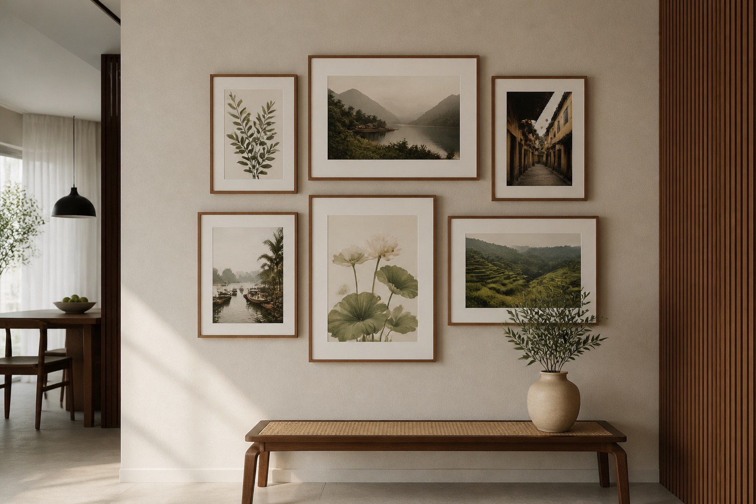
Most expats and international property owners in Vietnam rent or lease with restrictions on wall damage. Here's how to hang auspicious Japanese art risk-free:
- Use adhesive strips or non-marking hooks (3M Command or local equivalent) instead of nails. Canvas and glass-coated prints are lightweight; two strips hold up to 2 kg per piece.
- Avoid high-traffic walls where someone might brush it; kitchens near doorways are okay if you keep 30 cm clearance.
- Mount on tile or already-painted walls to avoid damaging the base plaster. Avoid fresh paint (wait 2 weeks before hanging).
- Paper-tape your holes before painting the wall back when you leave—no security deposit loss.
- Store the original backing board. If you move, roll canvas prints gently or leave them stretched; glass-coated prints pack flat with cardboard spacers.
For 3-piece or larger sets, use a spirit level and mark all holes with a pencil first. Measure twice, hang once.
💬 WhatsApp/Zalo +84 775 017 977 for size and design advice
Colour and Contrast: What Pairs With Your Kitchen Palette
Japanese auspicious art typically uses indigo, black, white, gold accents, soft greens, or cool greys. Match these to your kitchen's dominant colour:
- White or stainless-steel appliances: Indigo-based prints pop. Black linework on cream background feels editorial.
- Warm wood cabinets: Soft greens, pale blues, or gold-accented pieces complement without clashing.
- Tiles (blue, terracotta, grey): Neutral Japanese prints (white cranes on grey, koi in grey tones) harmonize; bold indigo creates rhythm.
- Small or dark kitchen: Cream-background prints with minimal lines brighten the zone without adding visual weight.
Avoid prints with busy gradients or multiple bright colours if your kitchen is already patterned (tiled backsplash, patterned tiles). Simplicity is the auspicious rule.
What to Check Before You Order
- Measure your wall and furniture. Sketch the space, note window placement, and confirm wall finish (painted, tiled, or wallpapered).
- Decide canvas or glass-coated based on humidity exposure (above stove = glass-coated preferred; dining area = canvas fine).
- Choose a single auspicious theme (not mixing cranes with koi). Coherence matters in tight spaces.
- Confirm size in centimetres via email or WhatsApp—aspect ratio and dimensions must match your wall. Send a photo if unsure.
- Ask about delivery and unpacking: Canvas arrives on a tube or stretched on bars; glass-coated ships flat with padding. Confirm it arrives ready to hang.
- Review the hanging hardware. Our canvas comes with pre-installed D-rings; glass-coated comes with wall anchors. Confirm you have the right wall type (plaster, tile, stud).
FAQ
What does "auspicious" mean in Japanese kitchen design?
Auspicious refers to symbols believed to invite positive qualities—cranes for longevity, koi for resilience, bamboo for flexibility, Mount Fuji for stability. In kitchens, these create an intentional, calm space without superstition; they're a visual philosophy, not a promise.
Will a canvas print fade in my Hanoi kitchen?
Canvas printed with UV-resistant inks fades slowly over 5–10 years if exposed to direct afternoon sun daily. Glass-coated prints resist fading better (10+ years). Position away from south-facing windows or add a sheer curtain to extend life.
Can I hang a glass-coated print above my stove?
Yes, if the print is at least 20 cm above the backsplash and your stove doesn't smoke excessively. Wipe the glass monthly with a damp microfibre cloth. Avoid hanging directly in steam plumes; side placement is safer.
How do I choose between a single large print and a multi-piece set?
Single large prints (120 × 80 cm) work for walls over 2 m wide and create impact. Multi-piece sets (2–5 pieces) suit smaller kitchens, rented apartments, and flexible arrangements—you can rearrange them later. Sets cost less per square centimetre.
Is Japanese kitchen art renter-friendly?
Yes. Use adhesive strips (not nails), avoid high-traffic doorway walls, and store the backing board. Canvas and glass-coated prints pack easily. You can remove them without wall damage when you move.
What's the difference between a rolled and stretched canvas?
Stretched canvas is pre-mounted on wooden bars and ready to hang (adds 5 cm depth to the room). Rolled canvas arrives flat and you frame it yourself or have a local framer stretch it (saves delivery space, adds labour). Both are durable; choose based on your DIY comfort and timeline.
Can auspicious Japanese art work in a modern minimalist kitchen?
Absolutely. Japanese minimalism is the foundation of modern design—single-line cranes, negative space, restrained colour. These prints naturally enhance clean kitchens with appliances and open shelving; they won't clash.
How much space do I need between multiple prints?
For a 2–3 piece set, space pieces 10–15 cm apart vertically or horizontally. For a grid (4–5 pieces), use a chalk line to mark the layout before hanging. Consistent spacing looks intentional and professional.