
How to Style 5 Canvas Prints Together: Layout, Size & Colour
Five-print arrangements demand a clear layout rule: either mirror-symmetry (two on each side of a central piece) or asymmetric rhythm (staggered heights, mixed sizes). Start by measuring your wall width and choosing a focal point—usually above a sofa, bed or console. Décor Vie canvas prints come stretched or rolled; stretched canvases arrive ready to hang. Size each print so the widest piece is roughly two-thirds your wall or furniture width, then cluster the other four around it, leaving 10–15 cm between frames. Gaps too tight feel cramped; gaps too wide break the visual connection. Test spacing with kraft paper cutouts before drilling, especially in rental apartments where mistakes cost deposits. Choose a unifying element—shared colour palette, theme (Vietnamese landscapes, abstract geometry) or frame finish—so five independent pieces read as one intentional composition.
Styling five canvas prints together is one of the most rewarding—and most daunting—wall art projects in an apartment. The good news: five pieces give you enough visual mass to create real impact. The challenge: without a plan, they scatter across the wall like unrelated thoughts. We've guided hundreds of expats and foreign residents through this decision in Hanoi and Ho Chi Minh City, and the patterns are clear. Here's how to do it right.
Why do layouts matter more than individual print choice?
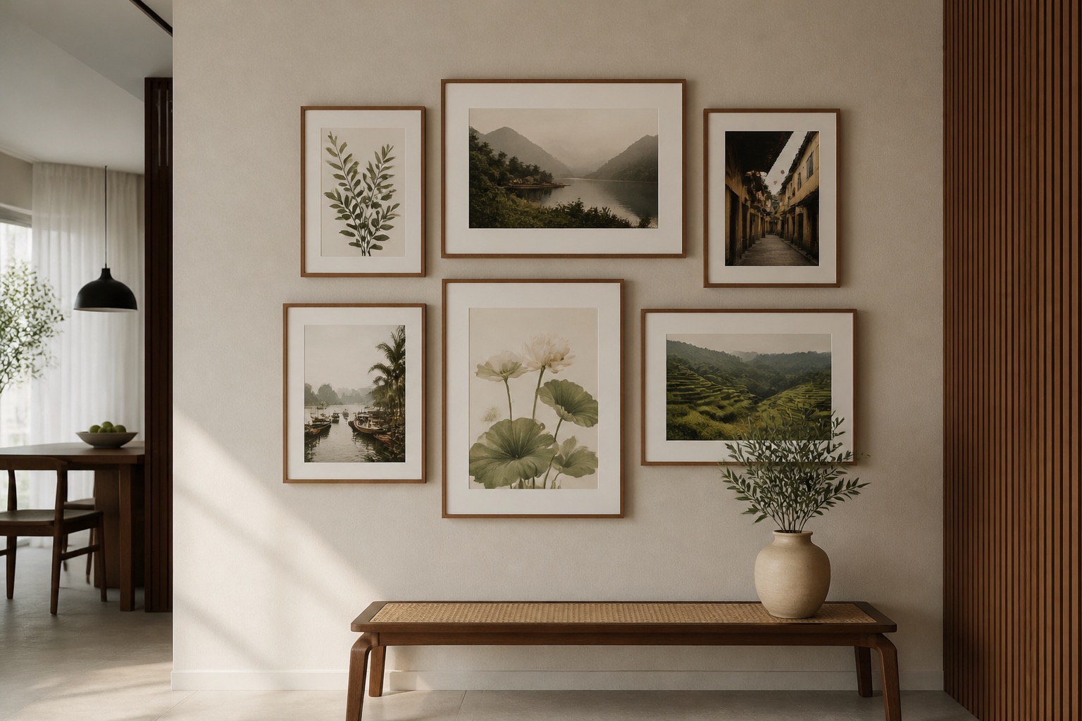
Five prints only work as a set if they share spatial logic. A beautiful image on its own fails if its neighbour breaks the visual rhythm. Layout is your grammar; without it, even stunning images become noise. The three most reliable arrangements are: symmetrical pair-and-centre (two prints left of centre, one in the middle, two right), asymmetrical cascade (descending heights, ragged edges, strong directional flow), and grid-based clustering (3-piece base + 2 floating accents above or beside). Each suits different wall shapes and room functions. Symmetry feels formal, calming—ideal for bedrooms and living rooms with centered furniture. Asymmetry feels dynamic, modern—better for smaller walls or accent niches. Grid clustering works for awkwardly angled walls or above kitchen islands. Test your chosen layout on paper before you commit.
💬 WhatsApp/Zalo +84 775 017 977 for size and design advice
What sizes should your five prints actually be?
Print size depends on wall width, not how much you like a design. The rule: your widest piece should be 50–70% of the wall or furniture width below it. For a 2-metre sofa, that means your largest canvas is roughly 100–130 cm wide. If you're using five pieces, don't make all five the same size; distribute them in a visual hierarchy. One strong anchor (the largest, most saturated colour, highest contrast) holds attention. Two medium pieces flank or echo it. Two smaller pieces punctuate the composition or fill negative space. When prints in a 5-piece set scale from, say, 40 cm to 100 cm width, the smaller ones read as intentional breathing room rather than afterthoughts. Measure your wall, sketch the arrangement to scale on paper, then contact us for size options by orientation and ratio.
| Scenario | Largest Print Width | Medium Prints | Smallest Prints | Why It Works |
|---|---|---|---|---|
| 1.8–2.2 m sofa, living room | 100–120 cm | 60–80 cm (×2) | 40–50 cm (×2) | Clear hierarchy, balanced visual weight |
| Bed wall, bedroom | 80–100 cm | 50–70 cm (×2) | 35–45 cm (×2) | Intimate scale, doesn't overwhelm sleep zone |
| Kitchen pass or accent niche | 60–80 cm | 40–60 cm (×2) | 30–40 cm (×2) | Fits compact walls, maintains readability |
| Entrance hallway, 2.4–3 m wall | 120–150 cm | 70–90 cm (×2) | 50–60 cm (×2) | High impact on arrival, sets apartment tone |
How do you match colours across five different pieces?
Colour unity is what turns five separate canvases into one composition. The strongest approach: choose a 2–3 colour dominant palette and ensure each print echoes at least two of those colours. For example, if your palette is navy, cream and terracotta, one print might be navy-heavy, another cream-dominant, and a third terracotta-accented—but all three share the same underlying trio. Alternatively, use a monochrome strategy: greyscale images, or five tones of the same hue. A third option, saturation bridging, works well: one vibrant focal print (high chroma) supported by four muted, desaturated companions. This keeps the eye from fragmenting. Vietnamese motifs—lotus, Hoi An lanterns, rice terraces—naturally sit within earth and green tones, making them easier to coordinate than abstract shapes. When in doubt, pair vibrant focal pieces with neutral (black, white, grey, beige) supporting prints; it never fails.
Should you go symmetrical or asymmetrical?
Symmetry conveys order and calm; asymmetry suggests movement and contemporary style. Neither is "better"—it's about your space and intention.
Symmetrical (2-1-2 or mirrored pairs):
- Strongest statement on walls above furniture (sofa, bed, console)
- Requires prints to actually mirror or at least share visual weight
- Easier to execute; mistakes are obvious, so they're also easier to avoid
- Best for formal living rooms, master bedrooms, executive home offices
Asymmetrical (staggered, cascade, or weighted off-centre):
- Works beautifully on solo walls without furniture anchors (hallways, landings)
- Demands confident spacing and size variation—harder to get right
- Feels contemporary, creative; more forgiving of "imperfect" image combos
- Suits modern apartments, creative studios, eclectic collectors
A practical hybrid: use a 3-piece set as your anchor (symmetrical core), then add two single prints asymmetrically above or beside. This gives you structure plus flexibility.
What layout mistakes do most people make?
Gap widths are inconsistent. Measure the spacing between all pairs; aim for uniformity (10–15 cm between all frames) or intentional progression (10 cm top-left, 15 cm top-right). Haphazard gaps feel accidental.
Vertical centring is ignored. The visual centre of a wall is roughly 145–160 cm from the floor. Hang your largest print so its midpoint sits near this height. Smaller pieces radiate outward and down from there. Too-low or too-high compositions feel unmoored.
Prints are too small or too large for the wall. Avoid the "postage-stamp" effect (five tiny prints on a vast wall) or the "wallpaper overload" (five enormous prints crushing a small space). The largest print should occupy roughly 15–25% of wall area.
Colour contrast is too weak. Five similar-toned prints blur into one muddy mass. At least one should pop with contrast—darker or more saturated than the rest. It's your focal point.
Hardware and frame quality don't match. Mixing cheap wire on one print and premium brackets on another reads as disjointed. If prints vary in weight and size, ensure hanging systems are proportionate and secure.
Which product types work best for 5-print sets?
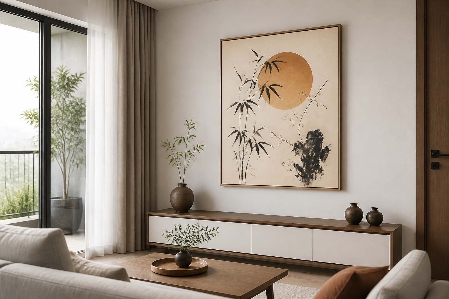
Décor Vie offers canvas prints in stretched or rolled form. Stretched canvases arrive on wooden stretcher bars, ready to hang immediately—no framing step, no additional expense. Rolled canvases ship flat and require your own frame or stretching; they're lighter, cheaper to ship, and suit customers who already have frames or want custom framing later. For five-print arrangements, stretched is simpler: you unbox, measure, mark, drill, hang. Rolled is flexible: you can order five pieces, frame three, roll two, and decide later.
For Hanoi and Ho Chi Minh City apartments with seasonal humidity (60–80% year-round), canvas and glass-coated prints both perform well if hung away from air-conditioner vents and direct sunlight. Canvas is forgiving, breathable, and matte (no glare). Glass-coated (also called crystal prints) is wipeable, glossy, and more resistant to dust—ideal if you're styling a living room or bedroom you plan to keep pristine. Five matching canvases in one medium create visual coherence; mixing canvas and glass-coated across a five-piece set can work if the colour and subject matter are strong enough to override the texture difference, but we recommend keeping the medium consistent for a professional finish.
How do you hang 5 prints securely in a rental apartment?
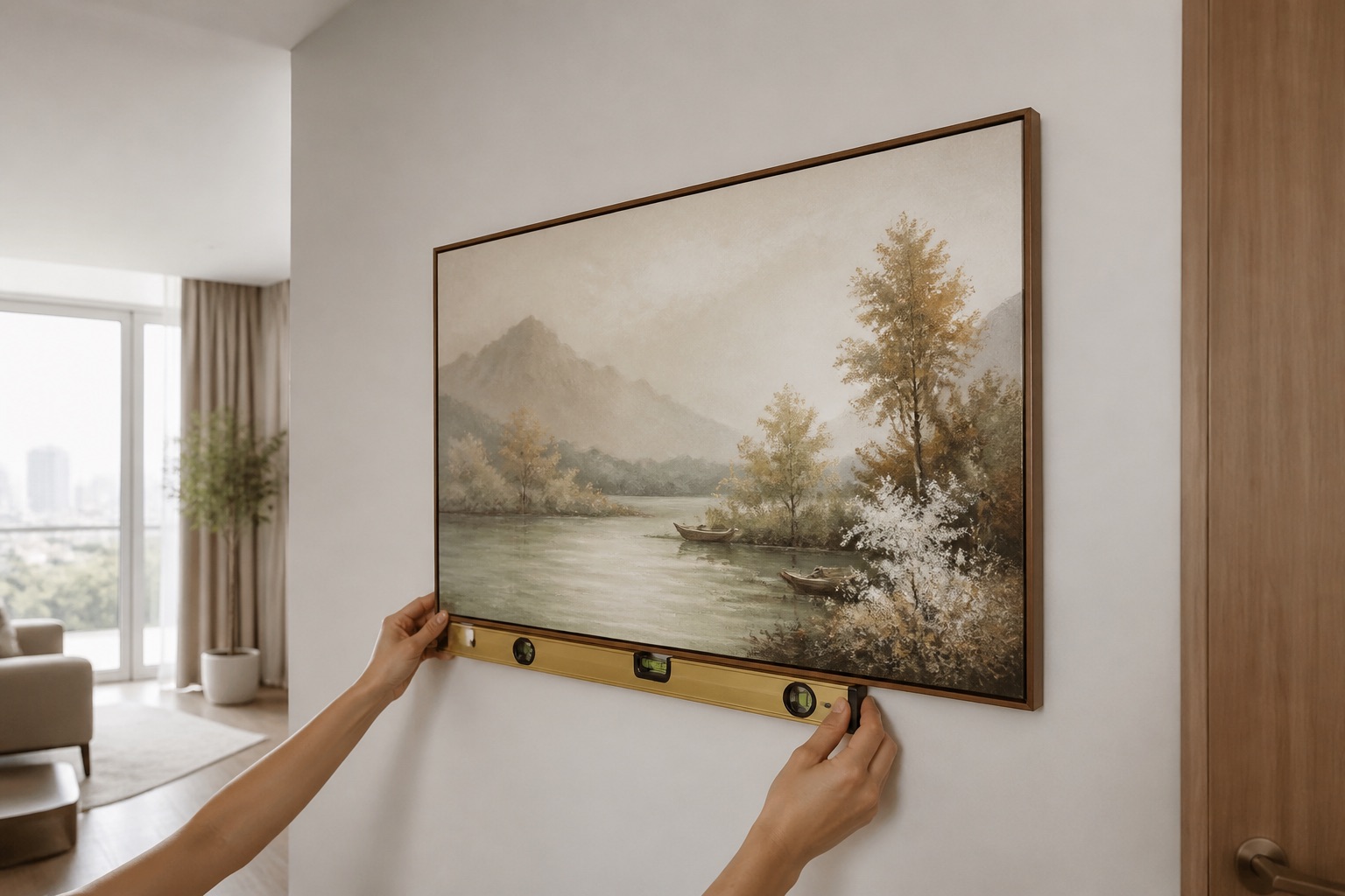
Rental apartments in Vietnam often have stringent deposit rules. Use non-permanent hanging methods: picture hooks rated for the total weight of all five prints (spread across adequate anchor points), or adhesive picture rails if your landlord permits. Never drill into tile or decorative panels—use the wall behind. Mark all five positions on kraft paper, tape the template to the wall, then drill through the paper to prevent slipping. Use a level for the first (usually largest) print, then position others relative to it. If you hang asymmetrically, the visual eye will forgive a 1–2 cm error; symmetrical setups demand precision (a 1 cm error is obvious). Always photograph your marked positions before drilling; if you need to rehang, you have a record. When you move out, fill nail holes with white filler and sand flush—your deposit stays intact.
💬 WhatsApp/Zalo +84 775 017 977 for size and design advice
What to check before you buy
- Wall dimensions: Measure width, height, and distance from floor to furniture (sofa, bed) below the wall. This determines maximum print sizes.
- Lighting: Does the wall catch morning sun (colour fades over years), or is it dim? Matte canvas works in all light; glass-coated prints may need gloss-matte balancing to avoid reflection issues.
- Existing décor: Note dominant colours in furniture, curtains, rugs. Your five prints should echo, contrast, or neutralize them—not clash.
- Hanging points: Check if wall is drywall, concrete, or tile. Drywall accepts standard picture hooks; concrete and tile require different anchors.
- Layout proof: Sketch your intended arrangement to scale on paper. Adjust sizes and gaps before contacting us for a quote.
Pages from our team you may need
FAQ
Can I mix portrait and landscape orientations in a 5-print set?
Yes—it adds visual rhythm. Use an odd number of one orientation (3 landscape, 2 portrait) so the eye finds balance. Sketch your layout first to ensure the composition reads as intentional, not random.
What's the ideal spacing between five prints?
10–15 cm (measured frame edge to frame edge) is the professional standard. Smaller gaps (5–8 cm) feel tight and formal; larger gaps (20+ cm) risk visual disconnection. Use a measuring tape and painter's tape to test before drilling.
Should all five prints be the same ratio (1:1 square, 2:3 portrait, 1:2 wide)?
Not necessarily. Mixing ratios—say, three 2:3 prints with two 1:1 squares—creates dynamic tension. The key: ensure the overall silhouette of the five-print group reads as cohesive (e.g., an asymmetric cascade or balanced cluster), not chaotic.
Do Vietnamese-themed prints work in modern minimalist apartments?
Absolutely. Vietnamese motifs like lotus or Ha Long Bay landscapes read as either cultural décor or abstract nature depending on the colour palette and print style. Desaturated or monochrome Vietnamese images suit minimalism perfectly; saturated, traditional styles feel more eclectic.
How much does a 5-print canvas set cost?
Pricing varies by size, medium (stretched/rolled), and subject matter. Contact us on +84 775 017 977 for a quote tailored to your wall dimensions and design preferences.