
How to Coordinate Wood Element Paintings with Furniture
To coordinate wood element paintings with furniture, match the painting's undertone to your timber—warm golden oak needs amber-toned art; cool walnut or ash suits cooler greys and silvers; dark mahogany pairs with deep earth pigments or black-line work. Décor Vie prints these designs on canvas or glass-coated surfaces; choose size so the art spans roughly two-thirds the width of the furniture beneath it, hung 20–30 cm above a sofa or console. Place the canvas so daylight and room lamps light it evenly—gloss finishes reflect warmth differently than matte. Avoid art that fights your furniture's wood grain direction; horizontal timber calls for horizontal compositions. Humidity in Hanoi or Ho Chi Minh City apartments favours glass-coated prints (easier to wipe, no moisture absorption) over canvas alone if the wall faces a water source.
Wood-toned furniture sets the room's thermal mood. If you live in a Vietnamese apartment or house with significant timber—flooring, built-in shelving, bed frames—the wall art you hang above or beside it either harmonises or jars. This guide breaks down the colour logic, sizing rules, placement mistakes, and product choices Décor Vie offers to get it right.
What undertone does your wood furniture actually have?
Wood isn't one colour. Hold a sample of your furniture against daylight, then lamplight. Does it lean warm (honey, amber, terracotta undertones, common in teak and oak)? Cool (grey, ash, silver streaks, typical of walnut or reclaimed pine)? Deep (chocolate, burgundy, ebony, seen in dark mahogany or blackwood)? Your answer determines whether warm-palette art or cool-palette art will sit comfortably beside it. Mismatch creates visual tension—warm art next to cool furniture makes the room feel disjointed. Décor Vie's design ranges include warm earth tones, cool silvers and greys, and rich jewel pigments; the first step is naming your furniture's undertone honestly.
💬 WhatsApp/Zalo +84 775 017 977 for size and design advice
How large should the painting be relative to furniture?
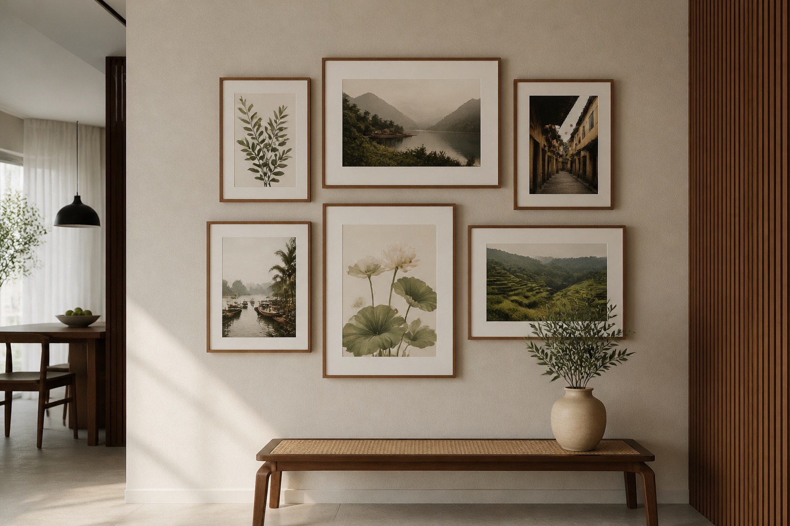
A common error: hanging art that's too small or too large for the furniture beneath. The rule is simple: aim for art width that covers roughly 60–75% of the furniture width below it—a sofa 2.4 m wide suits art 1.5–1.8 m wide; a console 1.2 m wide pairs with art 0.8–0.9 m wide. This creates visual balance without overwhelming the room or leaving the furniture looking bare. For most apartments in Hanoi or Ho Chi Minh City, a living room wall art canvas or 3–4-piece set (each piece 0.4–0.6 m) works across a standard sofa. Measure your furniture first; contact us for exact sizing once you know the width and wall space.
Should you choose canvas or glass-coated prints for wood-furniture rooms?
Humid climates—Hanoi's 70–90% humidity, Saigon's salt air—stress canvas slightly over time. Canvas absorbs moisture and can warp or develop mildew in poorly ventilated rooms; glass-coated prints (also called crystal or tempered-glass finish) repel moisture entirely and wipe clean with a soft cloth. Both types are stretch-printed at Décor Vie; the difference is finish. If your wood furniture sits against an exterior wall or near a window, glass-coated is safer. If your room is well-air-conditioned and interior-facing, stretched canvas offers a classic, matte look that complements warm wood beautifully. Canvas prints suit cool, dry rooms; glass-coated suits humidity-prone spaces. Neither will fade faster than the other under normal household light.
| Finish Type | Humidity Resistance | Warmth of Appearance | Cleaning | Best For |
|---|---|---|---|---|
| Stretched Canvas | Moderate (matte finish absorbs moisture) | Warm, soft, traditional | Dust gently with brush | Cooled, interior-facing rooms |
| Glass-Coated (Crystal Print) | Excellent (completely sealed, waterproof) | Slight gloss, vibrant colour depth | Wipe with microfibre cloth | Exterior walls, kitchens, humid zones |
| Glass-Coated Canvas | High (hybrid protection) | Warm matte with subtle sheen | Microfibre cloth, mild soap water | Balanced choice for Hanoi/HCMC |
Where should you hang the art relative to your sofa or bed?
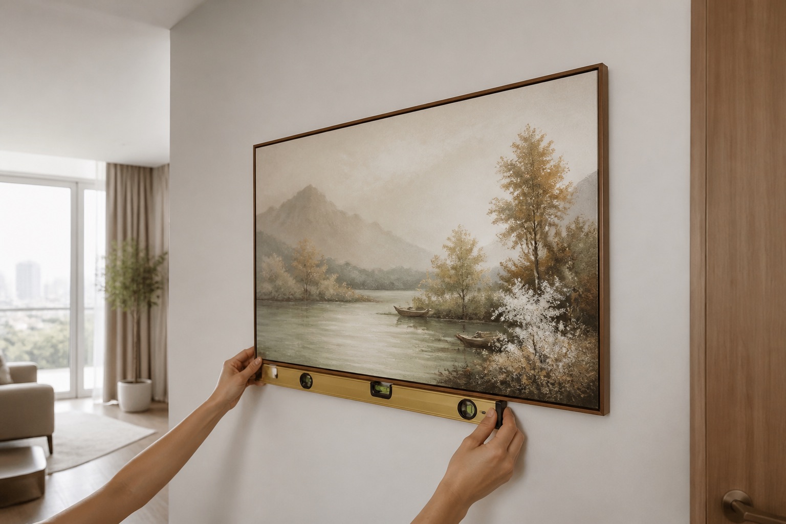
Vertical placement affects how wood furniture and art "speak" to each other. The rule: centre the art at eye level when seated—approximately 145–160 cm from the floor for a sofa, 160–180 cm for art above a bed headboard. Leave 20–30 cm gap between the top of your sofa or bed and the bottom of the frame; this breathing room prevents the art from feeling cramped. If your furniture is walnut (cool) and your art is warm-toned, ensure light hits the art evenly—a lamp on one side can make the colour appear unbalanced. In Vietnamese apartments, afternoon sun often floods one wall; angle the glass-coated wall art so it doesn't sit in direct sun all day, which may fade printed pigments over years (though Décor Vie uses UV-resistant inks). Horizontal art suits horizontal timber grain; vertical or multi-piece sets adapt to stacked or feature walls.
What colour and subject themes pair with wood?
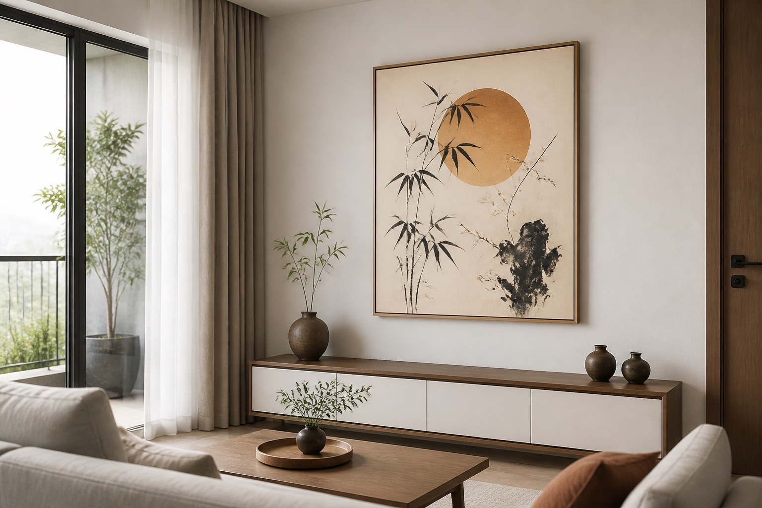
Warm wood (teak, oak, chestnut) harmonises with earth tones, terracotta, forest greens, navy, and warm greys—think rice fields at sunset, Ha Long Bay limestone in amber light, or Hoi An lanterns in warm gold. Cool wood (walnut, ash, pale pine) partners with slate grey, cool whites, silver metallics, blacks, and cool-grey landscapes—minimalist lines, architectural studies, or sepia-tone vintage prints. Dark wood (mahogany, blackwood) anchors jewel tones (deep emerald, burgundy, navy) and high-contrast work without strain. For bedroom wall art, warm wood furniture calls for calm, warm-palette abstracts or soft botanical prints; cool wood suits geometric or monochrome work. Vietnamese cultural themes—abstract wall art renders of rice terraces, water reflections, or modernist lotus motifs—work across all timber tones if the pigment palette matches your furniture's undertone. Contact us to discuss theme and tone for your specific room.
💬 WhatsApp/Zalo +84 775 017 977 for size and design advice
Rented apartments: how to hang without damaging walls?
Renting in Hanoi or Ho Chi Minh City means avoiding nail holes and landlord disputes. Décor Vie prints come rolled or stretched; stretched canvas on lightweight frames fit standard picture rails or adhesive hooks (non-permanent, removable). Rolled prints can be hung via magnetic strips or poster rails that clamp to walls without penetration. If your rental has wood-panelled walls or timber furniture built-in, rolled art on a temporary rod creates a layered, flexible look—you can rotate designs without commitment. Never use permanent adhesive on rented walls; always ask your landlord. Removal is instant and damage-free with the right hanging hardware.
Decision Framework: Matching Wood Furniture to Wall Art in 4 Steps
- Identify furniture undertone (daylight + lamplight test)
- Measure furniture width, calculate 60–75% for art size
- Choose finish (canvas for cool/dry rooms, glass-coated for humid/exterior walls)
- Select colour palette (match undertone, test in your room light before committing)
What to Check Before You Buy
- Measure twice. Furniture width, wall width, ceiling height, distance from sofa to wall.
- Test colour in your light. Show Décor Vie a photo of your furniture in both daylight and your room's typical lamps; undertone shifts dramatically under different light.
- Confirm delivery. Contact us on +84 775 017 977 for a quote by size and confirm lead time.
- Humidity zone. If your wall faces exterior or is near kitchen/bathroom, choose glass-coated.
- Rented? Ask landlord before hanging anything permanently.
🖼️ Browse Décor Vie wall art
For 3-piece wall art sets, consider how three separate frames echo your furniture's wood grain—vertical rectangles over horizontal timber, or clustered asymmetrically for modern rooms. For projects or hotels with statement wood features, art for hotels and projects offers custom sizing and bulk coordination. Read our wall art journal for real Hanoi and Ho Chi Minh City apartment examples and before-and-after placements.
💬 WhatsApp/Zalo +84 775 017 977 for size and design advice
FAQ
Can I hang warm-toned art next to cool wood furniture?
Technically yes, but it creates visual tension. Slight tone mismatch is acceptable if the art has a unifying neutral (white, black, or grey); bold colour clash risks making the room feel disjointed. Test first by holding a printed sample beside the furniture.
Does canvas fade faster than glass-coated prints in Hanoi's humidity?
Both use UV-resistant inks. Canvas may absorb humidity and require more careful storage; glass-coated resists moisture entirely and wipes clean. Neither fades noticeably under normal household light within 5–7 years.
What if my room has mixed wood tones (teak floor, walnut furniture, oak trim)?
Anchor the art to the dominant wood surface—usually the furniture you're coordinating. If equally mixed, choose art in a neutral grey, cream, or black-and-white palette; these bridge warm and cool without favouring one tone.
How high should I hang art above a wooden console table in an entryway?
Centre the art at 145–160 cm from the floor, leaving 20–30 cm gap between the console top and art bottom. This prevents clutter visually and protects the print from dust/moisture off the table surface.
Can I hang a Décor Vie print in a rented apartment without damaging walls?
Yes. Use adhesive strips, magnetic rails, or poster rods (non-permanent). Avoid nails unless you patch holes before move-out. Always confirm with your landlord before hanging anything.