
How to Choose Canvas Paintings by Room Color Tone
Choosing canvas paintings by room color tone starts with identifying whether your space runs warm (creams, terracottas, golds) or cool (greys, blues, silvers). Warm rooms suit earth-toned, ochre, or sunset-palette designs; cool rooms absorb blues, greens, and whites. Begin by assessing natural light (Hanoi's humidity and southern-facing windows shift perception throughout the day), artificial lighting (warm LEDs enhance oranges; daylight-temperature bulbs sharpen cool tones), and your existing furniture colors. At Décor Vie, we work with clients to test designs against phone photos of their walls before printing on stretched canvas or glass-coated prints—both withstand Hanoi's moisture, though glass-coated resists humidity better. The key is not to match exactly (flat, dull) but to echo one accent or complement the dominant tone. Avoid oversizing art or choosing highly saturated colors if your room is already busy; understatement often reads as confident. Contact us on +84 775 017 977 for size and design advice customized to your space's light and mood. 💬 WhatsApp/Zalo +84 775 017 977 for size and design advice
What is a room's color tone, and why does it matter for art?
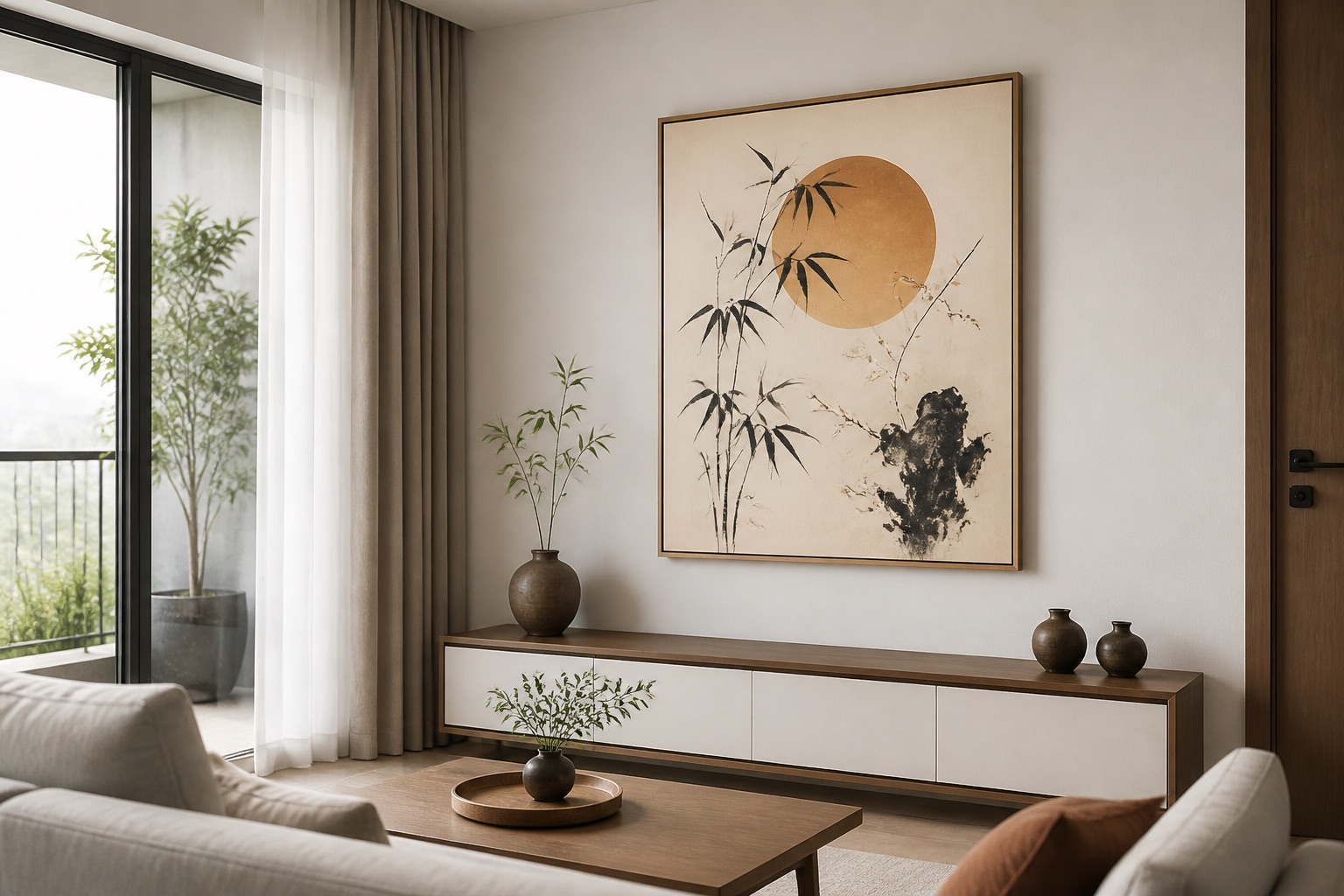
A room's color tone is the dominant warmth or coolness cast by walls, floors, and permanent fixtures—not by moveable decor. It matters because art that clashes with that undertone visually "floats" and divides the eye; art that harmonizes or intentionally echoes it anchors the space. In Hanoi, our warm, tropical light naturally enhances warm tones, so a cool-grey living room can feel jarring without art that bridges to earth tones or white accents.
How do you assess your room's underlying warmth?
Take a phone photo of your room at midday (natural light) and at dusk (artificial light). Open it in a photo app and check the overall cast: yellow/gold = warm; blue/grey = cool. Walk your fingers over the wall paint card if you kept it—look at the undertone (most paint brands list this on the back). Check your furniture too: a sofa in warm grey (taupe) vs. cool grey (dove) changes everything. Many expats in Hanoi apartments find their walls are "white" but actually lean warm because of the ceiling light and humidity haze. Once you know your baseline, you can choose art confidently.
Warm room, warm art, or warm room, cool art—which pairing works?
Warm + warm = cohesion. Creamy walls + terracotta, gold, or rust-toned art = unified, restful. Best for bedrooms and traditional living rooms.
Cool + cool = calm. Grey walls + blue, teal, or charcoal art = tranquil, modern. Works in home offices and minimalist lounges.
Warm + cool or cool + warm = intentional contrast. A warm room with one cool-toned accent print (e.g., deep blue geometric set against ochre) draws the eye and feels curated. Use this sparingly—one strong contrast per wall, or the room becomes chaotic.
| Room Tone | Art Palette | Effect | Best For |
|---|---|---|---|
| Warm (cream, terracotta, gold) | Rust, ochre, burnt sienna, bronze | Harmonious, grounded | Living rooms, bedrooms |
| Cool (grey, blue-white, silver) | Navy, teal, slate, lavender | Calm, contemporary | Offices, bedrooms, galleries |
| Mixed (white wall + warm wood floor) | Warm accent + cool secondary | Balanced interest | Kitchens, hallways |
| High-saturation color (teal wall) | Desaturated or white-dominant design | Prevents overwhelm | Statement walls only |
How does Hanoi's light and humidity affect color choice?
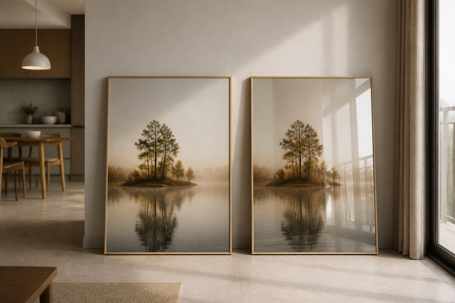
Hanoi's humidity (80–90% in summer) and warm ambient light shift how you perceive color. A blue that looks crisp in a cool-lit showroom can read almost purple-green under warm indoor light and moisture haze. Stretched canvas absorbs humidity, so deep colors may appear slightly muted over time; glass-coated prints resist this better and maintain color intensity. For living room wall art, we recommend testing a digital mockup on your actual wall at multiple times of day—contact us and send a photo, we'll overlay options. If you rent and can't paint, using a cool-toned or neutral art set compensates for warm-toned landlord walls.
What sizing and placement rule makes color work harder?
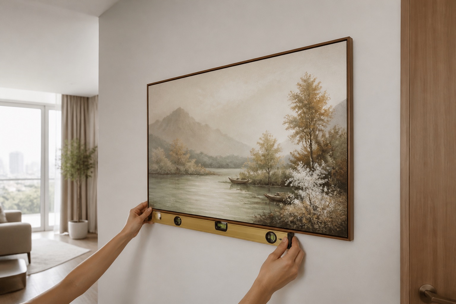
The "two-thirds furniture width, centered at 145–160 cm" rule applies equally to color. Art that's undersized (smaller than half your sofa width) disappears and wastes its color impact; oversized art (wider than 90% of the wall) dominates and can make a warm room feel oppressive or a cool room cold. A 3-piece wall art set spanning 1.5–2 m above a 2.5 m sofa breaks up a monochrome wall and lets you layer two colors—e.g., warm neutral + teal accent—without overpowering. Placement at 145–160 cm from the floor (eye level sitting down) ensures the art engages the room's color story, not just the ceiling.
Which design types best suit warm vs. cool room tones?
Warm rooms shine with:
- Vietnamese motifs (Hoi An lanterns in gold, rice fields in amber light)
- Abstract wall art in earthy layers (ochre over cream over tan)
- Florals and botanicals in warm greens and rust
- Sunset or sunrise photography
Cool rooms absorb:
- Geometric and minimalist designs (black, white, navy)
- Urban and architectural imagery
- Water or sky themes (blue, silver, teal)
- Monochrome or desaturated landscapes
A warm room asking for a cool-toned art piece? Go abstract or geometric in cool tones—it feels intentional rather than accidental. A cool room wanting warmth? Choose designs where warm colors are secondary (e.g., a blue-dominant piece with rust accents), not the star.
What to check before you buy
- Lighting test: Photo your wall in natural and artificial light; ask us to overlay a mockup.
- Undertone honesty: Ignore paint names ("Cloud White"); trust the undertone code on the back of the card or a swatch held next to furniture.
- Size preview: Measure your wall and furniture; use a tape outline or cardboard mock-up at the exact hanging height.
- Material for your climate: Warm, humid rooms favour glass-coated canvas for durability; cool, dry apartments suit standard stretched canvas prints.
- Renter's backup: Choose neutral, cool-toned art that works against any wall color if you can't add your preferred tone to the space itself.
💬 WhatsApp/Zalo +84 775 017 977 for size and design advice
Assess your room's warmth, measure your wall, and test color before choosing. At Décor Vie, we work with your photos and preferences to match canvas paintings to your space—no guesswork, no returns if the color doesn't sing. For a quote or design chat, contact us on +84 775 017 977.
FAQ
Can I hang a cool-toned canvas in a warm room without it looking out of place?
Yes, if the design is intentionally striking—geometric, abstract, or architectural. Place it as a focal point (above a console, centered on a feature wall) so it reads as a chosen accent, not a mistake. Pair it with neutral or warm secondary decor to anchor it.
Does humidity in Hanoi apartments fade canvas colors over time?
Stretched canvas absorbs moisture and may appear slightly muted in high humidity; pigment doesn't typically fade if the print was UV-stable to begin with. Glass-coated prints resist humidity better and maintain vibrancy longer—contact us to compare for your specific room.
How large should canvas art be relative to my sofa?
Canvas width should be 60–75% of your sofa width, centered at 145–160 cm from the floor. For a 2.5 m sofa, aim for a 1.5–1.8 m span (single, 2-piece, or 3-piece set). Too small and it looks timid; too large and it overwhelms.
What if my walls are white but I'm not sure if they're warm or cool white?
Take a phone photo at midday against your sofa or wooden furniture. If the wall leans yellowish or beige beside warm-toned items, it's warm white; if it looks silver or blue-grey, it's cool white. If genuinely neutral, choose art that complements your furniture tone instead.
Can I use a single accent color in my canvas art to warm up or cool down a room?
Absolutely. A secondary accent color in your art (e.g., rust in an otherwise blue abstract) can echo your room's undertone and create visual harmony. Use this in a 20–30% ratio within the design so it supports, not fights, the dominant tone.
Does feng shui influence color choice for room-specific art?
Feng shui traditionally pairs room zones with colors (south = red/fire, north = blue/water); we respect this as cultural reference. What matters most is that your chosen color balances your room's light, furniture, and mood—cultural alignment is a bonus, not a guarantee of function.