
How to Arrange Asymmetrical Modern Paintings on Your Wall
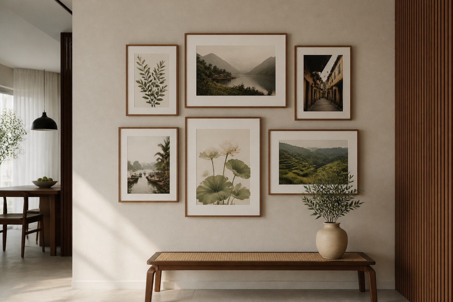
Asymmetrical modern paintings work beautifully when balanced by negative space and paired thoughtfully. The key is controlling distance, furniture alignment, and visual weight—not following rigid symmetry. Start by identifying your focal point—usually 145–160 cm from the floor, centre-aligned with furniture below—then cluster smaller prints around it, leaving 15–25 cm gaps between frames. For a 2-piece set on a living room wall, place the larger canvas 20–30 cm above the sofa or console, with a smaller companion print offset 30–40 cm horizontally and 10–15 cm vertically. Décor Vie's canvas prints and glass-coated options work equally well here; choose canvas for warmth in natural light, glass-coated if humidity or dust concerns you in Hanoi's climate. Avoid centering every piece—instead, let one artwork "anchor" the group while others dance around it. This creates modern, gallery-like energy without chaos.
Why Does Asymmetrical Balance Feel More Modern Than Symmetry?
Symmetrical walls—identical paintings flanking a sofa—feel formal and predictable. Asymmetry invites the viewer's eye to explore, creating rhythm and personality. Modern design celebrates intentional imbalance because it mirrors how we naturally organize living spaces: furniture isn't always matched, light enters from one side, focal points shift. When you anchor one strong piece and add smaller companions off-centre, you tell a story rather than impose order. The wall feels curated, not decorated.
Rule: One dominant artwork + 1–3 smaller companions, never evenly spaced.
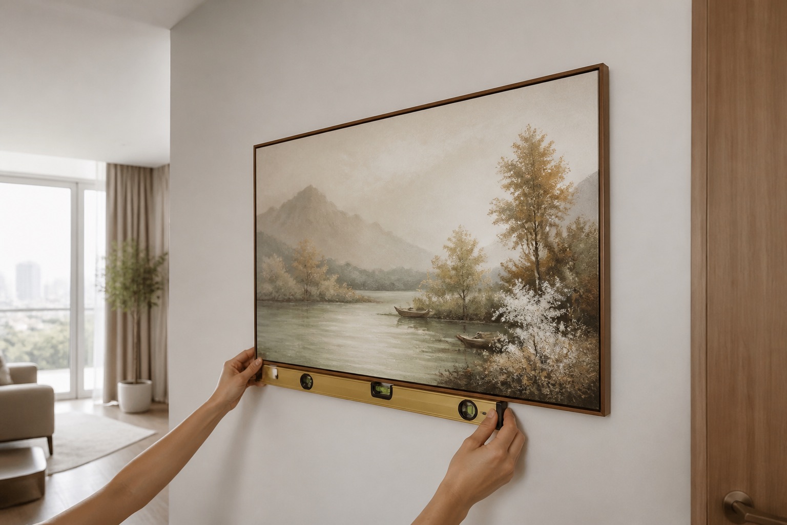
How Do You Calculate the Right Spacing for Your Wall Size?
Spacing depends on wall width, furniture width, and room scale. Here's a framework:
| Wall Width | Dominant Print Width | Distance to Companion | Gap Above Sofa |
|---|---|---|---|
| 1.8–2.2 m | 70–90 cm | 30–50 cm | 20–30 cm |
| 2.2–3 m | 90–120 cm | 50–80 cm | 25–35 cm |
| 3–3.5 m | 120–140 cm | 60–100 cm | 25–35 cm |
| 3.5+ m | 140–160 cm | 80–120 cm | 30–40 cm |
Measure your sofa or console width, then aim for artwork that covers about 60–75% of that width. Place the top of the dominant piece 145–160 cm from the floor. Offset companions 10–20 cm vertically and 30–80 cm horizontally, depending on scale.
Check: If the arrangement looks too sparse when you hold mockups on the wall (use paper cutouts), tighten gaps by 10 cm and re-test.
Should You Use Canvas or Glass-Coated Prints for Asymmetrical Layouts?
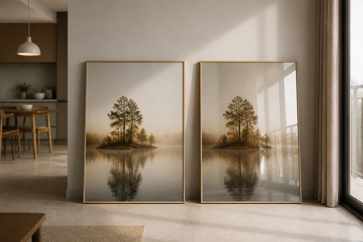
Both work; the choice depends on light, humidity, and wall condition. Canvas has a matte finish—no reflections, forgiving in direct sunlight, and feels tactile. Glass-coated (crystal) prints have a glossy tempered-glass surface; they resist dust and humidity better in Hanoi or Saigon apartments, but reflections can shift how colours read depending on viewing angle and time of day.
For asymmetrical walls with multiple pieces: glass-coated prints make each piece "pop" individually because the gloss emphasizes edges and edges define asymmetrical rhythm. Canvas unifies the group visually because matte surfaces blend with walls more softly.
Climate rule: High humidity + potential water splash (kitchen, bathroom) = glass-coated. Living rooms, bedrooms with moderate humidity = either, based on preference.
Explore glass-coated wall art options to compare gloss depth and frame finishes.
What Colour and Style Themes Work Best for Asymmetrical Arrangements?
Modern asymmetrical layouts shine with cohesive colour palettes even if print sizes differ. Choose one of these frameworks:
Monochromatic modern: Grayscale, blacks, whites, and soft greys across all pieces. Visual weight stays balanced because tones are similar; size variety feels intentional.
Accent + neutral: One bold-colour print (sapphire, burnt orange, forest green) anchors; companions in cream, white, or pale grey. The colour print becomes the focal point without need for spatial dominance.
Analogous harmony: Blues + teals, ochres + rust, sage + charcoal. Pieces feel connected even at different scales.
Single-hue gradient: Different tints of one colour (navy → sky → powder blue). Creates flow and calm across uneven sizing.
Check: Lay prints side by side before ordering or hanging. If a companion print competes for attention (e.g., equally bold colour, similar size), the asymmetry reads as clutter, not design.
How Do You Adapt Asymmetrical Layouts for Rented Apartments?
Renters often face nail restrictions and must avoid permanent damage. Asymmetrical arrangements are easier to shift without leaving visible holes if you use damage-free picture rail hangers or lightweight adhesive strips rated for your print weight (canvas is lighter than framed pieces; glass-coated can be heavier due to tempered-glass).
Renter-friendly setup:
- Use 2–3 nails per print (not 1) to prevent tilting and re-nail marks.
- Space nails 2–3 cm apart; fill holes with toothpaste + white paint if needed on move-out.
- Measure twice with pencil marks, hang once to minimise nail holes.
- Offset pieces so you're not hammering in a straight line—landlords notice rows of holes.
Benefit of asymmetry for renters: If you move, the layout doesn't depend on a single centred focal point. You can reorganise pieces into a new configuration quickly.
Canvas prints are lighter and renter-friendly than many wall art types—easier to rehang, less wall damage risk.
Common Mistakes: What Breaks an Asymmetrical Wall?
| Mistake | Why It Fails | Fix |
|---|---|---|
| All pieces at same height | Looks like you avoided arrangement, not chose it | Vary heights by 15–30 cm minimum |
| Even spacing between pieces | Mathematically balanced = symmetry in disguise | Use 20 cm, then 50 cm, then 30 cm gaps |
| Similar colours + sizes | Defeats the asymmetry; reads as incomplete set | Pick one dominant piece; make companions visibly smaller or bolder |
| Pieces too far from furniture | Wall feels disconnected from room | Anchor group 20–40 cm above/beside seating |
| Horizontal line across tops | Creates false symmetry axis | Stagger top edges by 20+ cm for each piece |
Before you hang: Sketch the layout on graph paper or use smartphone photo mockups (stand back 2–3 metres and check proportions).
💬 WhatsApp/Zalo +84 775 017 977 for size and design advice
What Sizes and Product Types Suit Asymmetrical Layouts Best?
Best for asymmetry: 2-piece sets, 3-piece sets with varied dimensions, single focal prints paired with smaller companions.
Avoid: 4–5-piece symmetrical grid sets (designed for balanced walls). Instead, mix single prints from different collections to build custom asymmetry.
3-piece wall art sets offer built-in imbalance because one piece is typically larger; this is perfect for asymmetrical schemes.
For bedroom wall art, asymmetry above a bed works if you anchor one larger print at the head-centre and flank with smaller pieces or modern abstracts on either side, 15–20 cm apart. For living room walls, a larger dominant print over the sofa with offset companion pieces creates visual interest without overwhelming the space.
What to Check Before You Buy
- Measure your wall and furniture first. Get width, height, and distance from floor to furniture top. A 90 cm print looks vastly different on a 2 m wall than a 4 m wall.
- Test the colour in your lighting. Order or borrow one piece; hang it for 2–3 days. Morning light, afternoon light, and evening light change how modern art reads. If the colour shifts too much, choose a different palette or switch to glass-coated prints (which stabilise colour perception).
- Confirm humidity tolerance if you live in Hanoi or Saigon. Canvas can warp or absorb moisture in poorly ventilated spaces; glass-coated prints resist humidity better. Contact us on +84 775 017 977 for a quote by size and climate advice.
- Check wall condition. Plaster, concrete, or tile? Drywall? Some walls resist nails more; ask your landlord or property manager before drilling.
- Verify whether prints ship rolled or stretched. Rolled canvas saves space; stretched canvas arrives ready to hang. Neither is "better"—it's about convenience and wall setup. Contact us to confirm delivery format.
💬 WhatsApp/Zalo +84 775 017 977 for size and design advice
Why Asymmetrical Modern Art Suits Vietnam's Interior Spaces
Vietnamese homes increasingly embrace modern minimalism while honouring cultural aesthetics. Asymmetrical layouts honour the principle of balance without uniformity—similar to how feng shui values harmony through counterbalance, not rigid symmetry. Contemporary Vietnamese interiors often blend traditional motifs (lotus, Hoi An lanterns, rice terraces) in modern frameworks; asymmetrical hanging lets each piece breathe individually rather than forming a formal wall statement.
For expats and international residents, asymmetrical arrangements offer flexibility: they work in rental apartments, adapt easily to furniture changes, and create a curated gallery feel that photographs well—important in Hanoi's design-conscious expat community.
🖼️ Browse Décor Vie wall art
Next Steps: From Mockup to Hanging
Once you've sketched your layout (or used photo mockups), order samples if available, or contact Décor Vie with your room dimensions, wall colour, and furniture style. We'll provide sizing advice and product recommendations based on your space—not generic "rules." Hold prints on your wall with painter's tape for 24 hours before final nailing to catch any last-minute doubts.
For abstract wall art that suits modern interiors, asymmetrical layouts let each piece's complexity show without competing geometrically.
💬 WhatsApp/Zalo +84 775 017 977 for size and design advice
FAQ
Can I hang a 3-piece set asymmetrically if the pieces are different sizes?
Yes—this is ideal. Place the largest piece as your anchor, then offset the two smaller pieces 30–50 cm away horizontally and 10–20 cm vertically. The uneven sizes reinforce the asymmetrical rhythm.
Should the gap between asymmetrical prints match the gap between the frame edges and the wall?
No. The gap between pieces (15–50 cm) is separate from spacing from the wall edge. Aim for 15–25 cm margin from each side wall to the nearest artwork; gaps between prints can vary to create rhythm.
Does asymmetrical work in small apartments (under 50 m²)?
Yes, if you use fewer pieces. A single focal print with one companion offset 40 cm away works beautifully in tight spaces and feels intentional, not cramped.
What's the best colour for asymmetrical modern paintings in a room with mixed décor?
Grayscale or muted analogous colours (blues + teals, ochres + rust). These don't fight existing furniture. Bold accent colours work if only one piece uses the colour; companions should be neutral.
Can I hang canvas and glass-coated prints together asymmetrically?
Yes. Canvas has matte finish; glass-coated has gloss. The different surfaces actually enhance asymmetry visually—each piece reads distinctly. Ensure they're at different heights and sizes to avoid a "matched set" feel.
Should lighting (track lights, natural sun) influence my asymmetrical layout?
Absolutely. If strong morning light hits one side of your wall, offset the larger print toward shadow to balance brightness. Glass-coated prints will reflect light unevenly; use this intentionally to create focal shifts throughout the day.