
How to Arrange 2 Asymmetrical Canvas Prints on a Wall
Two asymmetrical canvas prints work best when you anchor them around a focal point—a sofa, bed, or console—rather than trying to centre them symmetrically. Place the larger print at eye level (145–160 cm from floor) and position the smaller 15–25 cm away horizontally or vertically offset by 10–20 cm; this creates visual rhythm instead of fighting for balance. Use a consistent colour palette or complementary tones so they read as intentional. At Décor Vie, we recommend printing both on the same material (canvas or glass-coated) and finish to unify them visually. Avoid equal sizing and equal spacing—that defeats the asymmetrical effect and looks hesitant. The smaller print should be 60–70% the width of the larger one for clean proportions. --- 💬 WhatsApp/Zalo +84 775 017 977 for size and design advice
What Does "Asymmetrical" Mean in Wall Art Arrangement?
Asymmetry in wall art means your two prints are different sizes, proportions, or compositions—and they're placed off-centre from each other. This breaks formal symmetry and creates dynamic visual interest. Rather than hanging two equal prints side by side, you're composing a layered, intentional look. The key is balance, not matching: a large abstract piece paired with a smaller figurative print, or two landscape frames where one is 1.5× wider. Asymmetry signals confidence and sophistication, common in modern Hanoi apartments where space is tight and every wall counts. The goal is calm visual tension—not chaos.
How Do You Measure and Anchor Two Different-Sized Prints?
Measurement framework:
| Measurement | Purpose | Rule |
|---|---|---|
| Larger print width | Reference scale | 60–70% of wall width (or 50–60% above furniture) |
| Smaller print width | Visual weight | 60–70% of larger print width |
| Vertical offset | Rhythm | 10–20 cm (larger 5–10 cm higher) |
| Horizontal gap | Breathing room | 15–25 cm apart edge-to-edge |
| Eye-level height | Anchor point | 145–160 cm from floor to centre of larger piece |
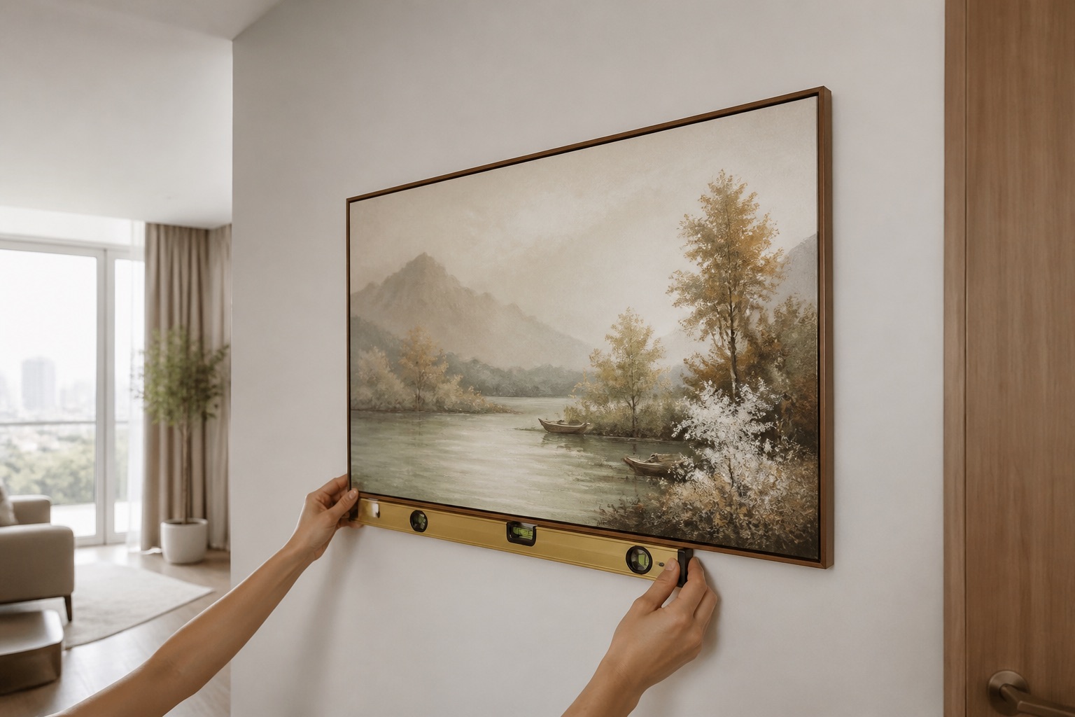
Start by measuring your furniture (sofa, bed, dresser). The combined art should sit 20–30 cm above it, with the larger print's centre at 145–160 cm from the floor. If your sofa is 80 cm wide, your larger canvas should be roughly 48–56 cm wide; the smaller piece 30–40 cm. Offset one vertically so they don't create a horizontal line. Use painter's tape and a level to mock up placement before drilling—this takes 5 minutes and saves a wall full of holes. For renters, removable adhesive strips work if prints weigh under 2 kg each; confirm weight when ordering.
Should Your Two Prints Use the Same Material (Canvas vs Glass-Coated)?
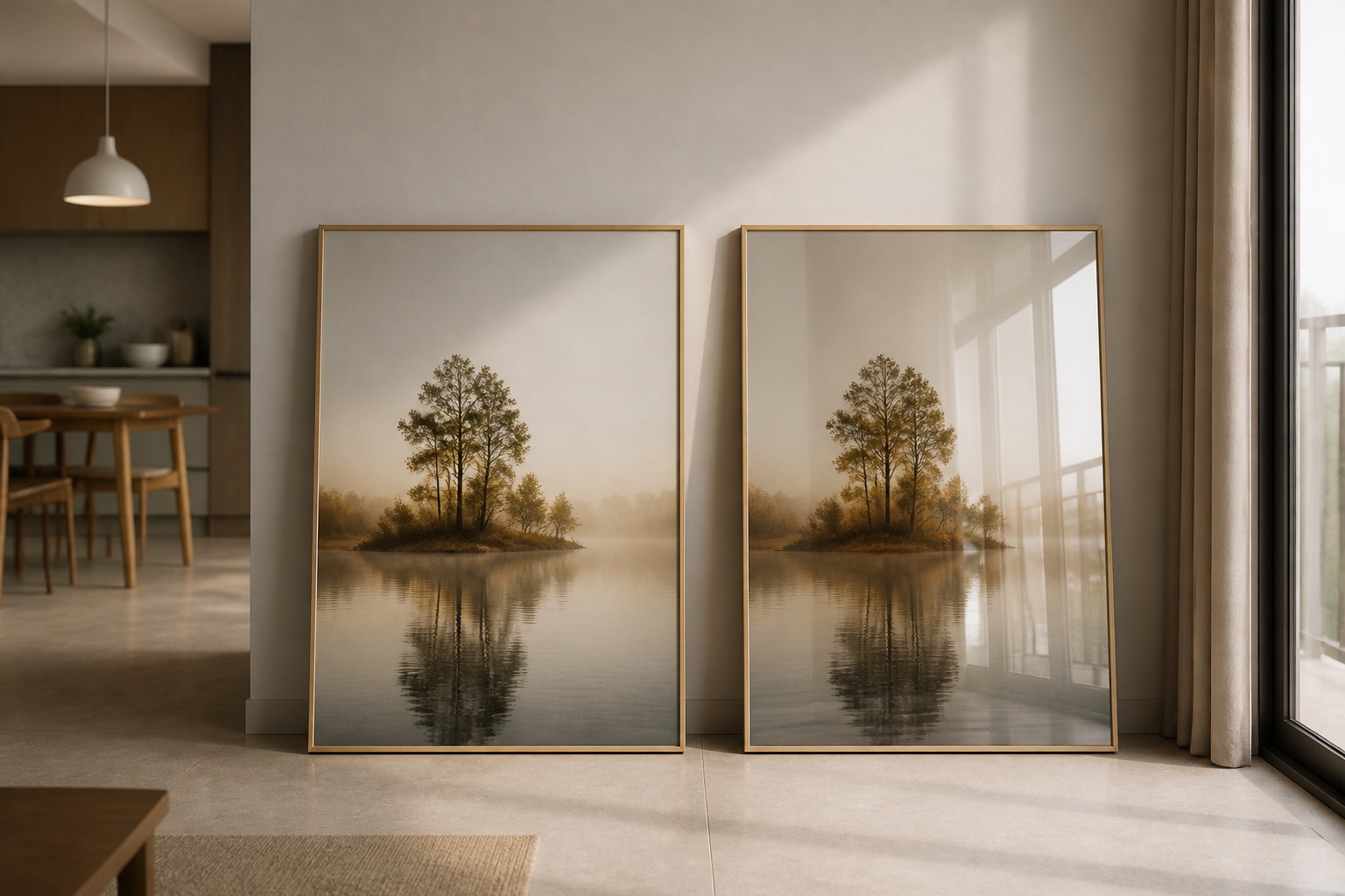
Matching material creates visual unity, but it's not mandatory—intention matters more. Canvas prints have warmth and texture; glass-coated prints have gloss, depth, and are more moisture-resistant in Hanoi's humidity. The practical difference: in a humid bedroom or near a kitchen, glass-coated resists mildew better and cleans easily (just wipe with a soft, dry cloth). Canvas in those spaces needs good ventilation or occasional vacuuming to prevent dust settling into the weave. If you pair a canvas with a glass-coated print in the same room, the glass-coated one will reflect light and may draw more visual weight—useful if you're trying to brighten a darker corner. Consistency in material keeps the display cohesive; mismatched materials work only if colour and tone align strongly.
We've seen pairing work beautifully in Hoan Kiem apartments: a larger abstract canvas anchoring a workspace, with a smaller glass-coated botanical print offset above. The glass-coated piece catches morning light and breaks up the heaviness of the abstract. Choose based on the room's humidity and light, not fashion.
What Colour Pairing Works for Asymmetrical Prints?
Colour is your easiest design lever. Three strategies:
Strategy 1: Monochromatic/Analogous Both prints in shades of blue, grey, or warm earth tones. This is safest and reads as intentional. Example: a large charcoal abstract with a smaller indigo-toned landscape.
Strategy 2: Complementary Accents One print warm (ochre, terracotta), one cool (teal, slate), but in similar saturation. The contrast energizes without clashing. Use this in living rooms where you want a focal point to anchor a seating area.
Strategy 3: Neutral Anchor + Colour Pop A large greyscale or black print paired with a smaller colour piece (vibrant leaf, sunset). The larger print grounds; the smaller one adds personality.
Avoid high-saturation colours in both pieces unless they're related (both sunset-orange is cohesive; bright orange + bright purple fights). If your wall is already coloured (soft grey, cream, pale yellow), choose print colours that sit one tone lighter or one tone darker for contrast—never match the wall exactly, or the prints disappear. Hanoi apartments often have white walls; here, nearly any colour works if the two prints have a tonal relationship. Sketch a small colour swatch mockup on your phone before ordering—use our WhatsApp preview service.
💬 WhatsApp/Zalo +84 775 017 977 for size and design advice
Where Should You Place Asymmetrical Prints—Living Room vs Bedroom?
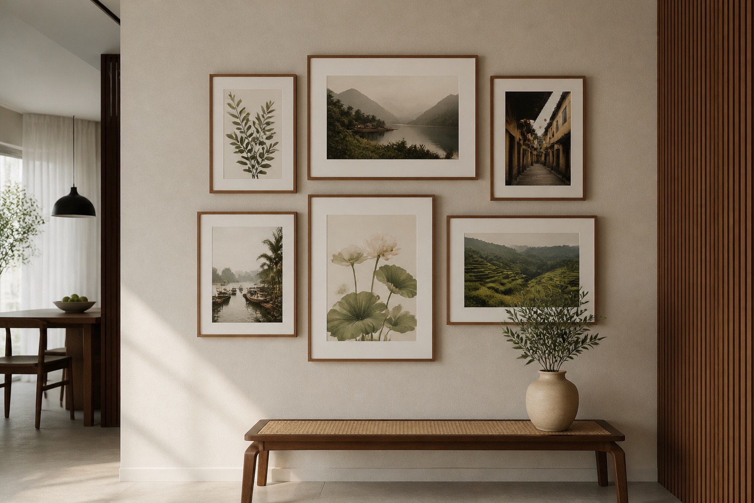
Living room: Hang above a sofa or console, with the larger print slightly off-centre toward the room's natural focal point (window, fireplace, entry). The smaller print can sit higher or lower—asymmetry reads as curated here because the room is public-facing. Gallery walls often include 2–3 pieces, so your two prints can anchor a larger arrangement.
Bedroom: Above the bed, flank the headboard off-centre for calm balance. Place the larger piece on the dominant side (the side most visible when you're sitting up). The smaller piece 10–20 cm away, slightly lower. Bedroom asymmetry feels intimate, not formal. Avoid prints in conflicting energy (a chaotic abstract + serene landscape can feel unsettled). Keep tones cool or warm, not mixed.
Home office/workspace: Stack vertically if wall space is narrow—larger below, smaller above, 20 cm apart. This draws the eye down to your desk naturally and doesn't feel like an accident. Works in long hallways too.
For bedroom-specific guidance, consider how morning light falls. Glass-coated prints create reflections that can be energizing (east-facing) or glare-prone (west-facing afternoon sun); canvas diffuses light evenly.
Common Mistakes When Hanging Asymmetrical Pairs
Mistake 1: Centering both prints on the wall. This defeats asymmetry. The eye expects symmetry and reads the unequal sizes as error. Instead: anchor the larger print to your furniture, then place the smaller print outside its visual footprint.
Mistake 2: Equal spacing on all sides. Equal gaps make the prints compete. Create a tighter cluster (15 cm gap) with one piece higher or lower. This signals intentionality.
Mistake 3: Mismatched material + drastically different tones. A cold-toned canvas paired with a warm-toned glass-coated print, with no colour bridge between them, reads chaotic. Use material consistency or tonal harmony, ideally both.
Mistake 4: Ignoring furniture scale. If your sofa is 2 m wide and your prints are 40 × 30 cm combined, they'll look lost. The combined width should be 50–70% of the furniture below.
Mistake 5: Hanging too high. Centre of the larger print at 145–160 cm; this is where the human eye naturally rests. Higher looks like you're hiding it; lower feels cluttered.
Mistake 6: Over-matching by style. Both prints in identical styles (e.g., two realistic landscapes) makes them feel like a pair of bookends, not an asymmetrical composition. Mix a photographic piece with an abstract or illustrative one for intentional contrast.
What to Check Before You Buy
✓ Measure the wall and furniture — combined art width should be 50–70% of the sofa/bed width ✓ Note the wall colour and room light — does it lean warm or cool? morning or evening light? ✓ Decide: canvas or glass-coated? — humidity-prone rooms favour glass-coated; dry spaces suit canvas ✓ Choose your colour palette — sketch two sample prints side by side on your phone in the room's light ✓ Confirm you can hang (renter or owner?) — renters should ask about adhesive strips; owners can use picture hooks ✓ Check frame/edge finish — canvas can be stretched (wooden edge) or rolled (plain edge); glass-coated comes pre-mounted ✓ Plan your spacing — sketch pencil marks on painter's tape before drilling
Why Asymmetrical Pairs Work Better Than "Matching" Prints
Asymmetry feels modern and personal because it shows choice—you've curated two pieces that complement each other, not just hang as a set. In Hanoi's compact apartments, asymmetry makes walls feel intentional rather than decorated-by-checklist. Two identical prints can feel cold; two different sizes and tones tell a story. This is why asymmetrical pairs appear in design magazines and boutique hotels. The constraint of limited wall space makes this strategy essential: you're maximizing visual impact without overwhelming the room.
Browse our 3-piece sets if you're considering a larger grouping, or stick with two and add more over time. Many customers in Hanoi build their walls incrementally as spaces evolve—start asymmetrical, add a third piece later.
For projects (offices, hotels, rental apartments), bespoke arrangements are common. Email us your dimensions and mood; we'll suggest ratios and layouts.
💬 WhatsApp/Zalo +84 775 017 977 for size and design advice
Vietnamese Motifs and Asymmetrical Arrangements
Pairing two prints featuring Vietnamese subjects—lotus and rice fields, Hoi An lanterns and Ha Long Bay—creates cultural resonance without feeling theme-park-y. A large, atmospheric Ha Long Bay canvas paired with a smaller, intimate Hoi An lantern print balances grandeur with warmth. This arrangement works especially well in living rooms where guests spend time; it's a gentle conversation starter. In bedrooms, a larger botanical lotus print paired with a smaller architectural piece (Hoi An street) creates calm and grounding. The asymmetry respects the subjects' different scales—the landscape needs more visual weight; the detail piece sits as a thoughtful counterpoint.
Pages from our team you may need
FAQ
How far apart should two asymmetrical prints hang?
15–25 cm edge-to-edge horizontally, or vertically offset by 10–20 cm. Tighter clusters (15 cm) feel intentional; wider gaps (25 cm) work in large rooms. Avoid equal spacing on all four sides.
Can I mix canvas and glass-coated prints in the same arrangement?
Yes, if colour and tone align. Glass-coated reflects light and may draw more visual weight, so pair it with a warmer or bolder canvas piece. Material consistency is easier but not required; intention matters more.
What if my wall is already painted a bold colour?
Choose print colours one tone lighter or darker than the wall, never matching. A pale yellow wall works with prints in grey, cream, or soft blue. Contact us for a colour preview on your phone.
Should the smaller print always go higher or lower?
Neither is a rule. Offset it vertically by 10–20 cm (either direction) to break the horizontal line. The larger print's centre should stay at 145–160 cm from the floor, anchoring the arrangement.
Are asymmetrical prints suitable for renters?
Absolutely. Use removable adhesive strips rated for your combined print weight (usually under 2 kg each). Confirm strip weight capacity before ordering. For heavier pieces, ask your landlord about picture hooks—they leave smaller holes than nails.
Can I hang asymmetrical prints in a narrow hallway?
Yes—stack them vertically (larger below, smaller above, 20 cm apart) rather than side-by-side. This draws the eye naturally and suits long, tight spaces. Ensure at least 2 m of unobstructed wall.
What if I want to add a third print later?
Start with two strong pieces. A third works if it's smaller than both and placed at a different height—this avoids visual clutter. We can sketch a future arrangement when you order.