
Geometric Abstract Art Combination: How to Mix Styles & Sizes
A geometric abstract art combination is a curated grouping of 2–5 prints featuring geometric shapes, lines, or colour-blocked design arranged as a cohesive set. At Décor Vie, you can order these as canvas prints, glass-coated prints, or fabric prints in stretched or rolled formats, in ratios from square (1:1) to panoramic (1:3). The key to success is intentional mixing—choosing either a consistent colour palette across all pieces, or a tonal progression (light to dark); and balancing frame ratios so no single print dominates. Combinations work best when the total wall area is roughly 2/3 the width of the furniture below (sofa, bed, or console), with the visual centre at 145–160 cm from the floor. Avoid the trap of treating each print as independent; plan the spacing, aspect ratios, and alignment (salon-style grid, offset, or stacked) before you buy. Contact us on +84 775 017 977 for a quote by size and layout preference. 💬 WhatsApp/Zalo +84 775 017 977 for size and design advice
Why Does Colour Matching Matter More Than Size?
Two prints of the same size in clashing colours will feel disconnected; a small and large print in the same colour family read as one idea. The human eye links colour before it notices proportion. If your sofa is warm grey, choose geometric prints with ochre, terracotta, or warm white; if your walls are cool white, gravitate toward navy, sage, or cool grey accents. When combining 3–5 prints, pick one "anchor colour" that appears in every piece—perhaps teal or charcoal—then vary the secondary colours around it. This strategy keeps visual chaos at bay and makes the combination feel designed, not accidental.
What Layout Patterns Work Best in Small Apartments?
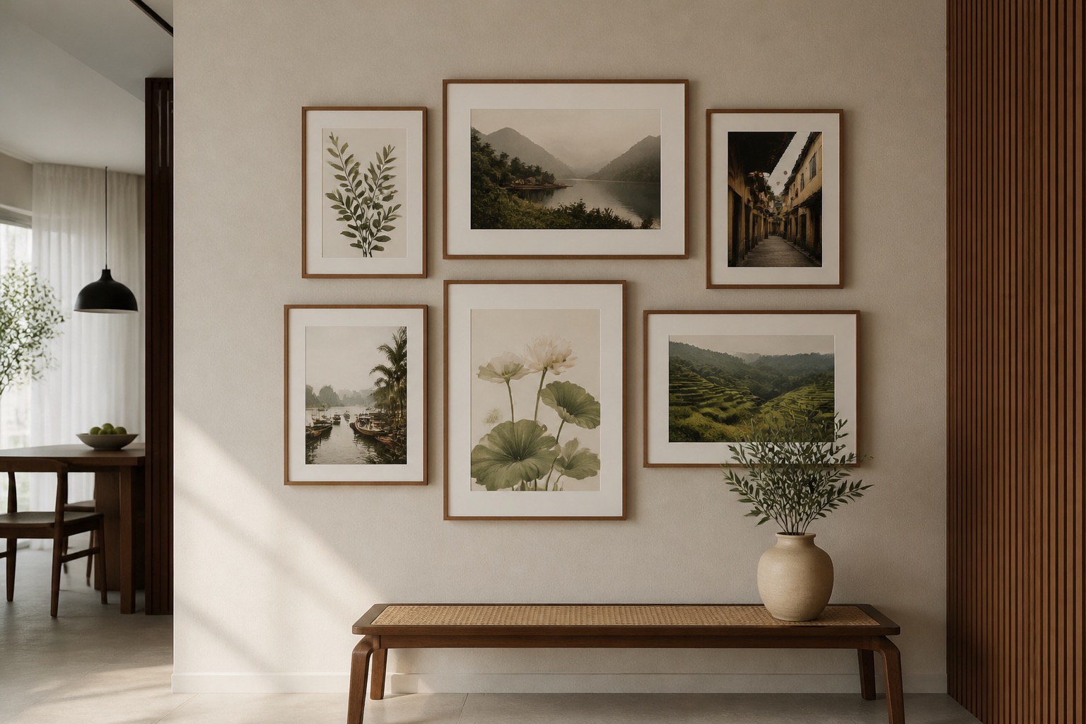
In Hanoi and Ho Chi Minh City apartments, wall space is often limited. The most practical layouts are:
- Stacked vertical (2–3 prints, all same width, centre-aligned): ideal for narrow walls above a bed or console; uses ~60 cm width.
- 2×2 grid (4 prints of equal size): needs ~100 cm × 100 cm and suits living room accent walls well.
- Offset or salon-style (mixed sizes, asymmetrical): requires ~120 cm width but feels curated and works in larger lounge areas.
For a rented apartment, stacked or grid layouts are easiest because they hang level with standard picture hooks and don't require drilling custom mounts. Keep 15–20 cm spacing between frames so each print breathes visually. If your apartment has high ceilings (over 3 m), center the entire combination at 145–160 cm from the floor; if ceilings are standard (2.7–2.8 m), drop it slightly lower (140–155 cm).
Canvas vs. Glass-Coated: Which Suits Geometric Art Better?
Geometric abstract art in Hanoi's humid climate demands thought about material:
| Aspect | Canvas print | Glass-coated print |
|---|---|---|
| Visual finish | Matte, texture-rich | High-gloss, mirror-like, vibrant colour |
| Humidity resistance | Prone to slight warping if humidity >65% | Tempered glass fully resists humidity |
| Reflection | Minimal glare | Can reflect overhead lights; position away from direct sun |
| Cleaning | Dust with soft brush; avoid water | Wipe with microfibre cloth; very easy maintenance |
| Colour pop | Softer, painterly feel | Jewel-toned, dimensional appearance |
| Best for | Muted, minimalist geometry | Bold, saturated geometric palettes |
If your apartment faces west or south (high afternoon light), canvas reduces glare but needs care in monsoon months. Glass-coated prints (also called crystal prints) thrive in humid environments and require zero fussing. For modern geometric designs with high-contrast colours, glass-coated delivers impact; for softer, earthy geometry, canvas is warmer.
💬 WhatsApp/Zalo +84 775 017 977 for size and design advice
How Do You Avoid the "Mismatched Diptych" Trap?
Many people buy two prints they like individually, hang them side by side, and wonder why they look like a mistake. This happens when:
- Colour doesn't connect (one cool, one warm; no shared tones).
- Aspect ratios clash (one portrait 2:3, one landscape 1:2; unbalanced visually).
- Visual weight is uneven (one has dense geometry, one is sparse).
The antidote is a combination framework. Before ordering, sketch your wall to scale (or use a smartphone mockup tool). Write down:
- Total wall width available.
- Colour palette (name 2–3 colours you see repeatedly in your room).
- Desired print count (2, 3, 4, or 5).
- Aspect ratio preference (square for balance, landscape for drama, portrait for height).
- Lighting (natural light direction, overhead fixtures).
Then choose prints that share at least one colour and follow one consistent aspect ratio, or mix ratios intentionally (e.g., one 1:1 square and two 1:2 landscapes, all in the same colour story). This turns a combination from accident into design.
Which Rooms Benefit Most from Geometric Combinations?
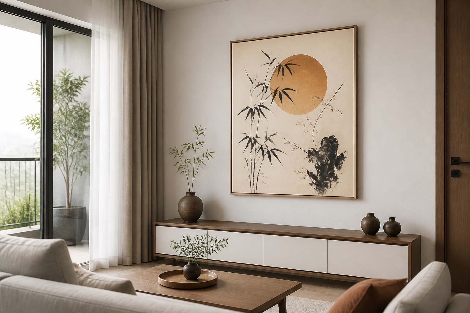
Living rooms are the natural home for geometric art combinations. A 3–5 piece set above a sofa at 145–160 cm eye level anchors the room and fills dead wall space without overwhelming conversation. Geometric and abstract living room wall art works because geometric shapes echo furniture edges and architectural lines, creating coherence.
Bedrooms suit smaller combinations (2–3 prints) flanking a headboard or stacked on a feature wall. The structure of geometric design promotes calm, unlike representational art that can feel busy before sleep.
Home offices and studios thrive on geometric combinations because the organized visual rhythm supports focus and creativity. A 3-piece abstract wall art set above a desk or filing console provides professional-looking backdrop without distraction.
Hallways and entry corridors benefit from linear or stacked combinations (tall, narrow format) that guide the eye forward and make tight spaces feel intentional rather than cluttered.
Avoid bedside tables and small powder rooms—these spaces are too tight for combinations; a single bold print works better there.
🖼️ Browse Décor Vie wall art
What to Check Before You Buy
- Wall colour and existing furniture tones – hold paint swatches and fabric samples against potential print designs; order samples if unsure.
- Natural light direction – morning light from the east softens geometric prints; afternoon west-facing light creates glare on glass-coated options.
- Exact wall measurements – use a tape measure; smartphone estimates are off by 5–10 cm. Rough sketches catch layout mistakes before order.
- Renter-friendly hanging – confirm your apartment lease allows picture hooks or adhesive strips; avoid drill holes if you're unsure.
- Humidity in your space – if bathroom or kitchen is adjacent (or if you live in a high-humidity zone like District 1, Ho Chi Minh City), lean toward glass-coated prints.
- Existing décor style – modern geometry suits minimalist, Scandinavian, or industrial interiors; warm-toned geometric works in eclectic or bohemian spaces.
Real Sizing Table: How Wide Should Your Combination Be?
Based on interior design proportion rules:
| Furniture width | Recommended art width | Example layout |
|---|---|---|
| 150–180 cm (small sofa) | 100–120 cm | 2×2 grid or stacked 3-piece |
| 180–220 cm (standard sofa) | 120–150 cm | 3–4 piece horizontal or mixed |
| 220+ cm (large sofa/console) | 150–200 cm | 4–5 piece salon-style or 2×2 grid |
Place the visual centre of your combination 15–25 cm above the top of your sofa cushion or furniture piece. If your sofa is 70 cm tall, that puts your art centre at 85–95 cm above the seat, or 155–165 cm from the floor—the comfort zone for the human eye.
Canvas prints and customisation are your foundation. From single geometric prints to 5-piece combinations, every format (stretched canvas, rolled, glass-coated, or fabric) is made-to-order to your exact specifications. We handle everything from design mockup to delivery across Vietnam—contact us to confirm lead time and final dimensions.
💬 WhatsApp/Zalo +84 775 017 977 for size and design advice
Geometric art combinations thrive on intentional colour, ratio balance, and room context. Use the frameworks here to plan, not guess. The difference between a "looks great" combination and a "why did I buy these together" mistake is 10 minutes of honest layout thinking before you order.
Pages from our team you may need
FAQ
Can I hang a geometric combination in a rented apartment without damage?
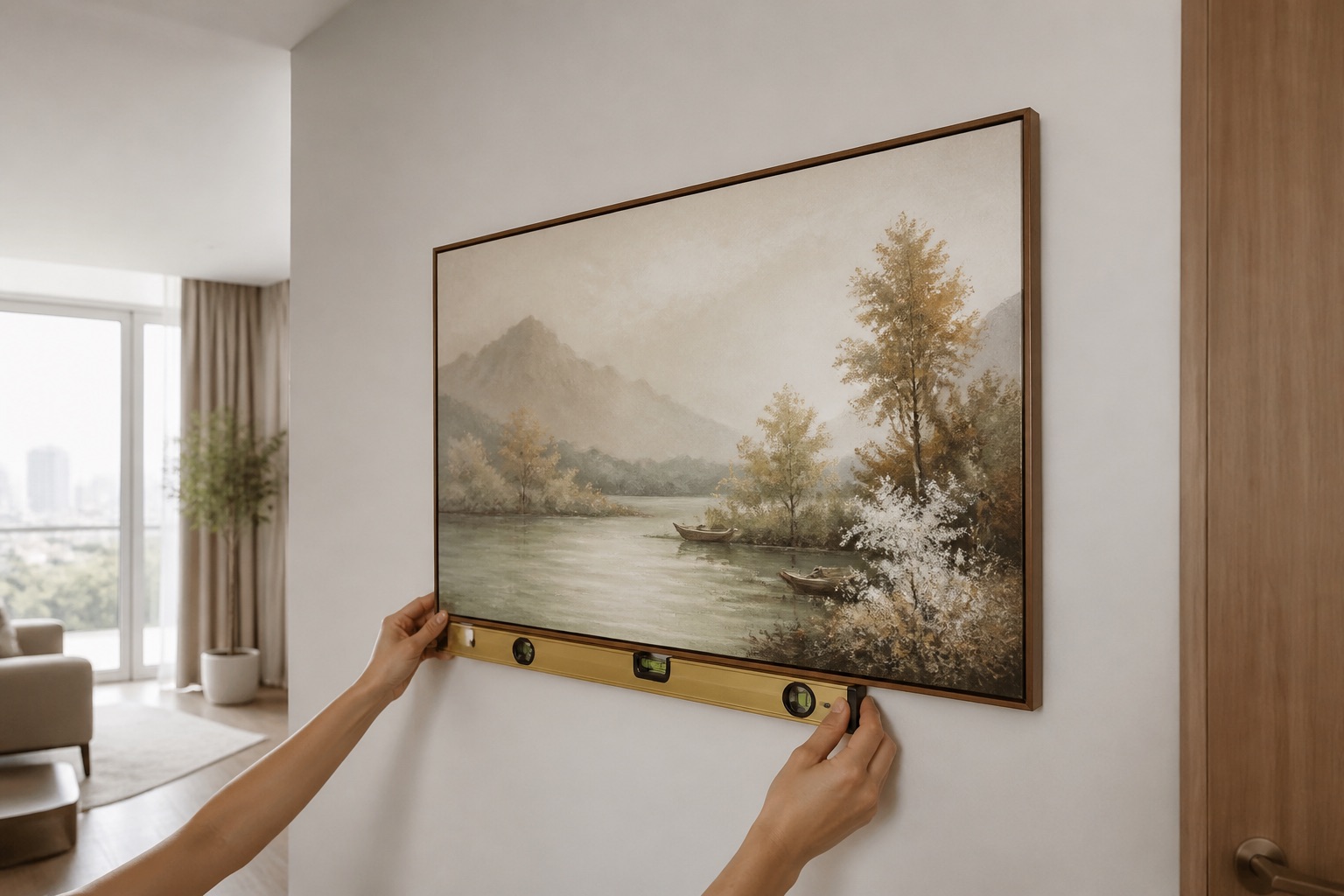
Yes—use adhesive picture hooks (rated for 2–3 kg per hook) or Command strips. Stacked and grid layouts are easiest because they distribute weight evenly. Avoid drilling custom mounts; check your lease first.
If I buy canvas and humidity ruins it, can I exchange it for glass-coated?
Contact us on +84 775 017 977 to discuss your specific situation. Canvas in high humidity may wrinkle slightly; glass-coated is immune. Plan ahead for tropical climates.
How much spacing should I leave between prints in a combination?
15–20 cm gap is standard and visually balanced. Too wide (>25 cm) fragments the grouping; too close (<10 cm) makes it feel crowded. Sketch it on paper to check.
What if my apartment walls are very warm (cream/beige) and I want cool-toned geometry?
Cool geometry (navy, grey, teal) can work on warm walls if you add a warm accent print (ochre, coral) to bridge them. Use one consistent secondary colour across all pieces to unify the palette.
Do I need matching frames if I order a 3-piece combination?
No—Décor Vie delivers prints unframed (canvas or glass-coated). You choose framing or hang directly. Keeping frames consistent (or frameless) is a design choice that strengthens the grouping.