
Fire Element Painting Color: Warm Hues for Décor Vie Canvas
Fire element painting colors are warm, energetic hues: deep reds, oranges, burnt sienna, and golds that symbolize passion, prosperity, and vitality in design. In Hanoi and Ho Chi Minh City apartments, these colors work best on canvas (cotton blend, stretched or rolled) or glass-coated prints (tempered glass with UV-resistant ink)—both resist humidity and fading. Fire tones suit living rooms, home offices, and accent walls; avoid bedrooms if you prefer calm. Décor Vie prints fire-element designs on these formats in sizes from small accents to 1.5-metre sets, with 1:1 (square), 1:2, 1:3, or 2:3 ratios to fit your wall. Avoid oversaturating small rooms—fire colors work best when balanced with neutral trim or artwork in adjacent spaces. Contact us on +84 775 288 777 for a quote by size and style. 💬 WhatsApp/Zalo +84 775 288 777 for size and design advice
What fire colours actually work in modern interiors?
Deep reds, burnt orange, terracotta, mustard gold, and warm amber are the fire palette—not neon or artificial tones. These sit comfortably in contemporary, industrial, and culturally inspired rooms without overwhelming. Soft rusts pair well with whites and greys; bold crimsons anchor accent walls. In humid Hanoi apartments, saturated reds can fade if printed on low-grade canvas; Décor Vie uses archival inks on premium cotton-blend canvas and tempered glass to hold colour for years. Test a sample in your room's natural light before committing to a large multi-piece set.
🖼️ Browse fire-inspired canvas prints
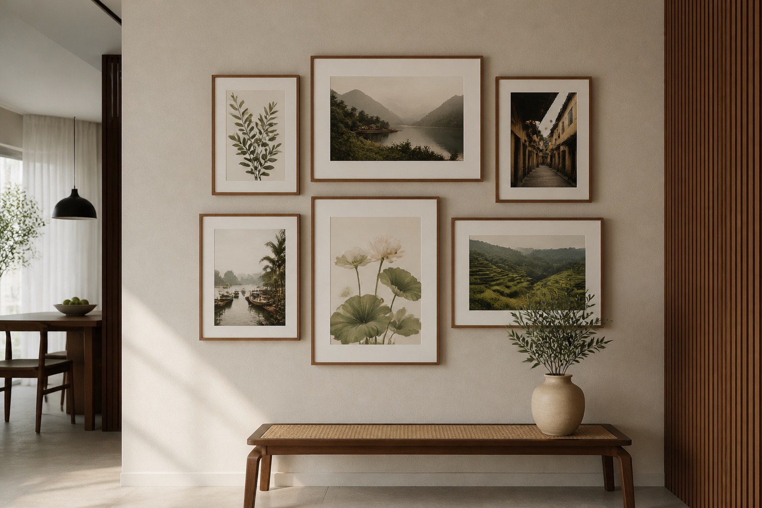
Canvas vs. glass-coated: which handles Hanoi humidity better?
Canvas breathes and softens over time; glass-coated prints (tempered-glass finish, also called crystal prints) are sealed and wipeable. In tropical apartments with air-con cycling, glass-coated wall art resists moisture and dust far better—no yellowing, easy to clean with a dry cloth. Canvas is gentler on bold reds and golds; glass adds a glossy, premium depth that intensifies warm tones. For bedrooms or kitchens near windows, glass-coated is safer; for living rooms with stable humidity, canvas offers a classic feel. Both formats accept fire-element designs in stretched, rolled, or fabric-print varieties. Choose based on your wall's light and touch frequency.
Which room suits fire element colours best?
Living rooms: Fire colours energize conversation zones; centre artwork at 145–160 cm height, two-thirds the width of your sofa (typically 1.5–2 m canvas for a 2–2.5 m sofa). Home offices: warm golds and burnt oranges boost focus without agitation—1:1 square prints (60–80 cm) work above desks. Hallways and entryways: single or 2-piece sets in flame tones create a welcoming threshold. Avoid master bedrooms unless you sleep deeply unaffected by stimulating colour; fire tones can disturb rest. Dining areas: deep reds paired with metallic accents (think Vietnamese silk or gold trim) honour tradition while feeling contemporary. Décor Vie living room wall art includes fire-toned landscapes, abstract designs, and culturally rooted motifs in all formats.
🖼️ Browse living room wall art
How do fire colours match Vietnamese design heritage?
Vietnam's traditional aesthetic—lotus (deep reds in silk painting), Hoi An lanterns (gold and crimson), sunset rice fields—naturally align with fire-element palettes. Many expats and local collectors blend these cultural references with modern interiors: a 3-piece set of abstract burnt-orange canvas above a minimalist sofa, or a single glass-coated print of stylized lanterns in warm gold tones. Fire-inspired feng shui wall art need not mean superstition; it's colour psychology and cultural resonance. Décor Vie offers abstract interpretations, photographic rice-field scenes in warm light, and modern takes on traditional motifs—all in fire tones—suitable for rented apartments (easy hanging, no damage) and permanent homes alike.
Sizing table: fire-element paintings for your wall
| Room | Wall Width | Recommended Art Width | Art Ratio | Height from Floor | Notes |
|---|---|---|---|---|---|
| Small living | 2–2.5 m | 1.2–1.5 m | 1:2 (wide) | 145 cm centre | 2-piece or single landscape |
| Master bedroom | 2–2.5 m | 1–1.2 m | 1:1 or 2:3 | 160 cm centre | Lower, softer fire tones if used |
| Home office | 1.5–2 m | 60–80 cm | 1:1 | 140 cm centre | Above desk, motivating but calm |
| Hallway | 1–1.5 m | 50–70 cm | 1:1 | 150 cm centre | Single or 2-piece sets |
| Dining zone | 2.5–3.5 m | 1.5–2 m | 1:3 (tall) | 150–160 cm | 3-piece or accent with metallics |
Place artwork 20–30 cm above furniture (sofa, bed, desk). If your wall is under 150 cm wide, choose a single small print (45–60 cm) rather than a cramped 2-piece set.
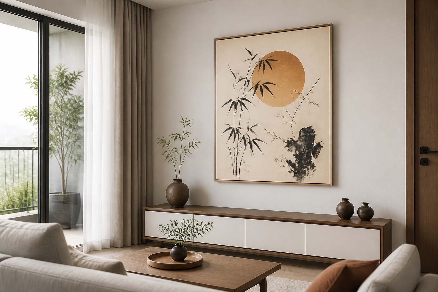
What fire-colour mistakes renters make—and how to avoid them
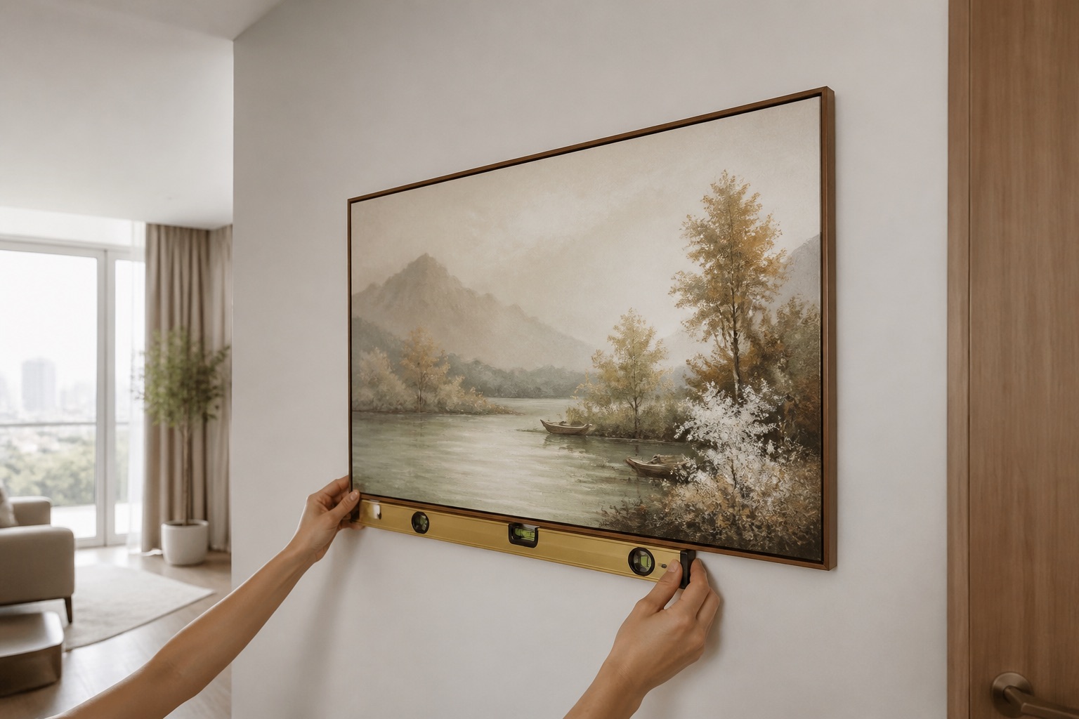
Mistake 1: Hanging fire-toned art on white walls in weak daylight—it looks dull and cold. Solution: position near a window or under supplementary warm lighting. Mistake 2: Oversizing—a 1.5 m red canvas can dominate a small studio. Measure first; most rentals suit 60–90 cm prints. Mistake 3: Using heavy frame nails on plaster: fire-art already demands attention; shoddy hanging cheapens it. Use wall-safe command strips or secure adhesive picture hooks rated for canvas weight. Mistake 4: Pairing fire tones with cool blue or purple accents—the clash fatigues eyes. Keep trim, rugs, and secondary art in warm neutrals (cream, grey, natural wood) or complementary warm tones (sage, terracotta accessories). Décor Vie canvas (stretched or rolled) and glass-coated prints hang cleanly on rented walls; remove without damage if you use correct hardware.
💬 WhatsApp/Zalo +84 775 288 777 for size and design advice
Colour balance: fire without overwhelming
A 1.5 m burnt-orange 3-piece wall art set demands visual rest nearby. Pair it with neutral sofas (white linen, grey knit), natural wood frames, and minimal accessories to let the art breathe. In open-plan apartments, fire art in the living zone should not clash with cooler tones in a kitchen beyond; use a half-wall or furniture grouping as a visual break. For collections, choose one fire-element piece as the anchor; secondary art in blacks, whites, or earth neutrals prevents visual fatigue. Lighting also shifts perception: afternoon sun deepens warm tones; cool LED can flatten them. If your apartment has fixed cool-white bulbs, opt for deeper reds and golds rather than pale oranges.
Abstract vs. representational fire art for your space
Abstract fire-toned paintings (gestural reds, layered gold washes, burnt-sienna swirls) suit modern, minimalist, and industrial rooms—no "reading," pure colour and emotion. Representational art (sunset landscapes, Hoi An lanterns, stylized flames, rice fields in warm light) tells a story and pairs well with eclectic, cultural, or traditional interiors. For offices, abstract sharpens focus without distraction. For living rooms, representational invites conversation. For hotels and commercial projects, Décor Vie art for hotels combines both: bold fire tones with subtle imagery that doesn't compete with furniture or guest attention. Single pieces frame conversation; 2–3 piece sets create rhythm. Choose based on your room's energy and how much visual narrative you want.
🖼️ Browse abstract wall art
What to check before you buy
✓ Measure your wall (width, height, distance from seating). Use the sizing table above. ✓ Check lighting: sunrise/sunset light warms fire tones; cool LED or north-facing walls may need deeper, more saturated reds. ✓ Decide format: canvas for softness and tradition; glass-coated for humidity resistance and modern sheen. ✓ Pick ratio: 1:1 (square) is versatile; 1:2 (landscape) suits sofas; 1:3 (tall) accents narrow walls. ✓ Consider your style: abstract for modern, representational for cultural/eclectic. ✓ Test one piece first: order a single 60–80 cm print, live with it for two weeks, then decide on a larger set. ✓ Confirm hanging hardware for your wall type (plaster, concrete, timber—common in Hanoi/HCMC rental apartments).
Contact us on +84 775 288 777 for a free design consultation by size and room type.
💬 WhatsApp/Zalo +84 775 288 777 for size and design advice
FAQ
Can I hang fire-element art in a small studio apartment without it feeling cramped?
Yes. Choose a single 60–70 cm print (1:1 ratio) or a 2-piece 1:3 set hung vertically. Avoid 1.5 m+ sizes. Pair with neutral walls (white, soft grey) and minimal furniture; the focused art becomes a feature, not an assault.
Does fire-colour art fade faster in Hanoi's humidity?
Not on Décor Vie canvas and glass-coated prints. We use archival UV-resistant inks. Canvas may yellow slightly after 3–5 years in direct sun; glass-coated resists fading indefinitely. Both outlast lower-grade alternatives commonly sold online.
What's the feng shui reason fire colours matter in Vietnamese homes?
Fire (red, gold, orange) symbolizes prosperity and energy in classical feng shui—a cultural reference, not a promise. Practically, warm tones energize living zones and home offices. Use them because they suit your style and room function, not for luck alone.
Can I use fire colours in a north-facing room that rarely gets direct sun?
Yes, but choose deeper reds, burnt sienna, or gold rather than pale orange. Pair with warm LED lighting (2700K) or additional table lamps. Cold daylight will mute fire tones; warm bulbs restore life. Test a sample before ordering large sets.
What's the difference between canvas and glass-coated prints for fire colours?
Canvas softens and absorbs warm tones warmly; glass-coated (tempered-glass crystal finish) reflects light and intensifies colour, adding sophistication. Canvas is forgiving in imperfect light; glass-coated demands stable, ideally warm lighting to shine. Both resist humidity; glass is easier to clean.
How large should fire-art be above my sofa?
Roughly 1.2–1.5 m wide (two-thirds your sofa width). Centre it 20–30 cm above the sofa back. If your sofa is 2.5 m, aim for a 1.5 m canvas or 3-piece set totalling that span. Smaller sofas (under 2 m) suit 80–100 cm single prints.
Can I use fire colours in a bedroom without it keeping me awake?
Fire tones can stimulate. If you sleep lightly, avoid bedrooms or use very muted burnt-orange and terracotta in small 50–60 cm single prints high on the wall (above head height). Most people tolerate it; test with a temporary poster first.