
Feng Shui Meaning in Abstract Art: How to Choose
Feng shui is a 3,000-year-old Chinese philosophy about arranging space to encourage positive energy flow (qi). In abstract art, feng shui meaning doesn't require dragons or bamboo—it lives in colour, shape, and composition. A balanced abstract print uses complementary colours, asymmetric but stable forms, and negative space to suggest movement without constraint. Modern abstract designs on canvas or glass-coated prints work because they let you read intention into them: warm tones and upward lines suggest growth; cool blues and horizontal flows suggest calm. At Décor Vie, we produce custom-printed wall art in Hanoi—canvas (stretched or rolled), glass-coated (crystal finish), and fabric prints—allowing you to choose a design and format that matches both your wall space and the energy you want to invite. The key is selecting an abstract piece that you respond to emotionally; that alignment is itself the feng shui principle at work, not superstition but intentional living.
Does abstract art actually align with feng shui principles?
Yes—feng shui cares about balance, flow, and intention, not imagery. A geometric abstract in soft greys and sage green can embody earth and stability just as much as a literal landscape. The difference is that abstract art doesn't tell you what to feel; it lets you feel what you need. This is powerful in feng shui terms: you're not importing someone else's symbolic meaning, but activating your own. Colour choice matters far more than a recognizable subject. Cool tones (blues, purples) are calming and yin; warm tones (oranges, reds) are energizing and yang. A balanced abstract piece uses both, or sits in a neutral range (greys, creams, soft teals). Abstract wall art in modern homes works because it respects the feng shui concept of "less is more"—no clutter, no excess symbolism, just intentional visual weight.
How do I choose the right colours for my room's feng shui?
Identify the room's purpose, then match abstract art colours to support that energy. Bedrooms need yin (cool, restful): blues, purples, pale greens, soft greys. Bedroom wall art in these tones encourages sleep and renewal. Living rooms benefit from balanced or yang energy: warm neutrals, ochres, soft terracottas, cream—colours that invite conversation and ease. Living room wall art in these ranges feels welcoming without agitation. Home offices work best with grounded, focused tones: deep teals, warm greys, soft sage, or even muted gold accents that suggest clarity and calm productivity. Avoid bold reds or high-saturation oranges unless you work in a field that thrives on energy and urgency. When you receive your custom print, check it in natural daylight and evening light; Hanoi's humidity and angle of sun shift how colours read throughout the day. If a print feels off once hung, contact us on +84 775 017 977 for a quote by size to explore alternatives.
💬 WhatsApp/Zalo +84 775 017 977 for size and design advice
What's the difference between canvas and glass-coated prints for feng shui spaces?
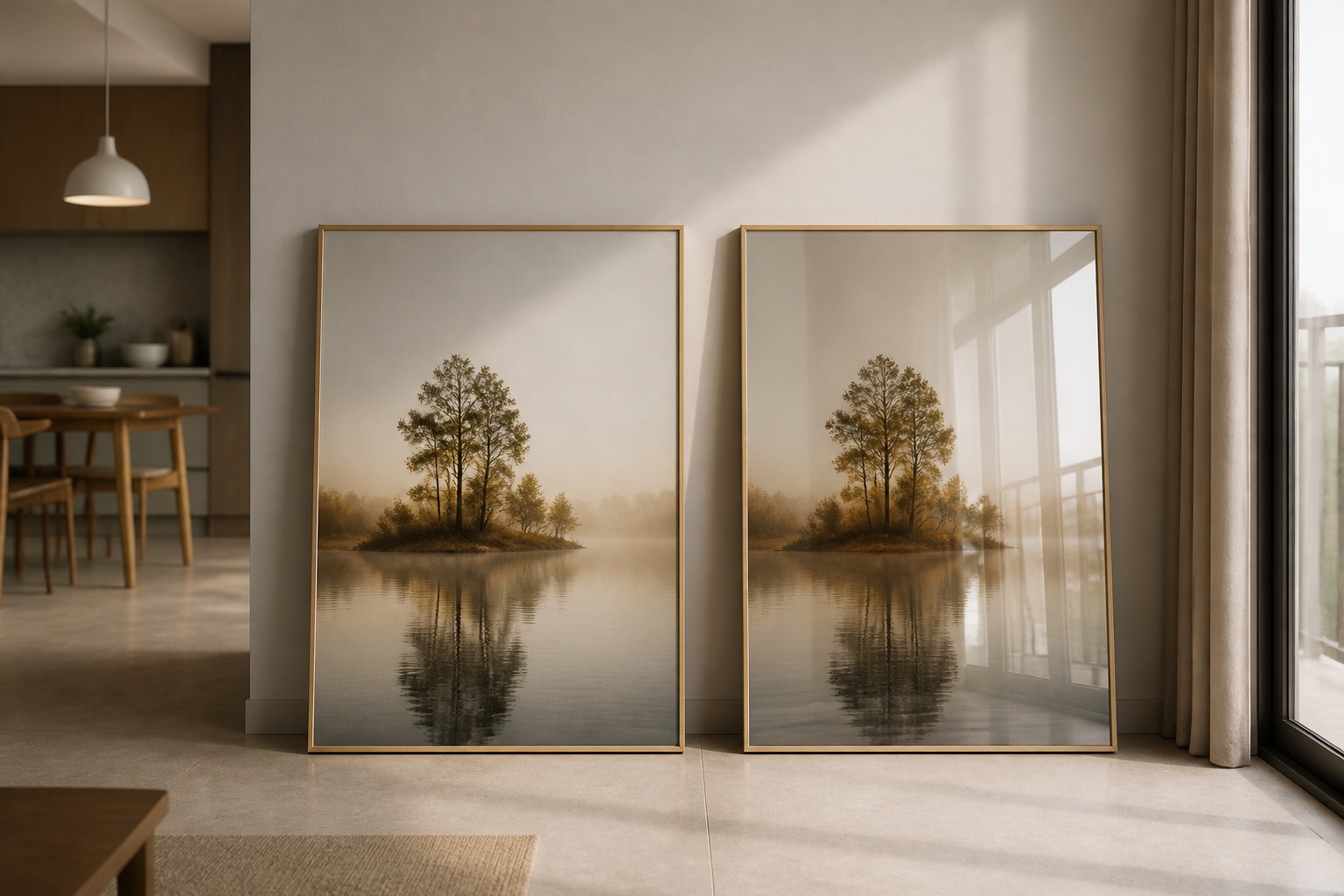
Canvas absorbs light and feels warm, grounding—suitable for bedrooms and intimate spaces where you want softness. Glass-coated wall art (tempered-glass crystal finish) reflects light, adding sparkle and airiness—ideal for living rooms, offices, and bright walls where you want visual lift. Canvas prints are matte; they don't create glare or reflections. In Hanoi's humid climate, canvas can hold moisture if not ventilated; glass-coated prints are easier to clean and more resistant to humidity, making them practical for kitchens, bathrooms, or ground-floor apartments. From a feng shui perspective, canvas feels more yin (soft, internal), glass-coated more yang (reflective, expansive). Your choice depends on the room's existing energy: if it's already calm, glass-coated adds beneficial movement; if it's restless, canvas grounds. Both are equally valid—pick based on the wall, light, and how the room feels when you're in it.
| Format | Finish | Humidity Resistance | Glare | Best For |
|---|---|---|---|---|
| Canvas (stretched) | Matte | Moderate | None | Bedrooms, intimate spaces, soft aesthetic |
| Canvas (rolled) | Matte | Moderate | None | Easy transport, storage before hanging |
| Glass-coated print | Glossy, mirrored | High | Minimal if angled correctly | Living rooms, bright walls, moisture-prone areas |
| Glass-coated canvas | Mixed texture | High | Low | Modern hybrid feel, texture + durability |
How should I size abstract art to balance a room's feng shui?
Proper sizing is about visual proportion and centre height, not superstition. Art should occupy roughly two-thirds the width of the furniture below it (sofa, bed, console). Centre the piece at 145–160 cm from the floor—this is eye level for most seated or standing viewers and feels natural. For a 2.4 m wide living room sofa, choose a 3-piece or 5-piece abstract set totalling about 1.5–1.8 m wide, or a single large canvas 1.2–1.5 m wide. Too small, and the wall feels empty; too large, and the space feels cramped—both disrupt flow. In a bedroom, a 3-piece wall art set above a 1.6 m bed works well: total width 1.2–1.4 m, hung 20–30 cm above the headboard. Measure your wall and furniture first, then contact us to discuss sizes. Hanoi apartments often have lower ceilings (2.4–2.6 m); tall vertical abstract pieces can feel oppressive. Horizontal or square abstracts are safer choices. Browse Décor Vie wall art to see sizing guides and decide between single, 2-piece, or multi-piece sets before ordering.
🖼️ Browse Décor Vie wall art
What abstract art mistakes disrupt feng shui flow in a home?
Common errors: hanging art too high (above 180 cm—it floats away), too small (looks insignificant), too asymmetrical without balance (feels chaotic), or choosing colours that clash with the room's mood instead of supporting it. Never hang abstract art directly above a bed at an angle where it could fall; ensure secure mounting. In rented apartments, use damage-free adhesive strips or hooks rated for your wall type; ask your landlord first. Dark, muddy abstracts in already-dim Hanoi apartments can feel heavy—pair them with good side lighting. Avoid four identical pieces on one large wall; use groups of 2 or 3 for visual interest. The biggest mistake: choosing art because someone said it's feng shui, not because you feel drawn to it. Intention—your genuine connection to the piece—is what feng shui is actually about. If abstract art makes you pause and feel grounded, that's the right choice. Trust your instinct over rules.
Can I hang abstract art in a rented apartment without permanent damage?
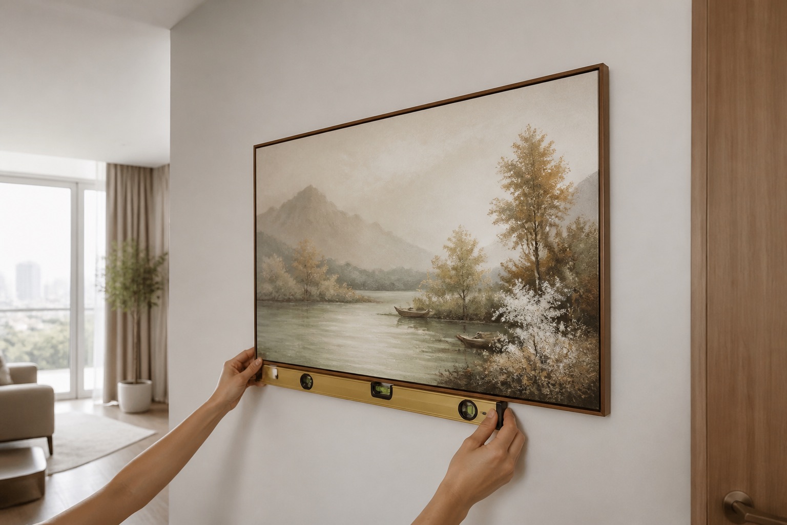
Yes—use adhesive strips, picture rails, or magnetic systems rated for your wall weight. For canvas prints under 2 kg, 3M Command strips (available in Hanoi) hold reliably for 6–12 months. For heavier glass-coated prints, use a stud finder to locate support behind drywall, or consult your landlord about temporary wall mounts. Never drill or hammer. Remove strips slowly at a 45° angle to avoid paint damage. Fabric prints and lighter canvases are safest choices for rented spaces because they're lower weight and lower risk. When you move, store canvas rolls flat in a dry cupboard; glass-coated prints pack flat too. At Décor Vie, we pack all prints securely for shipping across Vietnam—the same care applies to storage. Document your wall before hanging and after removal with photos for your rental deposit. If you're unsure about your wall type (concrete, drywall, tile), contact us on +84 775 017 977 for size and design advice and describe your space; we'll recommend the best format and hanging method.
💬 WhatsApp/Zalo +84 775 017 977 for size and design advice
What to Check Before You Buy
- Measure your wall and furniture; know the exact width and height available.
- Test the colour: view sample images in your room's morning and evening light, or request a small proof if unsure.
- Decide: canvas (soft, matte, warm) or glass-coated (bright, reflective, durable)?
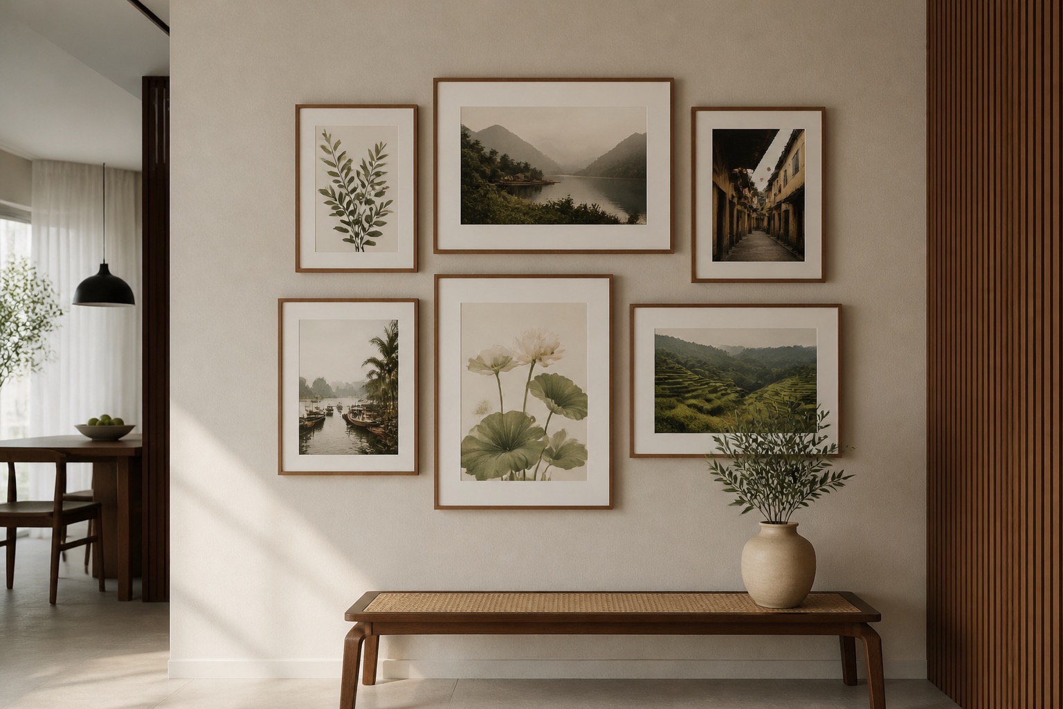
- Single piece or multi-piece set? Multi-piece sets (2, 3, 4, or 5 pieces) offer flexibility and visual interest; single large prints are bold and minimal.
- Check hanging hardware: do you have permission (rented) or do you need damage-free solutions?
- Confirm delivery timeframe and return terms; contact us to confirm.
FAQ
Does feng shui abstract art have to match my existing décor colours?
No. Intentional contrast can work beautifully—a cool-toned abstract on a warm-neutral wall, or vice versa. What matters is that the art feels balanced in the room, not jarring. If you're unsure, choose tones one shade lighter or darker than your wall or furniture; this creates harmony without boredom.
Can I use abstract art in multiple rooms, or does each room need different feng shui art?
Different rooms benefit from different energies. A energizing abstract in the living room might overstimulate a bedroom. Consider the room's function: calm for bedrooms, balanced for living areas, grounded for offices. You can echo a colour across rooms while choosing different compositions for each space.
Is rolled canvas less feng shui-friendly than stretched canvas?
No. Rolled canvas is stretched and mounted on the wall exactly the same way. The only difference is packaging and storage—rolled canvas is easier to ship and store. Once hung, there's no difference in appearance or energy flow.
What if I hate the abstract art once it arrives?
You have a 30-day smile guarantee. If a piece doesn't feel right in your space, reach out; we'll work with you on alternatives. Feng shui is personal—the art has to resonate with you, not follow a rule.
Can abstract art fix feng shui problems in my apartment (bad layout, low light, cramped)?
Abstract art supports your intentional living, but it's not magic. Good feng shui also depends on furniture layout, natural light, ventilation, and decluttering. Use art as one tool among many: position your sofa to face the door, let light in, keep surfaces clear. Art amplifies the feeling of a well-arranged space, not replace it.
How do I know if an abstract design is "balanced" in feng shui terms?
Look for visual weight distributed across the frame (not all dark on one side), a mix of warm and cool tones if possible, and open space that lets your eye rest. Asymmetry is fine—even preferred—as long as it feels stable, not tilted. If a piece makes you feel calm or energized (depending on your intent), it's balanced for you.