
Fabric Canvas Art for Kitchens: Bright Colors That Last
Fabric canvas prints are cotton-blend textiles stretched over wood frames, designed to withstand kitchen moisture better than paper. Bright colors work best in kitchens when they complement natural light, cabinet finishes, and backsplash tones—not fight them. For a 2 m × 1 m kitchen wall, a single 100 cm print or a 2-piece set (each 70–80 cm) centered 150–160 cm from the floor works. Décor Vie offers fabric prints in stretched (canvas-ready appearance) or rolled formats, with custom sizing. Avoid oversaturated yellows or reds that clash with stainless-steel appliances; instead, choose sage greens, warm neutrals, or terracotta. Humidity in Hanoi and Ho Chi Minh City requires regular dusting; fabric handles condensation better than paper but resists it less than glass-coated prints. Contact us on +84 775 017 977 for a quote by size.
Why Does a Kitchen Need Bright Art Instead of Dark?
Kitchens are task spaces with hard-edged appliances and surfaces. Bright art softens that geometry and lifts the energy. Dark or muted prints recede into stainless steel and tile; bright colors create visual interest and make the room feel larger. Choose warm brights (apricot, chartreuse, coral) if your cabinets are cool-toned wood or white. Pick cool brights (sage, dusty blue, cream) if your cabinetry is warm oak or walnut. Brightness doesn't mean neon—it means saturation and clarity that read across a 2–3 m sightline without strain.
💬 WhatsApp/Zalo +84 775 017 977 for size and design advice
What Size Fabric Print Fits a Kitchen Wall?
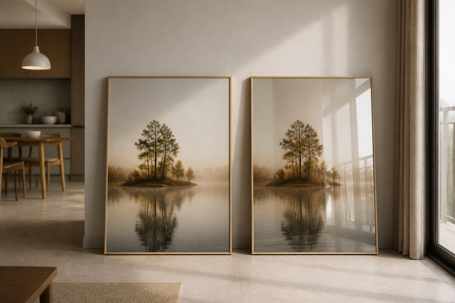
Kitchen walls vary, but most accent walls (above a worktop, beside a fridge, or over an open shelf) range 1.5–2.5 m wide and 1.2–1.6 m tall. Art should occupy about two-thirds of wall width. A 1.8 m wide wall suits a 100–120 cm single print or a 2-piece set (70 cm each, 10 cm gap). Smaller kitchens (1.2 m walls) work with 60–80 cm single prints. Mount the center 150–160 cm from the floor, about 20–30 cm above a countertop or island. A 3-piece or 4-piece set spreads visual weight and suits open-plan kitchens where the art bridge the cooking and dining zones. Browse sizing options on our canvas collection page for custom dimensions.
How Do Bright Colors Stay Vibrant in Humid Kitchens?
Kitchen humidity—from steam, cooking, and ventilation—fades printed colors over time. Fabric canvas handles moisture better than paper because it's woven cotton with sealed edges; ink sits deeper in the fibers. However, glass-coated prints (crystal or tempered-glass finish) outperform fabric in kitchens because the glass layer blocks water vapor and UV light, keeping colors sharp for 10+ years with minimal fading. Fabric prints in Hanoi and Ho Chi Minh City kitchens last 4–6 years before subtle fading, especially if the room lacks a range hood. Dust fabric prints monthly with a dry microfiber cloth. Never use water, cleaners, or steam near fabric art. If your kitchen has an east or west window with direct afternoon sun, glass-coated is worth the investment.
| Print Type | Humidity Resistance | Color Durability | Cleaning Ease | Best For |
|---|---|---|---|---|
| Fabric Canvas | Moderate | 4–6 years | Dry cloth only | Traditional, warm kitchens |
| Glass-Coated | High | 10+ years | Damp cloth safe | High-moisture, modern kitchens |
| Rolled Canvas | Moderate | 4–6 years | Dry cloth only | Renters, easy transport |
What Bright Colors Pair Best with Common Kitchen Styles?
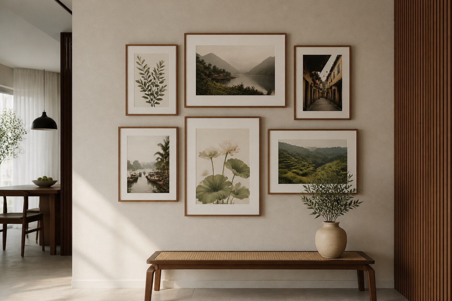
Modern minimalist kitchens (white cabinets, gray tile, stainless steel): sage green, dusty blue, or warm taupe. Avoid orange or hot pink—they clash with the cool palette.
Warm wood kitchens (oak, walnut, natural finishes): apricot, chartreuse, cream, soft terracotta. Dark colors (navy, forest green) also work but feel heavier.
Mediterranean or tropical kitchens (terracotta, blue tile): deep turquoise, burnt orange, cream. Bright citrine or coral risks saturation.
Industrial kitchens (concrete, exposed brick, steel): charcoal gray with bright coral or lime accents. Single-color prints in muted brights (sage, blush) also suit the aesthetic.
Bring a phone photo of your cabinets and backsplash when you contact us; we can suggest two or three print designs that read bright without overwhelming the space.
🖼️ Browse Décor Vie wall art to see our full range of kitchen designs.
How Do I Avoid Common Mistakes When Hanging Bright Canvas?
Mistake 1: Placing art too high. A print centered 180 cm or higher looks like it's floating above the kitchen; 150–160 cm is natural eye level from a standing cook.
Mistake 2: Choosing a print that's too small. A 50 cm print on a 2 m wall vanishes. Aim for 50–70% of wall width.
Mistake 3: Pairing bright colors with busy backsplash or countertop. If your tile or stone is patterned, choose art in one dominant color or tone-on-tone design. Competing patterns tire the eye.
Mistake 4: Hanging unprotected canvas near a stove. Fabric absorbs steam and grease. Mount 1 m away from the cooking zone, or use glass-coated instead.
Mistake 5: Ignoring light direction. North-facing kitchens look cool; south-facing kitchens look warm. If your kitchen is dim (north-facing), warm brights (coral, gold, apricot) brighten it. Bright-lit south kitchens suit cool brights (sage, aqua).
Before You Buy: A Quick Checklist
- Measure your wall width and height; note cabinet and appliance placement.
- Photograph your cabinets, countertop, and backsplash in natural light.
- Decide: single print, 2-piece, or 3-piece set?
- Choose a bright color that harmonizes, not clashes, with existing finishes.
- Assess humidity: does your kitchen have a range hood or window ventilation?
- If humidity is high and you want 10+ years of color, compare fabric vs. glass-coated prices.
- Confirm custom sizing availability before ordering.
💬 WhatsApp/Zalo +84 775 017 977 for size and design advice
For living room wall art that also uses bright fabrics, or abstract designs suited to kitchen environments, we offer the same quality and durability. If you're furnishing a hotel, restaurant, or office kitchen, explore our project services.
FAQ
Can I use fabric canvas directly above a stove?
No. Steam and grease stain and weaken fabric fibers. Mount art at least 1 m away from cooking heat, or choose glass-coated prints instead.
Will my bright fabric canvas fade in a south-facing kitchen?
Gradually. South-facing light accelerates fading; expect 3–4 years of vibrant color. Glass-coated prints resist UV and last 10+ years in the same light.
What's the difference between stretched and rolled fabric canvas?
Stretched fabric comes on a frame, ready to hang. Rolled canvas arrives flat and must be stretched or framed by you. Both use the same fabric; stretched is quicker to install.
How often should I clean bright canvas art in a kitchen?
Dust monthly with a dry microfiber cloth. Never spray water or cleaners on fabric. If grease builds up, contact us; aggressive wiping can damage the print.
Does a 2-piece or 3-piece set work better than a single large print?
Both work. Single large prints (100–140 cm) suit wider walls and make a bold statement. 2- or 3-piece sets create rhythm and work in long, narrow kitchens or above islands.