
Earth Element Person Painting Color: Warm Hues for Balanced Walls
If you're an earth element person (grounded, stable, nurturing), warm, earthy tones anchor your home best: ochre, terracotta, burnt sienna, warm gold, and soft beige. In Feng Shui tradition—a cultural framework many Vietnamese and expat residents use—earth corresponds to late-summer energy, stability, and harmony. Rather than decorative superstition, think of it as a psychology of colour: these tones feel naturally calm and trustworthy. Canvas prints and glass-coated wall art in these palettes work equally well; canvas absorbs Hanoi's humidity slightly; glass-coated resists it. At Décor Vie, we offer these hues across single pieces, sets (2–5 panels), and round formats. The right choice depends on wall size, light direction, and room function—not on "luck," but on how colour moves through your space. Contact us on +84 775 017 977 for a quote by size and style preference.
Which Warm Colors Suit Earth Element Energy?
Earth element aesthetics centre on stability and groundedness. The core palette includes ochre (muddy gold-yellow), terracotta (warm brick-red), burnt sienna (deep rust), warm sand tones, and soft caramel. These hues don't shout; they anchor. If your home receives afternoon light, terracotta deepens richly; north-facing rooms suit warmer ochres to balance cool shadows. The key is depth, not brightness—muted, natural tones, never fluorescent versions. Avoid pure yellows (fire element) and cool greys (water); instead, layer warm neutrals. This creates a coherent, restful backdrop without feeling heavy or dated.
💬 WhatsApp/Zalo +84 775 017 977 for size and design advice
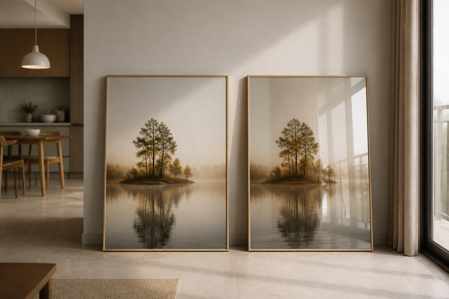
Does Canvas or Glass-Coated Finish Work Better for Warm Earth Tones?
Canvas absorbs light, deepening warm hues naturally; glass-coated (crystal) prints reflect light slightly, adding a subtle luminosity. In humid Hanoi or Saigon apartments, glass-coated resists moisture damage better—no mould risk on the print itself. Canvas, sealed with our standard treatment, handles typical humidity well if hung away from air-conditioner direct spray and bathroom steam. Warm earthy tones hide dust slightly better on canvas; glass-coated looks pristine but shows fingerprints more visibly (easy to wipe clean with a soft cloth, though). For bedrooms, canvas feels cosier; for living rooms or projects requiring durability, glass-coated excels. Neither option is "wrong"—it's about your room's humidity level and aesthetic preference.
How Do You Match Painting Color to Your Existing Furniture and Light?
Decision Framework: The 70% Rule
Measure the wall and furniture tones first. If your sofa is neutral (grey or beige), earth-toned art becomes the focal point—go bold with deep terracotta. If your sofa already has warm undertones, choose art that's one shade deeper or lighter than the sofa, never identical. This creates visual layering.
For wall colour: if walls are white or off-white (standard in most Vietnam apartments), warm earthy art pops naturally. If walls are already painted warm (cream, pale ochre), choose art 2–3 shades deeper to avoid a washed-out blend.
Light direction matters:
- Morning (east) light: ochre and warm gold deepen richly.
- Afternoon (west) light: terracotta stays vibrant; avoid overly dark burnt sienna (risk of heaviness).
- North-facing (cool, indirect): warm caramels and ochres compensate.
A simple test: take a phone photo of your sofa and walls in midday light. Open our collections page on the same screen. If the art's warmth sits between your wall and sofa tones, it's balanced.
| Room Type | Ideal Earth Tone | Canvas vs Glass-Coated | Why It Works |
|---|---|---|---|
| Bedroom | Warm sand, soft ochre | Canvas (cozier feel) | Relaxation; avoids gloss fatigue |
| Living room | Terracotta, burnt sienna | Glass-coated (durability, visual impact) | Humidity-resistant; colour pops |
| Dining room | Caramel, deep gold | Either (depends on light) | Appetite-friendly warmth |
| Home office | Ochre, warm beige | Canvas (reduces eye strain) | Grounding without distraction |
What Sizes and Formats Work for Earth-Toned Wall Art?
Wall size determines format. The classic rule: art should span about 65–75% of furniture width below it. For a sofa 2m wide, choose a 1.3–1.5m-wide piece (single canvas or 2-piece set). Round prints (1:1 ratio) suit accent walls or narrow hallways. 2–3 piece sets create rhythm; 4–5 piece sets work in open-plan spaces (kitchen + living room, for instance).
Height matters too: centre the art at approximately 145–160 cm from the floor. Hang it 20–30 cm above a sofa backrest or bed headboard. Rented apartments? Use damage-free hanging strips (available locally) rather than nails—they hold our standard canvas securely and leave no marks when removed.
Browse our 3-piece wall art sets to compare aspect ratios. Contact us on +84 775 017 977 to confirm sizing for your exact wall and furniture layout.
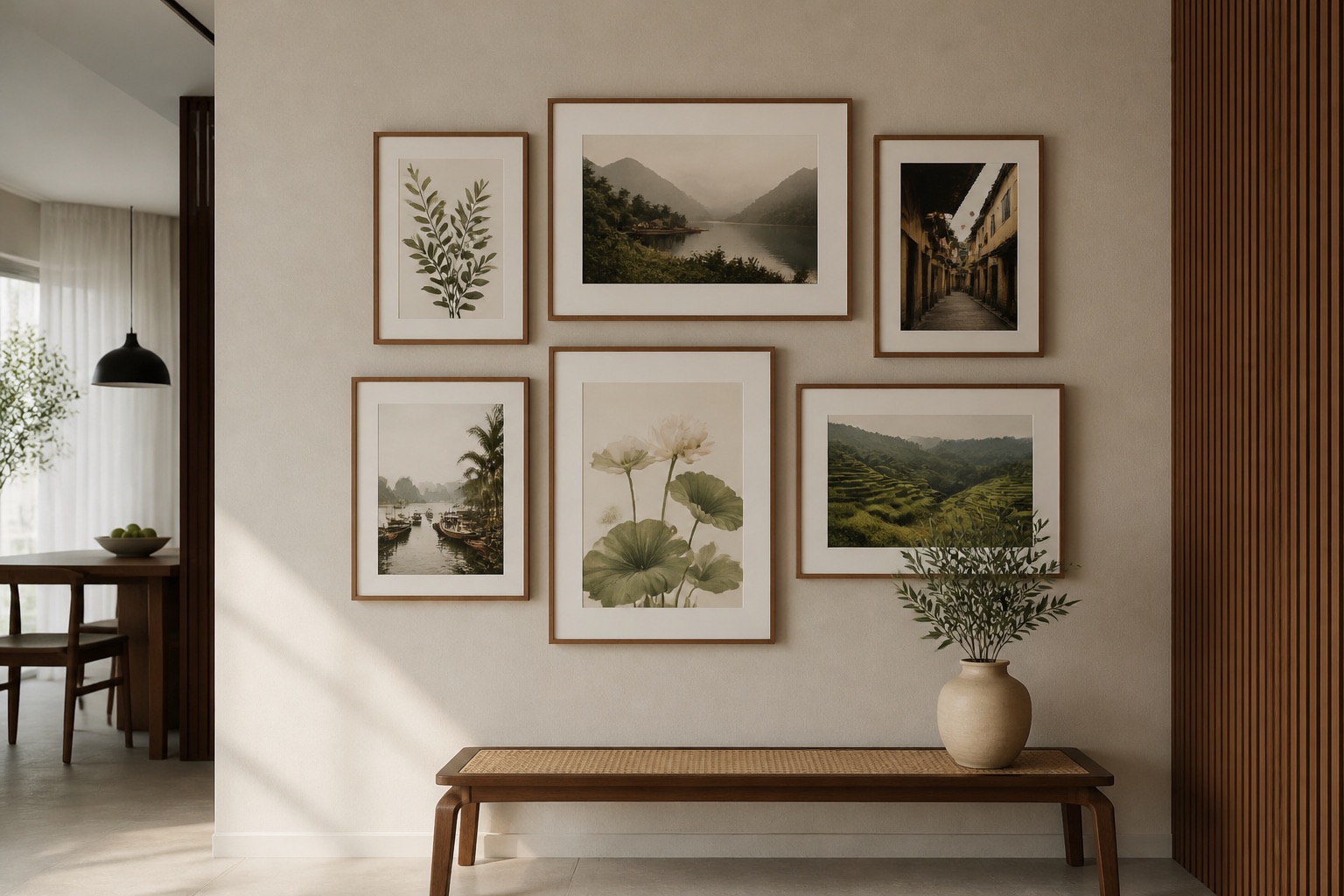
Can Earth-Toned Art Work with Feng Shui Principles Without Superstition?
In Vietnamese tradition, earth element corresponds to the centre and four diagonal zones of a space—not "luck," but spatial balance. Decorators and residents use it as a design language. An earth-toned feng shui wall art collection suits living rooms (the gathering zone, naturally earth-grounded) and bedrooms (stability, rest). The logic is practical: warm, stable colours create calm neurologically. Corner spaces (south-west, centre) are where earthy hues traditionally "settle" in a room—so if your sofa faces a corner, place art there.
Avoid: treating it as a magic cure. Avoid: choosing only by zodiac ("I'm a dragon, so I need red"). Instead, use it as a framework for intentional, coherent colour choice—which any interior designer, Vietnamese or not, would recommend. The result is a thoughtful room, not a superstitious one.
What Should You Check Before Buying Earth-Toned Wall Art?
- Humidity in your apartment: Is the wall above a radiator or AC unit? Behind a door that opens to a bathroom? Glass-coated is safer in high-humidity zones.
- Light direction and intensity: Photograph your wall at three times of day. Warm tones shift in cool morning light; check your phone images against sample colours online.
- Existing undertones: Is your sofa grey-based or warm-based? Grab a fabric swatch and hold our sample colours next to it in natural light.
- Renter status: Confirm you can hang safely. Damage-free strips work; permanent nails may breach your lease.
- Room function: Bedrooms favour calm, single pieces; living rooms and projects suit bold, multi-panel sets.
💬 WhatsApp/Zalo +84 775 017 977 for size and design advice
Why Décor Vie for Earth-Toned Wall Art?
We're based in Hanoi; we understand the humidity, light, and space constraints of Vietnamese apartments. Our canvas prints ship rolled (compact, renter-friendly) or stretched (ready to hang). Glass-coated finishes are tempered, moisture-sealed, and simple to clean. We work with single pieces through 5-piece sets, 1:1 round to 1:3 panoramic ratios. No oil paintings, no hand-painted work—only custom-printed art, which means consistency and fair pricing. For bedroom art or living room installations, we match your colour and size needs directly.
FAQ
What's the difference between "earth tone" and just "brown"?
Earth tones include ochre, terracotta, burnt sienna, warm sand, and caramel—all with undertones of red, gold, or rust. Pure brown is flat and can feel dated; earth tones breathe and age well, linking to natural materials (clay, stone, wood).
Can I hang earth-toned art in a small apartment?
Yes. A single smaller piece (40–60 cm wide) or round print suits tight spaces. Warm tones actually make rooms feel larger by drawing the eye inward, not outward like cool colours.
Does earth element art clash with modern or industrial decor?
No. Pair terracotta or ochre with concrete, steel, or white walls—the warmth softens industrial edges and feels intentional. It works equally in minimalist, bohemian, or traditional settings.
How do I clean a glass-coated earth-toned print?
Use a dry microfiber cloth first; for dust, slightly dampen it. Avoid abrasive materials. The tempered glass surface resists scratches far better than canvas.
What if the colour looks different when it arrives?
Light and screen settings vary. We recommend viewing proofs on your phone's natural-light photo app before final print. Contact us on +84 775 017 977 to discuss colour matching if you're unsure.
Is earth-toned art suitable for hotels or commercial projects?
Absolutely. We offer art for hotels and projects—bulk sizing, batch pricing (contact for a quote), and durability guarantees in high-traffic zones.