
Color Direction Wall Art Placement: Finding Your Room's Best Angle
Colour direction in wall art placement is about orchestrating the visual weight of your room so that light, furniture, and your art all reinforce one another. This isn't decoration guesswork—it's a spatial decision with concrete rules that change based on your apartment's aspect, climate, and how you live in the space.
Why does light direction matter more than wall colour alone?
Wall colour is static; light is dynamic. A pale grey wall painted in your living room reads differently at 9 a.m. (cool north light) and 3 p.m. (warm reflected light from street-level heat). Art colour direction must respond to this shift. If your sofa sits against a north-facing wall and receives soft, diffuse light all day, art with warm accent tones (burnt orange, rust, warm grey) will appear muddy and lifeless; cool or neutral art with deep charcoals and slate tones will read crisp and present. The reverse holds for south-facing bedrooms in Saigon or the lower floors of Hanoi apartment blocks, where afternoon sun is golden and intense. Warm-toned art (ochre, cream, warm taupe) leans into that light and feels inviting; a cool blue-grey piece can appear washed out and cold. At Décor Vie, we advise checking your wall's light at three times—morning, midday, evening—before settling on a print. This one habit prevents buyer regret. Your wall doesn't change, but the art's colour direction only reads right when light is considered first.
💬 WhatsApp/Zalo +84 775 017 977 for size and design advice
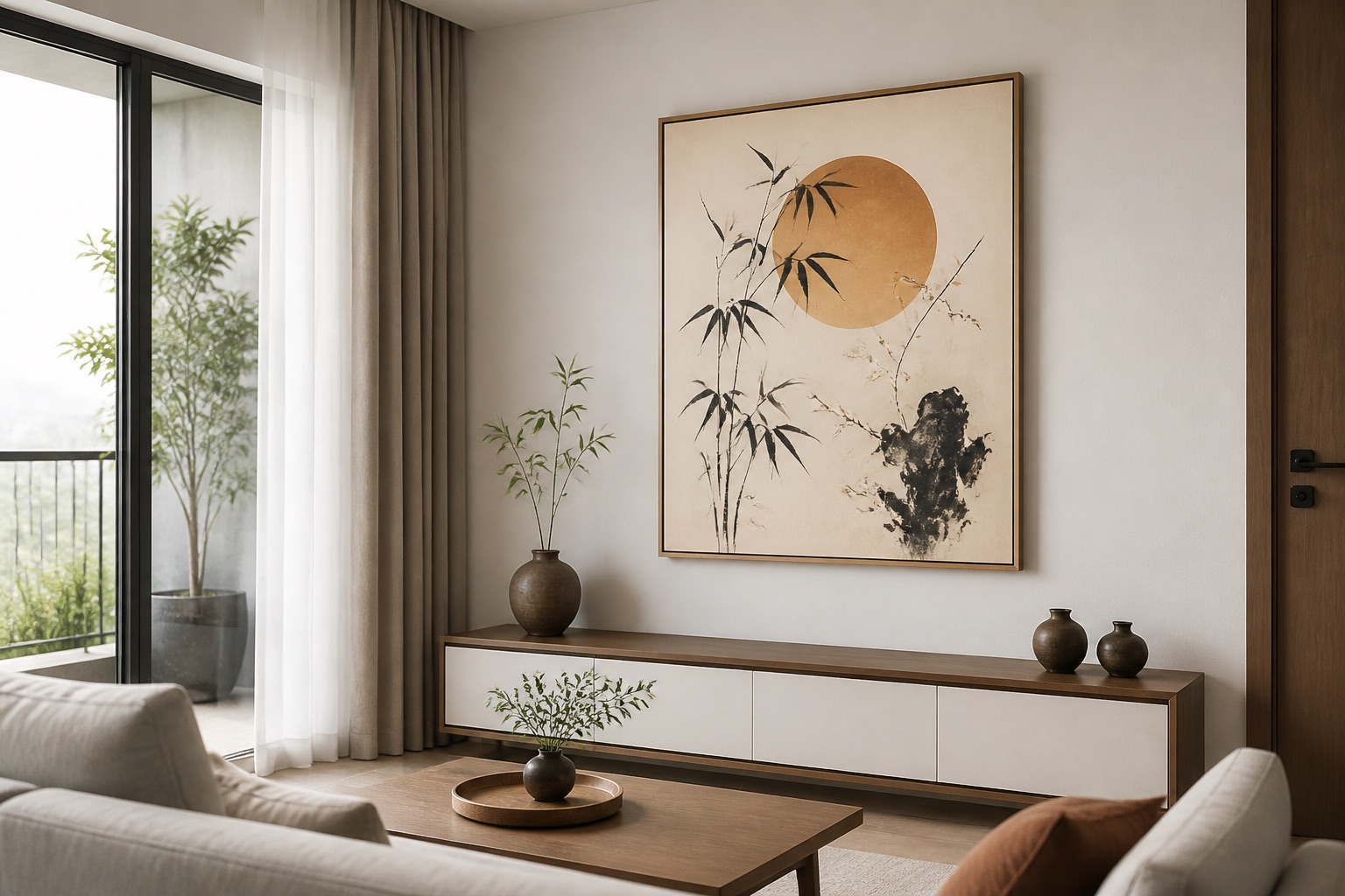
What's the difference between canvas and glass-coated prints under directional light?
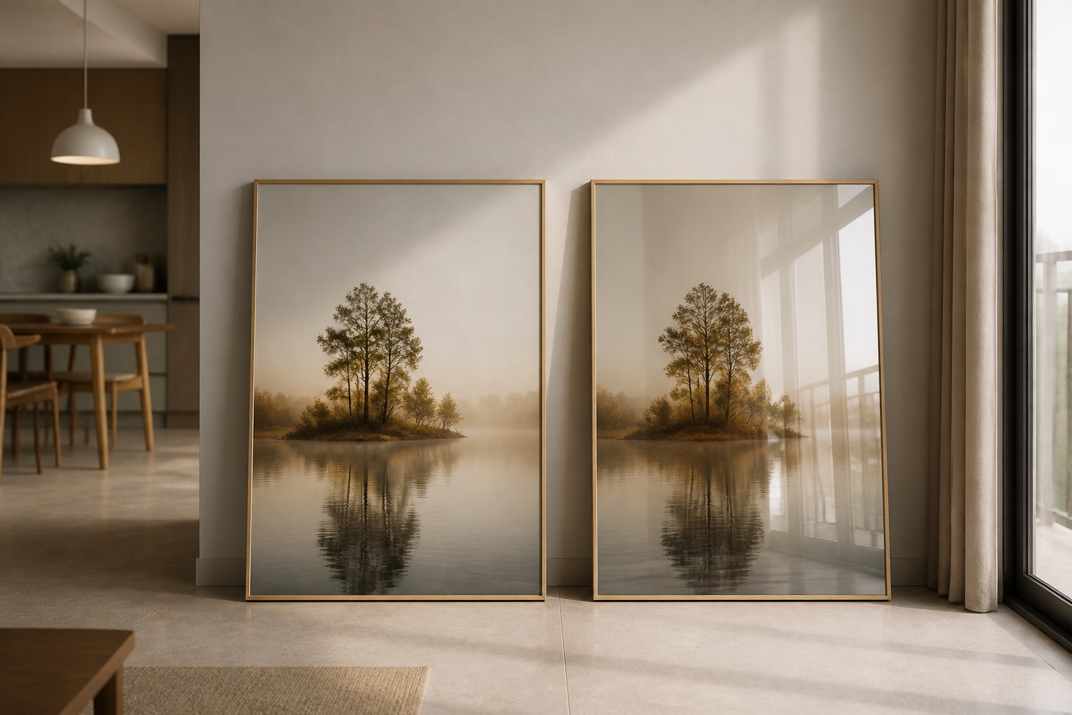
Canvas is porous and matte; it absorbs light and colour appears soft and grounded. Glass-coated (crystal or tempered-glass finish) prints are reflective and have high gloss—colour feels vibrant and lifted, but the reflection can create glare if hung opposite a window or under direct sun. In Hanoi's humid climate, canvas breathes better and resists mildew longer if you hang it on an external wall; glass-coated prints are easier to wipe clean (use a microfibre cloth, no water spray) and won't absorb moisture. If your room gets 4+ hours of direct afternoon sun, glass-coated is durable but may need a slight angle to reduce reflection. If your room is north-lit and soft, canvas won't add unwanted glare and colours will feel intentional, not washed. For colour direction strategy: warm-toned art on canvas looks naturally inviting in dim spaces; warm art on glass-coated can feel theatrical or bright—good for hotels and statement pieces, less cosy for bedrooms. Cool tones gain depth on canvas (depth matters in moody bedrooms) but can feel cold under glass-coated unless the room itself has warm furnishings to balance it. Many expats in Hanoi choose canvas for bedrooms (calm, absorptive) and glass-coated for living rooms or offices (colour pop, easy to clean, durability in aircon-heavy environments where dust settles fast). Browse our glass-coated wall art and canvas options to compare finishes side by side.
How do you centre art on furniture and balance colour direction?
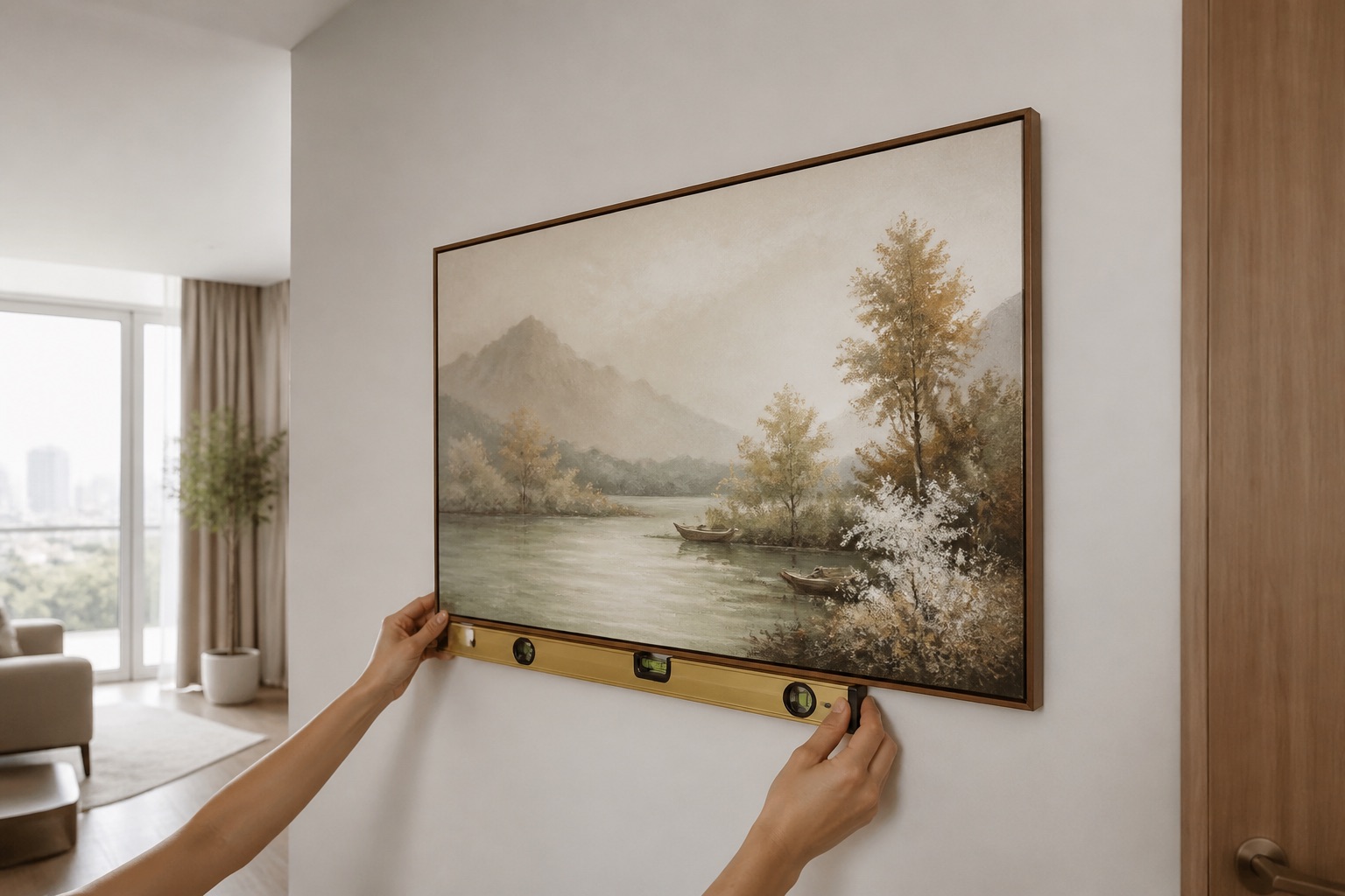
The standard rule: art should be centred on the furniture piece below it (sofa, bed, desk) and hung so that the vertical centre of the art sits 145–160 cm from the floor—roughly at eye level when you're standing in the room. For a sofa, the art should be about 2/3 the width of the sofa itself; for a bed, it anchors the headboard zone. Colour direction enters here because a large 3-piece or 5-piece set will visually pull the eye across the wall in the direction its composition flows. If a room's natural light enters from the left (east-facing window), art that has warm or bright tones on the left side of the composition will draw sight-lines toward that light—visually expanding the room. Conversely, if your art is darker or cooler on the left, the eye bounces back into the room, making the space feel more enclosed and cosy. This isn't magic; it's how warm colours advance and cool colours recede in space. Explore 3-piece and 5-piece art sets if you want to use this principle across a larger wall—the multi-panel format lets you balance colour direction horizontally and create a subtle visual rhythm. For single pieces, a 1:1 or 1:2 ratio canvas or print works best if you're hanging above a sofa or bed in a standard apartment. A 1:3 ratio (very wide) suits accent walls in living rooms where furniture is sparse and the art must anchor the entire wall.
Which colours work best on north-facing walls versus south-facing?
| Aspect | Light Quality | Best Art Colours | Why It Works | Medium Preference |
|---|---|---|---|---|
| North-facing | Cool, diffuse, constant | Deep slate, charcoal, navy, cool greys, teal, forest green | These hold depth and don't fade under stable light; cool colours appear intentional, not washed | Canvas for warmth, glass-coated for clarity |
| South-facing | Warm, golden, intense afternoon | Ochre, rust, terracotta, warm taupe, cream, burnt orange, warm grey | Warm tones glow in golden light; cool art looks flat or cold under direct sun | Canvas for softness, glass-coated for durability in high-heat aircon zones |
| East-facing | Soft morning light, cool | Soft blues, greens, greys, warm neutrals (cream, oatmeal) | Morning light is clearest early; softer tones prevent glare; a mix of warm and cool reads balanced | Canvas for bedrooms (calm); glass-coated for guest rooms |
| West-facing | Harsh afternoon glare, very warm | Deep greens, cool greys, soft purples, navy | Counteracts glare and heat; cool tones prevent the room feeling like an oven; absorbs visual harshness | Glass-coated (reflects heat, easier to clean dust) or canvas with UV lining |
Explore living room wall art for south- and west-facing spaces or bedroom art for north- and east-facing walls to see how Décor Vie's collections are curated by light direction and room purpose.
How do Vietnamese motifs and design styles anchor colour direction?
Vietnamese art—lotus, Ha Long Bay seascapes, rice paddies, Hoi An lanterns—carries inherent colour direction because these subjects have natural light associations. Lotus and water scenes have cool, reflective tones; rice fields and lanterns have warm, golden tones. If your living room is south-facing and you want to celebrate that warmth, a Hoi An lantern or rice-field print in warm ochres and reds will sync beautifully with afternoon light. In contrast, north-lit bedrooms sing when paired with Ha Long Bay or lotus art—cool blues and deep greens appear serene, not gloomy. Feng shui concepts (which we reference as cultural design principle, not superstition) align with this colour-and-light logic: water and cool tones in the north area of your home are grounding; fire and warm tones in the south are energizing. This isn't about luck; it's about how human eyes and brains perceive colour under different light. Check our feng shui–inspired and abstract collections for art already designed with this light direction in mind. Many expat clients in Hanoi choose abstract art in cool tones for home offices (focus, calm) and warm abstract or Vietnamese motif art for living rooms (social, welcoming). The abstract pieces work universally because their colour is intentional and timeless; motif art works best when matched to your room's light path.
What mistakes happen when colour direction is ignored?
Mistake 1: Hanging a cool-toned art on a south-facing wall without testing. The piece feels cold, the room feels disjointed, and you blame the art instead of the light match. Solution: request a sample or high-resolution photo to view on your wall at three times of day before confirming the order.
Mistake 2: Choosing canvas or glass-coated based on trend, not function. A glossy glass-coated print in a humid bedroom corner (Saigon or wet-season Hanoi) may show condensation or water spots if the wall sweats; a canvas in a high-glare living room reflects no heat and collects dust faster. Solution: match medium to light exposure and humidity—canvas in bedrooms or dim spaces, glass-coated in offices and high-traffic living rooms or if the wall gets direct afternoon sun and you want colour to pop.
Mistake 3: Sizing art as an afterthought. A small 20×30 cm print on a 4-metre living room wall reads like an accident. Art should occupy 1/2 to 2/3 of the furniture width below it, so the colour direction and composition are legible and powerful. A 1×2 ratio or 2×3 ratio set (multi-piece) often works better than a single small print in large rooms.
Mistake 4: Hanging in rental apartments without permission or using permanent nails. Colour direction matters zero if you lose your security deposit. Use non-damaging adhesive strips rated for the weight, or ask your landlord first. Décor Vie art in canvas or glass-coated is light enough for most renter-friendly hanging methods.
💬 WhatsApp/Zalo +84 775 017 977 for size and design advice
What to check before you buy
- Light direction of your wall: North, south, east, or west? How many hours of direct sun? Does light reflect off neighbouring buildings?
- Existing furniture colour: Sofa, bed, desk. Is it warm (brown, tan, red) or cool (grey, blue, navy)? Art should harmonize, not clash.
- Room humidity: Ground-floor apartments in Saigon or Hanoi's rainy season are damp. Canvas needs airflow; glass-coated is moisture-resistant.
- Wall material: Concrete or painted plaster? Both accept canvas or glass-coated equally, but test your hanging method on a spare area first.
- Your sight lines: Stand where you spend most time (sofa, bed, desk). Does the art fall into your natural eye path, or do you have to turn your head to see it?
- Colour mood you want: Cosy and calm (warm tones, canvas), energized and clean (cool or warm tones, glass-coated, abstract or modern), or balanced (a mix of warm and cool accents in a multi-piece set).
Once you've answered these five questions, the colour direction and best medium become obvious. Contact Décor Vie by WhatsApp/Zalo or phone with your room's aspect, existing colours, and mood preference—we'll recommend sizes, medium, and design direction specific to your apartment and light.
FAQ
If my wall is painted a dark colour (charcoal, forest green), does art colour direction change?
Yes—dark walls absorb light, so your art needs slightly more saturation or brightness to read clearly. Cool-toned art on a cool-toned wall can blur together; a warm accent or metallic-edged glass-coated print will pop. Test your colour choice under the same light at different times before confirming the order.
Can I hang the same art on a north-facing and south-facing wall in my apartment?
Technically yes, but it won't feel equally balanced. The same warm-toned canvas will glow on the south wall and look dull on the north. If you have both exposures, choose art colours that bridge warm and cool—soft greys, warm neutrals, or multi-toned abstract pieces—or hang different designs to match each wall's light. Browse abstract wall art for designs that work across light directions.
Does glass-coated (crystal print) really stay cleaner than canvas in a humid Hanoi apartment?
Yes. Canvas is porous and can hold dust and moisture; glass-coated is sealed and wipeable with a microfibre cloth. In humid climates or aircon offices where dust settles fast, glass-coated is easier to maintain. Canvas is still durable if hung on interior walls with good airflow, but glass-coated wins for kitchens, bathrooms, and humid ground-floor bedrooms.
Is 145–160 cm the right height for every room, or does furniture height change this?
It's a guideline, not a rule. The goal is to centre the art's midpoint at eye level (roughly chin to forehead when standing). If your sofa is very low or very high, adjust accordingly. The key is that the art should feel like a visual anchor for the furniture below, not float detached above it. For a tall headboard, the art might sit 160–170 cm; for a low platform bed, 140 cm is fine.
What if my room has mixed light—part north-facing, part south-facing, with windows on two walls?
This is common in corner apartments and lofts. Place art on the wall that gets less direct sun (usually north or east) so colour won't wash out. If you must hang on a bright wall, choose slightly warmer or more saturated tones to hold their intensity. Glass-coated prints are more forgiving in mixed-light rooms because the gloss helps colours read clearly despite light shifts. Contact us to discuss your specific layout—we can recommend a placement and colour direction tailored to your apartment's geometry.