
Canvas Prints in Warm Tones: Choosing Colour, Size & Finish
Warm-tone canvas prints are stretched or rolled cotton prints in earthy, golden, and rust hues that suit living rooms, bedrooms, and hallways in Hanoi and Ho Chi Minh City apartments. Décor Vie produces them in 1:1, 1:2, 1:3, and 2:3 ratios as single pieces or 2–5-piece sets, printed on archival ink and stretched over FSC wood or shipped rolled. Warm tones work best in rooms with soft, north-facing light or where you want intimate ambiance; they pair well with natural wood furniture and rattan. Before ordering, measure your wall width (art should be 50–70% of furniture width below it), check indoor humidity levels (canvas handles Hanoi's moisture reasonably, but glass-coated prints resist it better), and confirm your existing colour palette. Contact us on +84 775 017 977 for sizing advice and quotes.
What warm tones actually do in a room
Warm colours—terracotta, ochre, burnt sienna, cream, soft gold—trigger calm and appetite because they mimic natural earth and sunset light. Unlike cool greys or blues, warm-tone canvas prints don't recede into background; they anchor a space and invite lingering. In Hanoi's tropical apartments with high humidity and variable light, warm tones hold their vibrancy better than pale pastels and don't emphasize dust on matte finishes as much as very dark colours do.
💬 WhatsApp/Zalo +84 775 017 977 for size and design advice
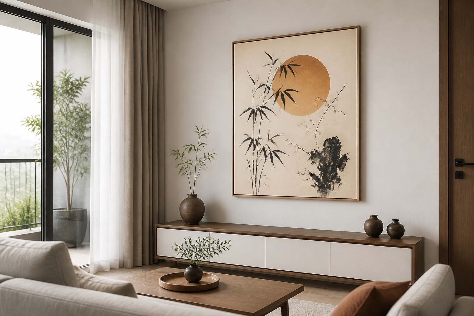
Should you choose stretched canvas or rolled prints?
Stretched canvas arrives ready to hang (wood-frame back included); rolled canvas ships flat and needs DIY stretching or professional mounting at a local framer. Stretched canvas costs more upfront but suits expats and renters who want zero assembly; rolled canvas saves shipping costs and works for those planning custom framing or long-term storage. Both formats accept warm-tone inks equally well. For Hanoi's humidity, neither format poses problems if hung away from direct AC vents or bathroom steam. Choose stretched if you're renting and want zero landlord friction; choose rolled if you're flexible on installation timing and budget-conscious.
How size and wall layout affect colour perception
A warm-tone print that measures 60 cm wide above a 100 cm sofa (roughly 2:3 ratio) feels balanced and prevents the wall from looking empty; the same print above a 150 cm bed appears too small. Colour also shifts with wall area: a 40×50 cm warm print in a small bedroom feels intimate, while a 100×80 cm version in a large living room grounds the whole seating zone. Measure your wall first, estimate furniture width below the artwork, and place your image centre at 145–160 cm from the floor (eye level when standing). A larger print in warm tones actually makes a room feel cozier, not heavier, because warm colours visually advance.
| Room | Wall width | Ideal art width | Suggested format | Why it works |
|---|---|---|---|---|
| Bedroom (small) | 2–2.5 m | 50–70 cm | Single 1:1 or 1:2 | Intimate, doesn't overwhelm |
| Living room sofa wall | 3–4 m | 80–120 cm | Single wide or 3-piece set | Anchors seating, fills visual weight |
| Hallway | 1.5–2 m | 40–60 cm | Single 1:3 (vertical) | Draws eye without crowding |
| Bedroom headwall | 2–3 m | 70–100 cm | 2–3-piece horizontal set | Warm tones soothe above bed |
Canvas vs. glass-coated prints: which handles warmth and humidity?
Canvas (cotton + stretcher) looks matte and texturally rich; warm tones appear soft and forgiving on canvas because the fabric diffuses light. Glass-coated (also called crystal) prints have a glossy tempered-glass finish that makes warm colours appear more saturated and reflective; they're harder to clean (use microfibre cloth only) and may show fingerprints. For Hanoi or Ho Chi Minh City humidity (65–80% year-round), both resist moisture if hung away from bathrooms and AC condensation. Canvas is cheaper and feels more "fine art"; glass-coated is more hotel-like and suits modern interiors. If your room gets high afternoon gloss (south-facing windows), glass-coated warm tones may feel too bright; matte canvas is safer.
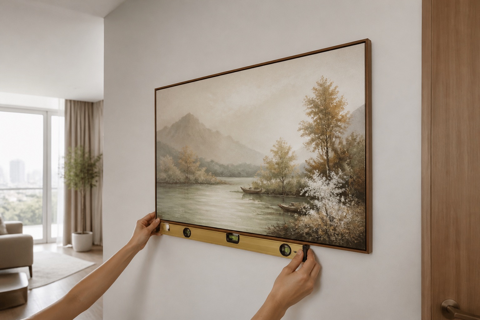
How to match warm-tone prints to existing décor
Pull paint swatches or photos of furniture, rugs, and walls before browsing. Warm-tone canvas prints in ochre pair with terracotta ceramics, rattan, natural wood, and cream walls; warm greys and taupes anchor minimalist schemes. If your sofa is grey-brown (a common neutral in Hanoi rentals), warm-gold or rust-toned abstract prints bridge the gap to earthy accessories without clashing. Avoid mixing warm and cool tones in the same wall (e.g. warm-tone print + blue-grey frame = visual tension). Abstract warm-tone designs offer safer colour-matching than representational art because they don't lock you into a single palette.
Browse our abstract wall art collection for designs that work with any décor style.
💬 WhatsApp/Zalo +84 775 017 977 for size and design advice
What to check before you order
- Measure your wall width and furniture width. Art should be 50–70% of the furniture width below it (sofa, bed, dresser).
- Note your room's light direction. North-facing rooms suit warm tones beautifully; south-facing rooms risk overpowering warmth—consider 2–3-piece sets to distribute visual weight.
- Check wall colour and finish. Matte warm-white walls make warm-tone prints pop; glossy or textured walls may absorb colour differently.
- Plan for humidity. If your apartment is in a basement level or near kitchen/bathroom, canvas can handle it; glass-coated is safer for extreme moisture.
- Confirm format preference. Stretched canvas = ready to hang; rolled = flat shipping, needs framing.
- Review ratio options. A 1:2 (horizontal, e.g. 100×50 cm) suits living rooms; 1:1 (square) suits small walls; 1:3 (tall vertical) suits hallways and narrow walls.
- Consider multi-piece sets. A 3-piece warm-tone set in separate frames offers flexibility—hang asymmetrically or linear—and costs less per piece than one large canvas.
Explore 3-piece sets for warm-tone designs.
Warm tones in bedrooms, living rooms, and rentals
Bedrooms: Warm-tone canvas above the bed (100–120 cm wide) creates a focal point without stimulating alertness—perfect for master suites. Place it centred at eye level (145–160 cm) so it's the last thing you see before sleep.
Living rooms: Larger warm-tone prints (80–120 cm) or 2–3-piece sets anchor the sofa wall and invite gathering. Warm ochres and rust work especially well with rattan side tables and wooden shelving.
Rentals: Stretched canvas on rented walls requires only small nail holes (8–10 cm apart for the mounting hardware); landlords rarely object. Avoid adhesive strips on glossy paint (warm tones show damage). If unsure, ask permission or hang a fabric print using invisible wire instead of nails.
See our full canvas print range and living room wall art options.
🖼️ Browse Décor Vie wall art
FAQ
Do warm-tone canvas prints fade in Hanoi's sunlight?
Archival-quality inks (which Décor Vie uses) resist fading for 10+ years if not in direct, constant sunlight. Place warm-tone canvas away from south-facing windows without curtains; indirect or north-facing light preserves colour indefinitely.
Can I hang a warm-tone canvas in a bathroom?
Not recommended. Bathroom humidity and steam warp canvas and weaken stretcher joints. If you want bathroom art, choose glass-coated prints instead—they withstand moisture and require minimal maintenance.
What size warm-tone print suits a 150 cm sofa?
Aim for 80–100 cm wide (roughly 1:2 ratio, e.g. 100×50 cm). Place it centred 20–30 cm above the sofa back, at eye level when standing. Contact us on +84 775 017 977 to confirm dimensions for your space.
Should warm-tone canvas be framed?
Stretched canvas arrives framed (wood-frame built in); no additional frame needed. Rolled canvas can be framed by a local framing shop or mounted frameless on stretcher bars. Framing adds cost but lets you match your room's wood tone or metal finish.
Do warm-tone multi-piece sets (2–5 pieces) work in small apartments?
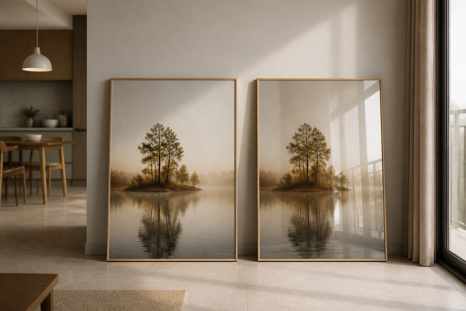
Yes. A 3-piece warm-tone set hung asymmetrically above a sofa or bed in a small living room creates visual interest without feeling cluttered. Each piece is narrower than one large canvas, so they suit compact walls better.
What's the difference between warm tones and "earth tones"?
Warm tones include any colour with yellow or red undertones (ochre, terracotta, gold, rust, cream). Earth tones are a subset of warm tones that mimic natural soil, clay, and stone. All earth tones are warm; not all warm tones are earth (e.g. warm peach or champagne gold are warm but not strictly "earthy").