
Canvas Art for Dim Living Rooms: Light & Colour Guide
Dim living rooms benefit most from canvas art in warm, saturated colours (terracotta, ochre, deep teal, cream) and matt or textured finishes that don't absorb all available light. Décor Vie offers canvas prints and glass-coated prints in stretched or rolled formats; glass-coated (crystal finish) reflects ambient light without harsh glare, while matte canvas feels warmer but absorbs more. For a 1.5–2 m-wide sofa in dim light, a 3-piece set (each panel 40–60 cm wide) or single landscape print (80–120 cm) works best; hang the centre at 145–160 cm from the floor, 20–30 cm above furniture. Avoid very dark designs, pure blacks, or metallic finishes in low-light rooms. Light-coloured mounts and frames help; warm LED bulbs at 2700–3000 K above or beside the artwork lift the whole space. Contact us on +84 775 017 977 for a quote by size and room layout. 💬 WhatsApp/Zalo +84 775 017 977 for size and design advice
Why Does Dim Lighting Change How Canvas Art Looks?
Low-light living rooms don't just show less of your art—they flatten colour, reduce depth, and make dark finishes disappear into shadow. A sunset photograph or warm abstract that glows in bright daylight can look muddy or dull in a room lit only by evening lamps. Canvas fabric has a natural matt finish; it doesn't throw light back at you, so less light hits the wall, and your eye sees less detail. Glass-coated canvas, by contrast, has a protective gloss layer that bounces ambient light forward, brightening the composition without creating a mirror-like reflection. The key is choosing art that works with your room's light source (position, colour temperature, brightness) rather than against it.
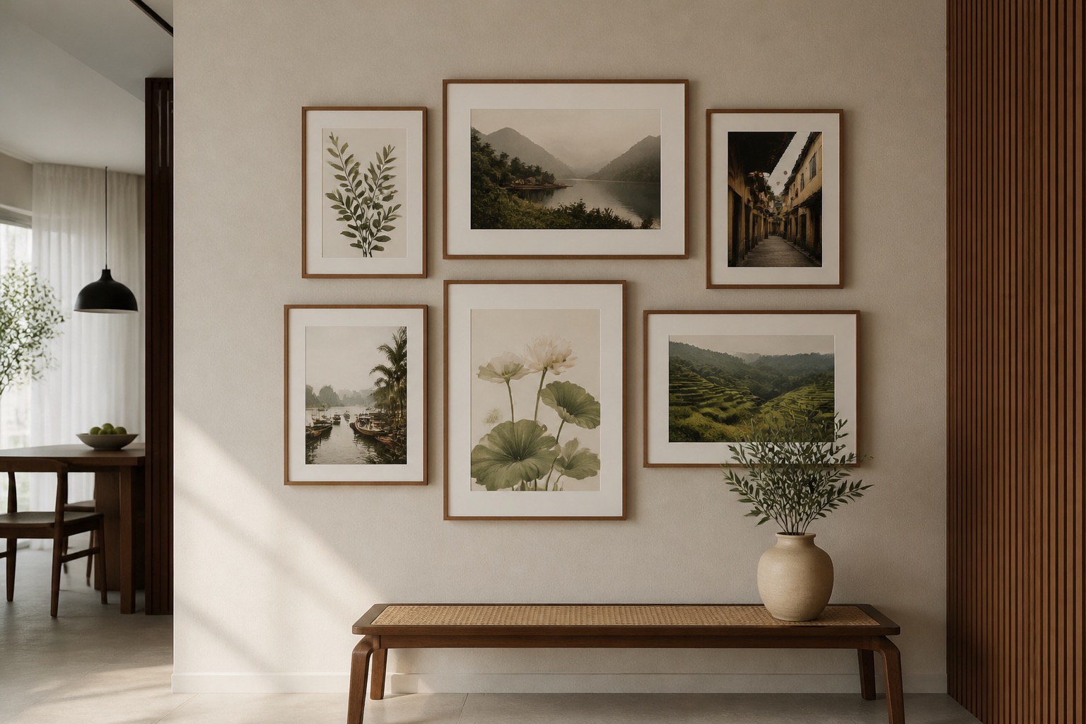
What Colours Work Best in Low-Light Rooms?
Warm, mid-to-dark saturated hues hold their character under dim lighting: terracotta, burnt sienna, deep mustard, warm grey, navy with warm accents, cream, and soft gold. Pastels and cool greys (blues without warmth, pale greens) lose intensity and can look washed out in shadows. Monochrome or single-colour designs often flatten further. Instead, choose art with contrast within the warm palette—a deep ochre background with cream or white detail, or a layered abstract with terracotta, rust, and ivory. Hanoi's humid tropical climate also favours slightly muted, earthy tones in dim rooms; they complement both colonial and modern interiors without competing with strong evening light.
| Colour Family | Looks Like in Dim Light | Best For |
|---|---|---|
| Terracotta, ochre, burnt sienna | Glows warm, holds depth | Sofas, focal walls |
| Navy, forest green (saturated) | Recedes but stays rich | Accent walls, 3-piece sets |
| Cream, pale gold, warm white | Lifts space, reflects light | Smaller prints, pairs |
| Dusty pink, mauve | Flattens, can look pale | Avoid unless paired with warm |
| Pure black, cool grey | Disappears into shadow | Only if other elements are bright |
| Bright red, electric blue | Can look neon or jarring | Use sparingly as small accents |
A 3-piece wall art set in complementary warm tones (say, burnt orange, cream, and terracotta) spreads colour across the wall, lifting the whole corner.
Canvas vs. Glass-Coated: Which Finish Wins in Low Light?
Canvas has a naturally porous, fabric weave that feels warm and absorbs light; in dim rooms, it can look flat unless the design itself is high-contrast. Glass-coated (crystal finish) has a thin, smooth protective layer that reflects light; it brightens and deepens colour without glare if hung away from direct lamp beams. Neither is objectively "better"—it depends on your space and preference.
Canvas: Best for warm, cosy vibes; forgiving with imperfect walls; no reflections to distract. In dim light, it needs brighter or bolder art to shine. If your room has yellow-tinted evening bulbs, canvas will warm up further, which can be good (hygge) or too amber (stuffy).
Glass-coated: Lifts dim spaces, sharpens colour definition, easier to clean (important in Hanoi's humid climate, where dust settles). Minimal glare if lit from above or the side, not from behind. Overkill in very brightly lit rooms (can feel clinical).
Humidity note: Hanoi apartments, especially older buildings, hold 60–80% humidity year-round. Stretched canvas can warp or sag if mounted on external walls. Glass-coated prints resist moisture better. Rolled canvas in a dry room or matte-finish glass-coated is a solid compromise.
💬 WhatsApp/Zalo +84 775 017 977 for size and design advice
How Should You Size and Hang Art in a Dim Room?
Undersized art looks lost in shadow. The rule of thumb: art width = 50–75% of the furniture below (sofa, console, bed). For a standard Hanoi sofa (1.5–1.8 m), a single print should be 80–120 cm wide, or three 40–50 cm panels hung 5–10 cm apart. Centre the composition at 145–160 cm from the floor (eye level while standing). Hang 20–30 cm above the sofa or headboard; this draws the eye upward and makes the ceiling feel higher.
In dim rooms, negative space around the art matters: white or light walls bounce light forward; dark walls swallow it. If your wall is mid-grey or warm taupe (common in Hanoi rentals), canvas prints in cream or pale gold will pop. If the wall is already cream or light, go deeper—terracotta or navy—for contrast and definition.
A single large print (100–150 cm) often works better than many small ones in low light; it commands attention without fragmenting the space. Test placement before hanging: use painter's tape and step back at different times of day, especially in evening when dim lighting is most noticeable.
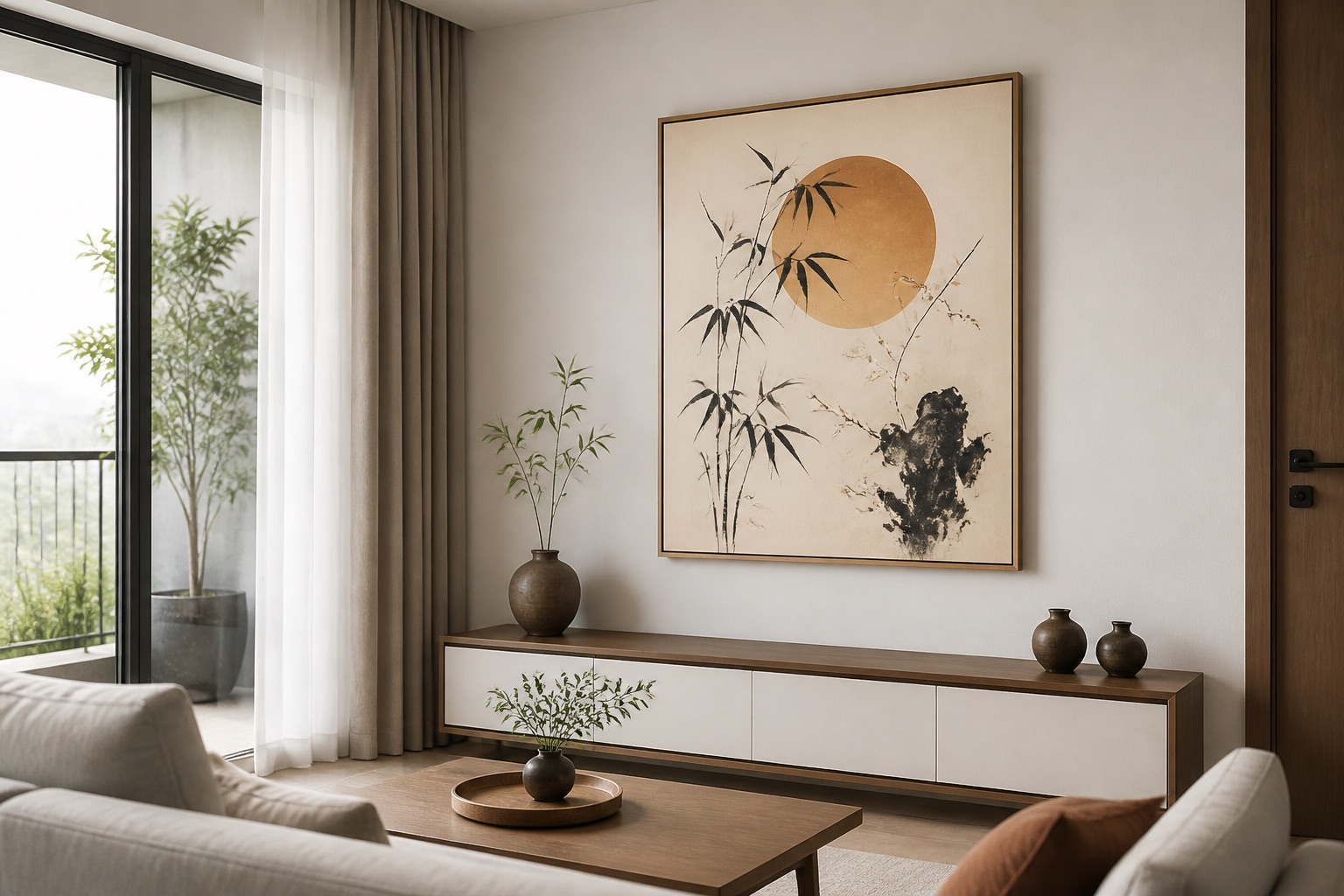
Which Design Styles Shine in Low-Light Living Rooms?
Abstract wall art with layered warm tones, geometric patterns, or textured designs often performs well because viewers engage with form and colour rather than fine detail. Impressionist-style landscapes (soft focus, warm light) evoke atmosphere without demanding pristine clarity. Vietnamese motifs—Hoi An lanterns, rice fields at sunset, lotus—naturally suit warm, dim environments; their cultural resonance fills shadow beautifully.
Photography in dim rooms works if it's warm-toned (sunsets, golden-hour scenes, interior shots) rather than cool or night-time. Minimalist, single-colour designs (a tonal wash of terracotta or warm grey) are risky unless you like stark, meditative spaces; most people find them too bare in low light.
Avoid photorealism of small details (fine architecture, tiny wildlife) where dim light will obscure the point. High-contrast black-and-white line art or ink drawings read clearly even in shadows, but check the overall mood—they can feel stark or cold in an already-dim space.
What Should You Check Before Buying Canvas Art for a Dim Room?
- Room light source: Note whether light comes from overhead (best for canvas), side lamps (works with either finish), or mainly from windows that go dark at evening. Dim rooms often rely on evening lamps; choose art that suits warm bulb-light.
- Wall colour and texture: A rough, dark wall will absorb art; a smooth, light wall lifts it. If renting, you can't change the wall, so choose art that contrasts it.
- Distance from viewers: Art viewed up close (console behind sofa, opposite a low chair) can be darker because you see it from nearer. Art across the room benefits from lighter colours and glass-coated finish.
- Size check: Measure your space. Take a photo, print it, hold up a piece of card the size you're considering. Does it feel right? In dim light, undersized art vanishes.
- Sample in situ: If possible, ask Décor Vie for a low-resolution mockup or sketch showing your design on a wall colour similar to yours, lit by warm-toned bulbs.
Common Mistakes to Avoid
- Too-dark art on a dark wall = invisible. Light up one, not both.
- Reflective finishes aimed at bright spotlights = glare and distraction. Position glass-coated prints away from direct beam.
- Small, busy details in low-light art = blur and frustration. Choose bold forms and clear colour blocks.
- Matching art exactly to wall colour = flat, boring. Contrast (even subtle) gives definition.
- Ignoring humidity. Stretched canvas in a steamy bathroom-adjacent wall will warp. Glass-coated or rolled canvas in a drier room is safer.
What to Check Before You Buy
| Checklist | Why |
|---|---|
| Room's dominant light source (overhead, side, lamps only) | Changes how art reflects and reads |
| Wall colour (photo under evening light) | Tells you if you need contrast or harmony |
| Furniture width below art | Sizes the print (50–75% of furniture) |
| Distance to viewing point | Affects readable detail and colour saturation |
| Humidity level (rented apartments often 60–80%) | Determines if canvas or glass-coated is safer |
| Existing palette (sofa, rugs, cushions) | Art should echo 1–2 tones, not clash |
💬 WhatsApp/Zalo +84 775 017 977 for size and design advice
For living room wall art in Hanoi's dim interiors, we recommend starting with a warm-toned canvas print or glass-coated option sized to 50–75% of your sofa width. Test the finish and colour in your space before committing. Décor Vie delivers rolled or stretched formats across Vietnam; contact us for a custom quote and mockup by room photo and dimensions.
FAQ
Can I hang canvas art in a room with no natural light?
Yes. Use warm LED bulbs (2700–3000 K) positioned above or to the side of the art. Choose canvas or glass-coated in saturated, warm colours (terracotta, ochre, navy with accents). Avoid pure black or very dark designs. Glass-coated will reflect the bulb-light and brighten the space more than matte canvas.
Should I choose glass-coated or canvas for a humid Hanoi apartment?
Glass-coated resists humidity (60–80% year-round) better and won't warp. If you prefer canvas warmth, hang it on an interior wall away from external walls or bathrooms, and ensure air circulates. Rolled canvas is safer than stretched in high-humidity spaces.
What size should a single print be above a 1.6 m sofa in a dim room?
80–120 cm wide. Hang it 20–30 cm above the sofa, centred at 145–160 cm from the floor. In dim light, slightly larger is better; undersized art vanishes into shadow. A 3-piece set (each 40–50 cm, spaced 5–10 cm apart) totals similar width and spreads colour.
Does a dim room need lighter art, or does darker art look better?
Neither automatically. Saturated, warm mid-to-dark tones (terracotta, navy, forest green) hold character in low light and feel rich, not flat. Pure black or washed-out pastels disappear. Test your colour choice under evening bulb-light before ordering.
Can I use an abstract print to brighten a dim living room?
Yes. Abstract with contrasting warm tones (burnt orange on cream, terracotta with ivory accents) lifts dim spaces well. Layered or textured abstract designs draw the eye and feel dynamic. Monochrome or single-colour abstracts can look flat in low light unless they have tonal variation.
How do I know if my room is "dim" enough to need special art choices?
If your space feels dark or gloomy in the evening with only lamps on, and you can't read details in a magazine without leaning close, it's dim. Rooms under 2.8 m ceiling height with limited window area or north-facing aspects are often dim. Check your space at the time of day you use it most.