
Canvas Art Color Matching Guide for Hanoi Homes
Canvas art color matching starts with three layers: your wall base (cool grays pair with cool-toned landscapes; warm creams suit earth-toned abstracts), your largest furniture anchor (sofa, bed, dining table), and natural/artificial light in your room at different times. In Hanoi and Ho Chi Minh City, humidity and intense afternoon sun fade some inks faster than others; Décor Vie's canvas prints use UV-resistant inks to hold color longer. Begin by photographing your wall in morning and evening light, then hold color samples—even phone screenshots—against that photo. Art should echo 1–2 colors already in the room, not introduce a third dominant shade. Size matters equally: art width should sit 50–70% of your sofa or bed width, centered 145–160 cm from the floor. If you're unsure whether stretched canvas or a glass-coated print suits your wall, contact us on +84 775 017 977 for a quote by size. 💬 WhatsApp/Zalo +84 775 017 977 for size and design advice
How do I match art colors to my wall tone?
Your wall acts as the canvas's backdrop. Warm walls (cream, beige, terracotta) sing with art holding ochre, rust, deep green, or muted gold. Cool walls (pale gray, soft blue, greige) accept cool-tone art—slate blues, cool grays, purples, cool whites. Neutral walls (true white, light taupe) are flexible. Shoot a photo of your wall at 10 a.m., 2 p.m., and 6 p.m. in natural light; notice how color shifts. Vietnamese apartments often face north or east, meaning softer morning light but intense heat by afternoon. If your wall shifts from cool to warm across the day, choose a mid-tone art piece (think soft sage or warm gray abstract) that works in both phases. Avoid art that's darker than 30% of your wall's lightness or it'll look heavy and cramped.
Should canvas art echo your furniture colors or contrast them?
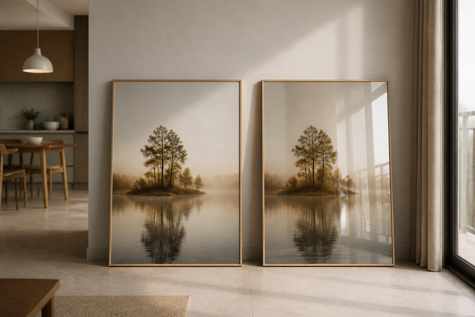
The harmony rule: art should contain one color already present in your furniture, one from your wall, and one new accent. If your sofa is charcoal, your wall is cream, and your rug is warm gray, choose art that includes those three—perhaps an abstract with charcoal, cream, and silver-gray strokes. This creates visual flow without monotony. Contrast works only when deliberate: a bright coral canvas on a cool gray wall reads as bold styling if the sofa also has a coral throw or the rug echoes warmth. Random contrast reads as a mistake. When in doubt, choose art with muted, grayed-down versions of your furniture colors; they're forgiving. Browse our abstract wall art collection for palette options.
Why does my canvas art look different at home than in photos?
Three culprits: ink reproduction, light color temperature, and screen calibration. Photos online are often shot under studio lights (neutral or cool), but your room may have warm tungsten bulbs or bright afternoon sun. A cool-toned abstract appears more purple online but reads more gray-green in your living room under warm light. Before ordering, ask Décor Vie for a swatch or high-res detail photo, then view it on your phone under your actual room light. Humidity in Hanoi also affects perception—high moisture can make matte canvas appear slightly washed, while glossy glass-coated prints stay vivid because the coating seals the ink. Order a sample in a 20×20 cm size first if you're uncertain; this investment saves larger regret. Lighting also shifts with seasons in Vietnam: May–September brings hotter, more direct sun (colors appear brighter and warmer), while November–February offers softer, cooler light. Plan art for the season you'll see it most.
What canvas colors work best in humid apartments?
Humidity in Saigon and Hanoi ranges 60–90% year-round; stretched canvas can absorb moisture and sag, while printed inks may fade or discolor. Décor Vie uses tight-stretched canvas (bar-braced backs) and fade-resistant inks to minimize this. Cool colors (blues, greens, purples, cool grays) hold their saturation better in moisture than warm, light tones (pale peach, butter yellow). Matte finishes can appear slightly washed by humidity gloss, while glass-coated canvas or crystal prints resist moisture by sealing the image in tempered glass—no fading, easier to wipe clean. If you live near the coast or in a high-humidity zone, avoid very pale, desaturated designs; go for art with medium to rich color depth. Dark backgrounds (charcoal, navy, deep forest) look fresh for years; light backgrounds show dust and humidity marks faster.
How should I arrange multiple canvas pieces in one room?
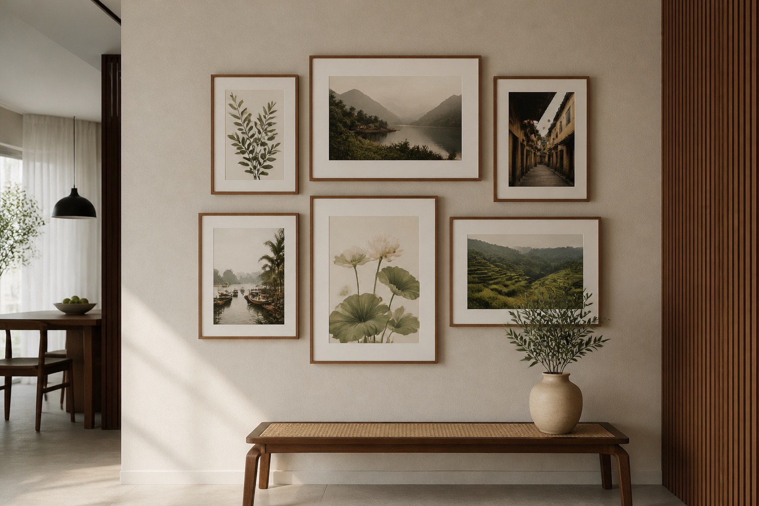
Multi-piece sets (2, 3, 4, or 5 pieces) follow a grid: hang them symmetrically with 5–10 cm gaps, centers aligned horizontally or in a staggered "salon style." For 3-piece wall art sets, layout matters. Hang the largest piece central, flanked by smaller pieces at equal height, or stagger all three vertically along a tall wall (10–20 cm apart). Group color should feel cohesive—all three should share a background tone or color family. If one piece is navy, one sage, one cream, they unify best if all three contain one shared accent (gold, gray, or white). Measure the wall space: art groupings should sit 2/3 the width of the furniture beneath them (sofa, bed, shelving). For a living room sofa, three pieces together should span roughly 180–240 cm width. Contact us on +84 775 017 977 for a quote by size to confirm measurements.
Which wall colors make art look smaller or larger visually?
Contrast expands: light art on a dark wall appears larger; dark art on a light wall recedes. If your walls are pale cream and your space feels small, choose art with darker tones or strong color saturation to anchor the room. If your walls are charcoal (common in modern Hanoi apartments), light-toned or brightly colored art pops forward and fills the visual space. Medium-tone art on a matching wall tone feels cozy but can shrink the room. Use this strategically: bedrooms benefit from softer palettes (art + wall in harmonious mid-tones), while living rooms with tall ceilings can handle bolder, larger-scale art that contrasts the wall. Never choose art darker than your wall and lighter than your trim in the same room—visual confusion follows. Aim for one of these hierarchies: wall (darkest), art (medium), trim (lightest) or vice versa.
| Room Type | Wall Tone | Recommended Art Color | Why |
|---|---|---|---|
| Living room, high ceiling | Light gray | Deep blue, forest, charcoal abstract | Creates anchor, prevents floating feeling |
| Bedroom, calm vibe | Warm cream | Sage, warm taupe, soft blue | Relaxes without stimulating |
| Apartment near window | Neutral white | Muted gold, cool gray, soft teal | Adapts to sun shifts across day |
| Modern minimalist | Charcoal | Cream, soft white, single accent (coral, sage) | Contrast defines space |
| Tropical/humid climate | Any | Medium-rich saturation (avoid pastels) | Humidity dims light tones faster |
💬 WhatsApp/Zalo +84 775 017 977 for size and design advice
What to check before you buy
- Wall surface: Is it smooth, textured, or uneven? Textured walls can hide edges of smaller art; oversized prints look better on flat walls.
- Light source: Natural light (direction, intensity), artificial light (cool LED, warm bulb?), and time of day when you're in the room most.
- Furniture placement: Measure your sofa/bed width; art should be 50–70% that width, not wider.
- Humidity level: Hanoi apartments above 75% humidity year-round; if yours is very high, glass-coated outperforms canvas for longevity.
- Color samples: Screenshot Décor Vie designs and view them under your room's actual light before ordering full size.
- Renter-friendliness: Are you using removable hangers? Confirm the wall can support the weight (stretched canvas ~2–5 kg per piece; glass-coated up to 10 kg).
Décor Vie's canvas prints and glass-coated options are available across Vietnam. We deliver from Hanoi in 5–10 business days. 30-day smile guarantee applies to all orders.
FAQ
Can I hang canvas art in a room with air conditioning that runs 10+ hours daily?
Yes—constant AC actually stabilizes humidity and temperature, reducing canvas flex and ink stress. Ensure the thermostat reads 50–60% humidity; if it climbs above 70%, brief mold risk exists on canvas back. Keep 5 cm clearance behind the frame for air flow.
Does a 3-piece set have to match in color, or can pieces clash intentionally?
Intentional clashing works if all three pieces share one dominant color and differ in secondary tones—e.g., one navy/coral, one navy/gold, one navy/cream. If colors share zero overlap, the eye can't unify them; it reads as scattered, not curated.
What canvas art color works best for a bedroom that faces south (intense afternoon sun)?
Medium-to-rich saturated colors (deep teal, sage, charcoal, soft purple) hold their warmth longest. Pale pastels will appear washed and yellow after 2–3 years in direct sun; UV-resistant inks slow this but don't prevent it entirely in relentless heat.
Should my living room art match my rug or contrast it?
Echo one color from the rug in your art, then add two colors from walls/furniture. Pure matching looks flat; partial harmony feels intentional. If your rug is warm gray and terracotta, choose art with terracotta plus a cool accent (slate, pale blue), not terracotta alone.
If I'm renting and want to swap art later, can I move canvas prints without damage?
Yes—canvas on stretcher bars can be moved easily if hung on wall anchors or removable adhesive strips rated for 5+ kg. Avoid hammer holes; use lightweight toggle anchors or Command strips. Glass-coated prints are heavier but equally mobile if you use the right hardware.